
Dia
Kevin Breit
Henry House
Judith Samson
Alan Horkan
Thomas Harding
Mark Dexter

Dia
by Kevin Breit, Henry House, Judith Samson, Alan Horkan, Thomas Harding, and Mark Dexter
This is version 0.97.0 of the Dia manual.
Copyright © 2004, 2009 Kevin Breit, Henry House, Judith Samson, Alan Horkan, Mark Dexter
Permission is granted to copy, distribute and/or modify this document under the terms of the GNU Free Documentation License, Version 1.1 or
any later version published by the Free Software Foundation with no Invariant Sections, no Front-Cover Texts, and no Back-Cover Texts. You
may obtain a copy of the GNU Free Documentation License from the Free Software Foundation by visiting their Web site or by writing to: Free
Software Foundation, Inc., 59 Temple Place - Suite 330, Boston, MA 02111-1307, USA.
Many of the names used by companies to distinguish their products and services are claimed as trademarks. Where those names appear in any
GNOME documentation, and those trademarks are made aware to the members of the GNOME Documentation Project, the names have been
printed in caps or initial caps.

iii
Table of Contents
1. Introduction ................................................................................................................. 1
1.1. Introduction ........................................................................................................ 1
2. Quickstart ................................................................................................................... 2
2.1. What Can You Do? ............................................................................................. 2
2.2. Starting Dia ....................................................................................................... 2
2.3. Creating a Canvas ............................................................................................... 2
2.4. Making a Diagram .............................................................................................. 3
2.5. Saving and Printing Your Diagram ......................................................................... 4
2.6. Running Dia From the Command Line ................................................................... 4
2.7. Who Does Dia Appeal To? ................................................................................... 4
3. The Canvas ................................................................................................................. 6
3.1. Canvas Introduction ............................................................................................. 6
3.2. Grid Lines ......................................................................................................... 6
3.3. Rulers ............................................................................................................... 7
3.4. Background Color ............................................................................................... 7
3.5. Zooming ............................................................................................................ 8
3.6. Other View Menu Options .................................................................................... 9
3.7. Undo and Redo ................................................................................................. 10
4. Objects and the Toolbox .............................................................................................. 11
4.1. Dia Toolbox Overview ....................................................................................... 11
4.1.1. Modify Control ........................................................................................ 11
4.1.2. Magnify Control ...................................................................................... 12
4.1.3. Scroll Control .......................................................................................... 12
4.1.4. Basic Objects ........................................................................................... 12
4.1.5. Special Objects ........................................................................................ 13
4.1.6. Default Color, Line Width, and Line Style .................................................... 14
4.2. Using Objects ................................................................................................... 15
4.2.1. Adding Objects ........................................................................................ 15
4.2.2. Moving Objects ....................................................................................... 15
4.2.3. Resizing Objects ...................................................................................... 16
4.2.4. Deleting Objects ...................................................................................... 16
4.2.5. Connecting Objects With Lines ................................................................... 16
4.2.6. Entering Text ........................................................................................... 18
4.2.7. Aligning Objects ...................................................................................... 19
4.2.7.1. How To Align Objects ..................................................................... 19
4.2.7.2. Left, Center, and Right Align ............................................................ 19
4.2.7.3. Top, Middle, and Bottom Align ......................................................... 21
4.2.7.4. Spread Out Horizontally and Vertically ............................................... 23
4.2.7.5. Align Adjacent or Stacked ................................................................ 25
4.2.8. Grouping Objects ..................................................................................... 26
4.3. Object Properties ............................................................................................... 26
4.3.1. Sources of Default Properties ..................................................................... 27
4.3.2. Changing Object Properties ........................................................................ 27
4.3.2.1. Changing Properties for One Object ................................................... 28
4.3.2.2. Changing Properties for a Group of Objects ......................................... 28
4.4. Colors ............................................................................................................. 28
4.4.1. Select Color Box ...................................................................................... 29
4.5. Diagram Tree ................................................................................................... 30
4.5.1. Opening the Diagram Tree ......................................................................... 30
4.5.2. Working With the Diagram Tree ................................................................. 30
5. Basic Objects ............................................................................................................. 33
5.1. Basic Objects Introduction .................................................................................. 33
5.1.1. Text ....................................................................................................... 33
5.1.2. Box ........................................................................................................ 34
5.1.3. Ellipse .................................................................................................... 34

Dia
iv
5.1.4. Polygon .................................................................................................. 34
5.1.5. Beziergon ................................................................................................ 34
5.1.6. Line ....................................................................................................... 34
5.1.7. Arc ........................................................................................................ 34
5.1.8. Zigzagline ............................................................................................... 34
5.1.9. Polyline .................................................................................................. 35
5.1.10. Bezierline .............................................................................................. 35
5.1.11. Line Properties ....................................................................................... 36
5.1.11.1. Line Width ................................................................................... 36
5.1.11.2. Line Color .................................................................................... 37
5.1.11.3. Line Style .................................................................................... 37
5.1.11.4. Arrows ........................................................................................ 38
5.1.12. Image ................................................................................................... 38
5.1.13. Outline .................................................................................................. 39
6. Special Objects .......................................................................................................... 40
6.1. Special Objects ................................................................................................. 40
6.1.1. Special Object Categories .......................................................................... 40
6.1.1.1. Assorted ........................................................................................ 40
6.1.1.2. Chemical Engineering ...................................................................... 40
6.1.1.3. Chronogram ................................................................................... 40
6.1.1.4. Circuit ........................................................................................... 40
6.1.1.5. Cisco - Computer ............................................................................ 41
6.1.1.6. Cisco - Misc .................................................................................. 41
6.1.1.7. Cisco - Network .............................................................................. 41
6.1.1.8. Cisco - Switch ................................................................................ 42
6.1.1.9. Cisco - Telephony ........................................................................... 42
6.1.1.10. Civil ............................................................................................ 42
6.1.1.11. Cybernetics ................................................................................... 42
6.1.1.12. DIN Electrical ............................................................................... 42
6.1.1.13. ER .............................................................................................. 42
6.1.1.14. Flowchart ..................................................................................... 43
6.1.1.15. FS (Function Structure) .................................................................. 43
6.1.1.16. GRAFCET ................................................................................... 43
6.1.1.17. Istar ............................................................................................ 43
6.1.1.18. Jackson ........................................................................................ 43
6.1.1.19. KAOS ......................................................................................... 43
6.1.1.20. Map 3D Isometric .......................................................................... 43
6.1.1.21. Misc. .......................................................................................... 43
6.1.1.22. MSE ............................................................................................ 44
6.1.1.23. Network ....................................................................................... 44
6.1.1.24. PLC Ladder .................................................................................. 44
6.1.1.25. Pneumatic/Hydraulic ...................................................................... 44
6.1.1.26. SADT .......................................................................................... 44
6.1.1.27. SDL ............................................................................................ 44
6.1.1.28. Sybase ......................................................................................... 44
6.1.1.29. UML ........................................................................................... 44
6.1.2. Organizing Sheets and Objects .................................................................... 45
7. Selecting Objects ........................................................................................................ 47
7.1. Selection Introduction ........................................................................................ 47
7.2. How To Select Objects ....................................................................................... 47
7.2.1. Selecting a Single Object ........................................................................... 47
7.2.2. Deselecting Objects .................................................................................. 47
7.2.3. Selecting Multiple Objects ......................................................................... 47
7.2.3.1. Shift+Click Selection ....................................................................... 47
7.2.3.2. Select By Area ............................................................................... 48
7.2.3.3. Select All ....................................................................................... 49
7.2.3.4. Select None .................................................................................... 49
7.2.3.5. Select Invert ................................................................................... 49

Dia
v
7.2.3.6. Select Transitive ............................................................................. 49
7.2.3.7. Select Connected ............................................................................. 49
7.2.3.8. Select Same Type ............................................................................ 50
7.3. Working With Selected Objects ........................................................................... 50
7.3.1. Operations on All Selected Objects .............................................................. 50
7.3.1.1. Move Selected Objects ..................................................................... 50
7.3.1.2. Copy, Cut, Paste, Duplicate, Delete .................................................... 50
7.3.1.3. Working With Individual Objects ....................................................... 51
7.3.1.4. Creating an Object Group ................................................................. 51
8. Loading and Saving Diagrams ...................................................................................... 52
8.1. Loading and Saving Introduction .......................................................................... 52
8.2. File Types ........................................................................................................ 52
8.2.1. Dia Native Diagram Files .......................................................................... 52
8.2.2. Import Formats ........................................................................................ 52
8.2.3. Exporting: Support for Other Formats .......................................................... 52
9. Customization ............................................................................................................ 54
9.1. Preferences Dialog ............................................................................................. 54
9.1.1. User Interface .......................................................................................... 54
9.1.2. Diagram Defaults ..................................................................................... 56
9.1.3. View Defaults .......................................................................................... 57
9.1.4. File export favorites .................................................................................. 57
9.1.5. Grid Lines ............................................................................................... 59
9.1.6. Diagram Tree .......................................................................................... 60
10. Managing Layers ...................................................................................................... 61
10.1. Introduction to Layers ...................................................................................... 61
10.2. Managing Layers Basics ................................................................................... 61
10.2.1. Create a New Layer ................................................................................ 61
10.2.2. Selecting Layers ..................................................................................... 62
10.2.3. Ordering Layers ..................................................................................... 62
10.2.4. Deleting Layers ...................................................................................... 62
10.2.5. Renaming Layers .................................................................................... 62
10.3. Viewing Layers ............................................................................................... 62
11. Custom Shape Module ............................................................................................... 64
11.1. Custom-shape Module introduction ..................................................................... 64
11.2. Shapes ........................................................................................................... 64
11.3. The Shape Description ...................................................................................... 65
11.3.1. Style attribute ......................................................................................... 66
11.3.2. Recognised drawing elements ................................................................... 66
11.4. Shapes in Shapes aka. Subshapes ........................................................................ 68
11.5. Extented Attributes .......................................................................................... 68
11.6. The Sheet description ....................................................................................... 69
11.7. How Dia helps to create and manage sheets and shapes. .......................................... 69
11.8. Design Notes .................................................................................................. 69
12. Dia command line ..................................................................................................... 71
12.1. Introduction .................................................................................................... 71
12.2. Command line manual ...................................................................................... 71
13. Authors ................................................................................................................... 75
14. License ................................................................................................................... 76
14.1. License .......................................................................................................... 76

vi
List of Figures
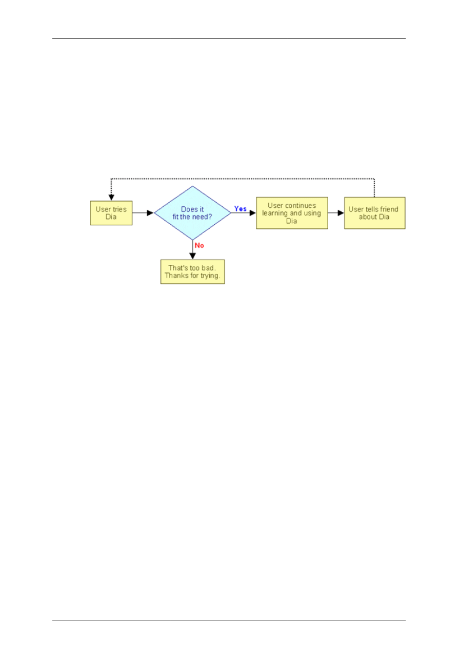
1.1. Sample Flowchart Diagram ......................................................................................... 1
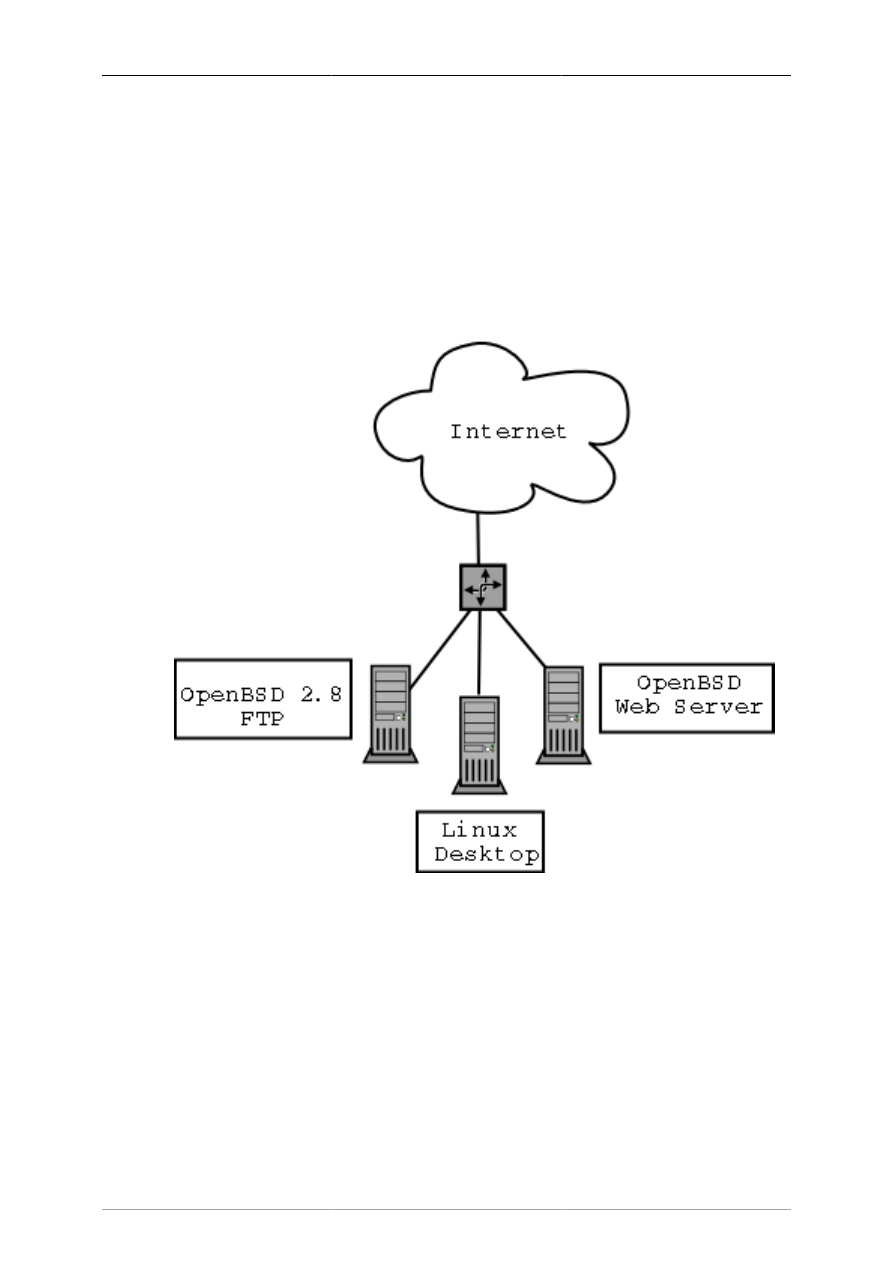
2.1. Sample Network Diagram ........................................................................................... 2
2.2. Dia Startup ............................................................................................................... 3
3.1. Diagram / Properties / Grid .......................................................................................... 6
3.2. Snap-To-Grid Toggle Button ....................................................................................... 6
3.3. Ruler With Arrows Circled in Red ................................................................................ 7
3.4. Changing Background Color ........................................................................................ 7
3.5. Toolbox Magnify ....................................................................................................... 8
3.6. Canvas Zoom ............................................................................................................ 8
3.7. View Menu Zoom Options .......................................................................................... 9
3.8. View Menu ............................................................................................................... 9
4.1. Dia Toolbox ............................................................................................................ 11
4.2. Modify Control ........................................................................................................ 11
4.3. Magnify Control ...................................................................................................... 12
4.4. Scroll Control .......................................................................................................... 12
4.5. Special Objects ........................................................................................................ 13
4.6. Default Color, Line Width, and Line Style .................................................................... 14
4.7. Restore Default Colors Button .................................................................................... 14
4.8. Reverse Colors Button .............................................................................................. 14
4.9. Default Line Width .................................................................................................. 14
4.10. Arrow and Line Style .............................................................................................. 14
4.11. Object Handles ...................................................................................................... 15
4.12. Line Handles ......................................................................................................... 16
4.13. Line Connected ...................................................................................................... 17
4.14. Fixed Connection Point ........................................................................................... 17
4.15. Middle Connection Point ......................................................................................... 17
4.16. Edit Menu Text Commands ...................................................................................... 18
4.17. Deleting Text ......................................................................................................... 18
4.18. Objects / Align Options ........................................................................................... 19
4.19. Before Left, Center, Right Align ............................................................................... 20
4.20. Align Left ............................................................................................................. 20
4.21. Align Center .......................................................................................................... 21
4.22. Align Right ........................................................................................................... 21
4.23. Before Top, Middle, Bottom Align ............................................................................ 22
4.24. Align Top ............................................................................................................. 22
4.25. Align Middle ......................................................................................................... 22
4.26. Align Bottom ......................................................................................................... 23
4.27. Before Spread Out Horizontally ................................................................................ 23
4.28. After Spread Out Horizontally .................................................................................. 23
4.29. Before Spread Out Vertically .................................................................................... 24
4.30. After Spread Out Vertically ...................................................................................... 25
4.31. Align / Adjacent ..................................................................................................... 25
4.32. Align / Stacked ...................................................................................................... 26
4.33. Before and After Group Create ................................................................................. 26
4.34. Default Text Properties ............................................................................................ 27
4.35. Default Box Properties ............................................................................................ 27
4.36. Color Listbox ........................................................................................................ 29
4.37. Select Color Box .................................................................................................... 29
4.38. Diagram Tree ........................................................................................................ 31
4.39. Diagram Tree Sort Options ...................................................................................... 31
5.1. Basic Objects .......................................................................................................... 33
5.2. Zigzagline Right-Click Menu ..................................................................................... 35
5.3. Polyline Right-Click Menu ........................................................................................ 35
5.4. Bezierline Right-Click Menu ...................................................................................... 36
5.5. Standard Line Properties ........................................................................................... 36

Dia
vii
5.6. Line Colors ............................................................................................................. 37
5.7. Line Styles .............................................................................................................. 37
5.8. Line Arrows ............................................................................................................ 38
5.9. Image ..................................................................................................................... 38
6.1. Assorted ................................................................................................................. 40
6.2. Cisco - Computer ..................................................................................................... 41
6.3. Cisco - Misc ........................................................................................................... 41
6.4. Cisco - Network ...................................................................................................... 41
6.5. Cisco - Switch ......................................................................................................... 42
6.6. Cisco - Telephony .................................................................................................... 42
6.7. Flowchart ................................................................................................................ 43
6.8. Misc ...................................................................................................................... 43
6.9. Network ................................................................................................................. 44
6.10. UML .................................................................................................................... 44
6.11. UML Class Properties ............................................................................................. 45
6.12. Sheets and Objects ................................................................................................. 46
7.1. Selected Object ........................................................................................................ 47
7.2. Select By Area Example ........................................................................................... 48
7.3. Select Menu ............................................................................................................ 49
9.1. User Interface ....................................................................................................... 54
9.2. Diagram Defaults ..................................................................................................... 56
9.3. View Defaults ......................................................................................................... 57
9.4. ............................................................................................................................. 58
9.5. Grid Lines .............................................................................................................. 59
9.6. Diagram Tree .......................................................................................................... 60
1
Chapter 1. Introduction
1.1. Introduction
Dia is an application for creating technical diagrams. Its interface and features are loosely patterned after
the Windows program Visio. Features of Dia include multiple-page printing, export to many formats
(EPS, SVG, CGM and PNG), and the ability to use custom shapes created by the user as simple XML
descriptions. Dia is useful for drawing UML diagrams, network maps, and flowcharts.
This document describes version 0.97 of Dia.
Figure 1.1. Sample Flowchart Diagram
2
Chapter 2. Quickstart
The Dia Quickstart is designed to help you get started creating diagrams with Dia without having to
read a manual.
2.1. What Can You Do?
Dia is a diagramming application that can be used to make a large variety of diagrams. Dia is easy to
learn and flexible enough to allow power users to create highly customized diagrams. Below are two
simple examples of diagrams that can quickly be created using Dia.
Figure 2.1. Sample Network Diagram
2.2. Starting Dia
You can start Dia by going into the Applications section on the Main Menu and clicking on the Dia icon.
Or, you can type dia in a console window or xterm.
2.3. Creating a Canvas
All diagrams are drawn in their own canvas. When you first start Dia, a blank canvas is created
automatically. At any time, you can create a new canvas by selecting File->New Diagram The canvas
may be customized in various ways, such as changing the background color or grid lines. See The
Canvas for more information on customizing the canvas.
Quickstart
3
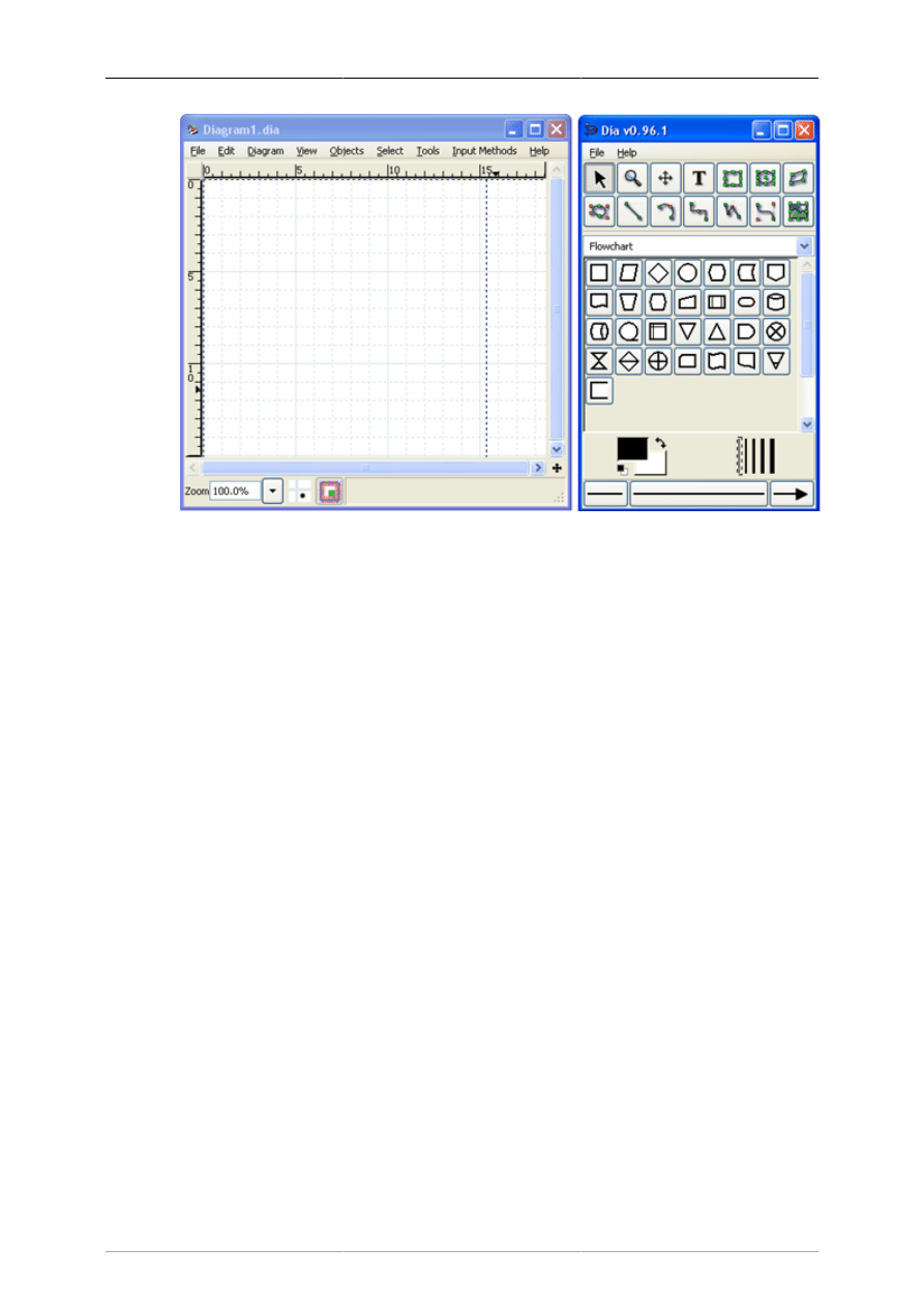
Dia startup showing blank canvas above and Toolbox to right.
Figure 2.2. Dia Startup
2.4. Making a Diagram
A diagram is made up of objects. Objects are shapes or lines that can be different colors and sizes.
Objects can be simple line drawings, text, or full-color pictures. Some objects allow text to be entered
inside the shape.
Using Dia to create a diagram is easy. The Toolbox contains a palette of predefined objects, including
simple shapes, lines, and specialized objects. To add an object to the canvas, simply click on the desired
object's icon on the Toolbox and then click on the desired point on the canvas. The object will appear
on the canvas where you clicked. See Adding Objects for more information.
An object can be moved by clicking on the object and dragging the mouse. The object can be resized
by clicking and dragging one of the object's green or red "handles". See Moving Objects and Resizing
Objects for more information on moving and resizing objects.
Objects can be connected using lines. Just drag each end of a line to any connection point (small blue
"x") on an object. Once objects are connected, they can be moved and the line stretches to keep them
connected. See Connecting Objects With Lines for more information on how to connect objects.
In the Toolbox, you can double-click on any object's icon to view and edit the object's default properties.
This allows you to customize various default properties of each object. For objects that include text,
you can customize the text alignment and font properties. For standard shapes, you can customize
the transparency, the corner shape, and the aspect ratio. See Sources of Default Properties for more
information about changing default properties.
Dia includes a set of standard shape and line objects. See Objects for more information on working
with the standard objects. Dia includes a large number of predefined objects for various uses. These
include flowcharts, UML diagrams, network diagrams, and many others. See Special Object Categories
for more information on the various objects available.
Many common tasks in Dia require selecting one or more objects. Dia includes a number of ways to
select objects quickly. See Selecting Objects for more information.

Quickstart
4
Dia can be customized in a number of ways. See Customization for more information on customization.
Layers create multiple-images so they are one image. By doing this, a user can edit one layer without
worrying about affecting any of the other layers. See Managing Layers for more information on working
with layers.
Dia is designed to make adding new user-defined shapes very easy. See Custom Shape Module for
more information on creating your own custom shapes.
2.5. Saving and Printing Your Diagram
Dia provides the normal save and print options, located on the File menu. Selecting the File -> Page Setup
allows you to set the paper size, orientation, and print margins. This also allows you to choose whether
to print the diagram to scale (entered in percent) or to fit the diagram to a specific size (in centimeters).
Dia supports exporting to numerous formats for excellent web publishing. Some of them include:
• Computer Graphics Metafile (.cgm)
• Encapsulated Postscript (.eps)
• Native Dia Format (.dia)
• Portable Network Graphics (.png)
• Scalable Vector Graphics (.svg)
See Loading and Saving Diagrams for more information.
Note
On some Windows systems, Dia diagrams do not print correctly. This problem can be
worked around by exporting the diagram -- for example to Portable Networks Graphics
(.png) format -- and then printing the exported .png file.
2.6. Running Dia From the Command Line
Dia can be run from the command line. This allows certain Dia capabilities to be used in batch script
files. See Dia Command Line for more information on creating your own custom shapes.
2.7. Who Does Dia Appeal To?
Dia can be used by many people in a variety of industries.
• A systems engineer can create SADT diagrams for system analysis and design.
• A requirements engineer can compose e.g. RE-KAOS, RE-Jackson or RE-I* diagrams.
• A software developer can create UML diagrams of various types and extend them with the flexibility
of a general purpose diagram tool.
• A database designer can represent data relations with ER diagrams.
• A control engineer may draw Cybernetics diagrams.
• A computer programmer can create a flow chart to show the execution path of a program.
• A network administrator can create a diagram to model the company's company network.

Quickstart
5
• An electrical engineer may use Dia to create a diagram to show how a circuit works.
• An mechanical engineer may design some Hydraulic or Pneumatic diagrams.
6
Chapter 3. The Canvas
3.1. Canvas Introduction
The Dia canvas is the window that contains the diagram. All of the user's objects are placed and arranged
on the canvas.
3.2. Grid Lines
Grid lines are similar to the lines on graph paper. They allow the user to easily align objects on the canvas.
The grid lines can be temporarily hidden for the current document by selecting View -> Show Grid .
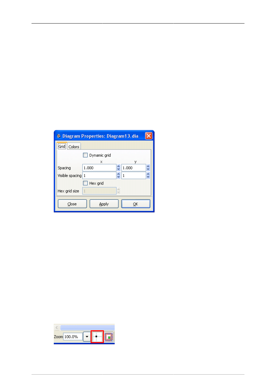
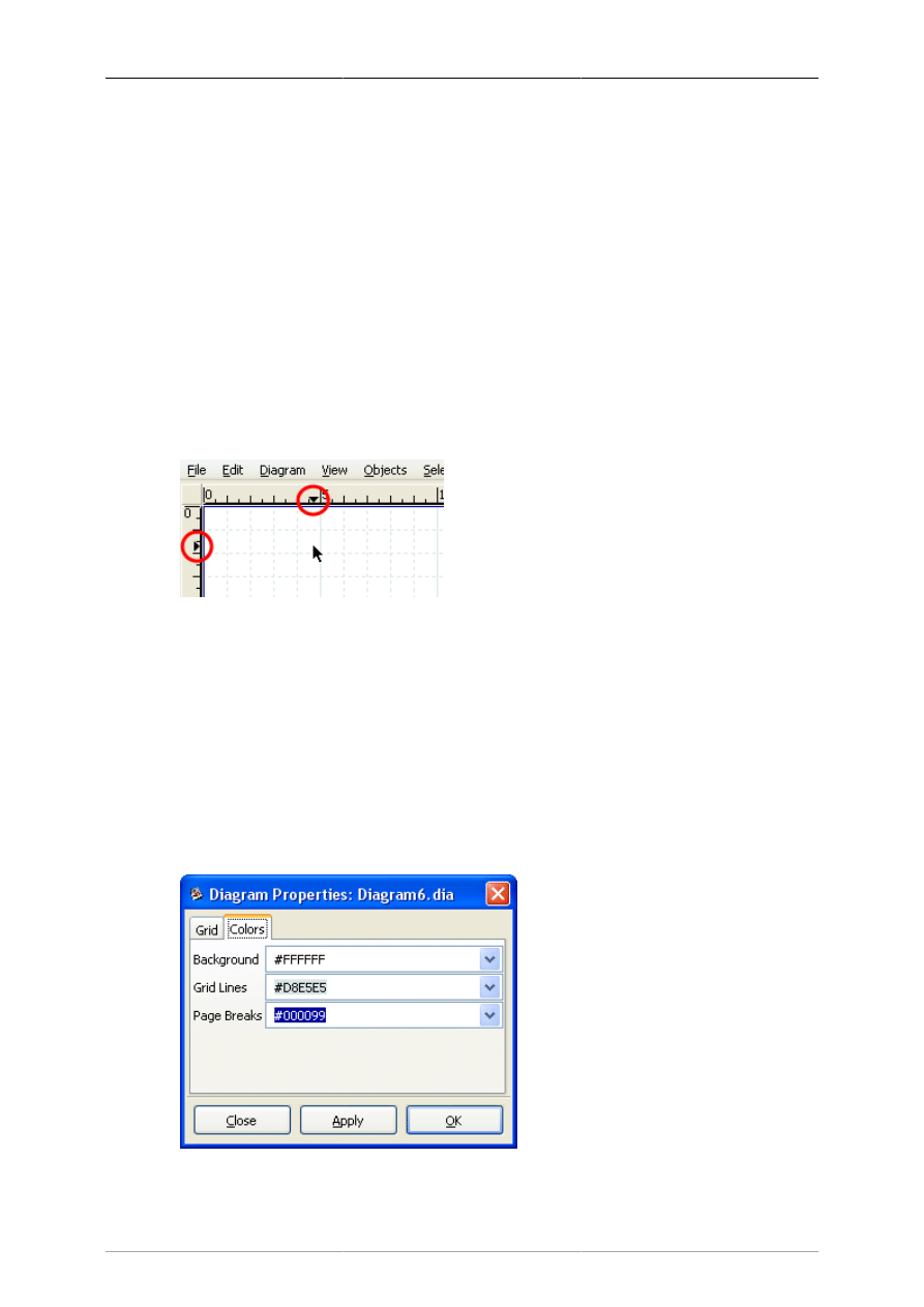
Grid line properties can be modified by selecting Diagram -> Properties, which brings up the dialog
shown in the figure below.
Figure 3.1. Diagram / Properties / Grid
If the Dynamic grid box is checked, the grid adjusts automatically to keep the same visible spacing as
the diagram view is zoomed in or out. Also, when this box is checked, the other options on the dialog
are disabled.
If the Dynamic grid box is unchecked, then the grid spacing remains the same in absolute terms. So when
the view is zoomed out, the grid appears smaller, and when the view is zoomed in, the grid appears larger.
The Spacing for the x and y coordinates is in centimeters and can be typed or entered using the increment /
decrement buttons. The visible spacing determines which grid lines are visible. A value of 1 indicates
that all grid lines are visible, 2 indicates that every second line is visible, and so on. Note that the snap-
to-grid works the same whether or not grid lines are visible.
The Hex grid checkbox allows you to create a grid of hexagons instead of squares. The Hex grid size
is also in centimeters.
The snap-to-grid feature may be toggled on and off using the snap-to-grid button located below the
canvas. When this is enabled, objects are forced to align on a grid line.
Figure 3.2. Snap-To-Grid Toggle Button
The Canvas
7
3.3. Rulers
Rulers appear on the top and the left of the Dia canvas. They show, in centimeters, how large your
canvas is. A centimeter on the screen will not necessarily equal an actual centimeter. This will depend
on your monitor's dots-per-inch (DPI) setting and your current zoom percentage. For example, if your
monitor is set to 96 DPI and your zoom percentage is about 185%, then the display ruler is at actual
scale. Regardless of these settings, you can always see how big your objects and diagram are using the
on-screen ruler.
Note
When you print a diagram and select the option Scaling / Scale of 100.0%, the diagram
will be printed to scale regardless of the printer's DPI setting or the view zoom factor.
Each ruler has an arrow that moves along the ruler to show the exact coordinate of the mouse pointer.
For example, if the user moves the mouse up, the vertical ruler's arrow will move up, indicating the
change. These arrows are useful when an object needs to line up exactly at a certain measurement point.
Figure 3.3. Ruler With Arrows Circled in Red
Rulers can be temporarily hidden for the current document by choosing the menu item View -> Show
Rulers . Unlike grid lines, rulers cannot be turned off by default for new documents.
3.4. Background Color
The background color option allows you to change the color of the canvas. By default, the color is white.
However, the color can be changed by selecting Diagram -> Properties and then selecting the "Colors"
tab. The first color option is Background. You can change the color by selecting the drop-down list box
and then using the standard color selection options. See Objects / Colors for more information about
selecting colors.
Figure 3.4. Changing Background Color
The Canvas
8
Note
The gridlines will change their color automatically to stay visible if the background color
is changed to black.
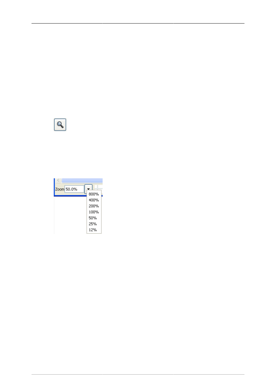
3.5. Zooming
Zooming allows the user to zoom in (make things bigger) or zoom out (make things smaller). Zooming
in is useful when you are trying to make your drawing very precise. Zooming out is useful when you
want to view a larger portion of the diagram.
The canvas can be zoomed in to 2500% and out to 5%. Zooming can be done in several ways.
Figure 3.5. Toolbox Magnify
The Toolbox contains a Magnify tool. If you select the Magnify tool and then click anywhere on the
canvas, the diagram is zoomed in at that point by a factor of two (e.g., from 100% to 200%). Shift+Click
reverses the process (i.e., zooms out by a factor of two).
Figure 3.6. Canvas Zoom
Dia has a zoom control at the lower left corner of the canvas. This control allows you to enter in a zoom
percentage or to select from a series of fixed zoom percentages.
The Canvas
9
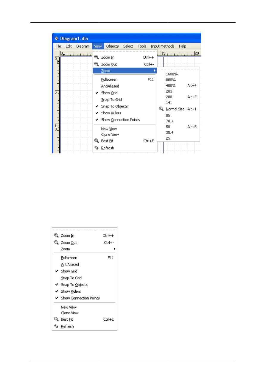
Figure 3.7. View Menu Zoom Options
The View menu has options for Zoom In (Ctrl++); Zoom Out (Ctrl+-); Zoom to a choice of fixed
percentages; and Best Fit (Ctrl+E).
Tip
The Ctrl+E (Zoom to Best Fit) is very useful for fitting the entire diagram in the window.
It also provides a quick way to see if there are any objects outside the current view area.
3.6. Other View Menu Options
Figure 3.8. View Menu

The Canvas
10
In addition to the zoom options discussed above, the View menu provides a number of useful functions.
These are discussed below.
• Fullscreen (F11) toggles between the normal window view and full-screen view.
• AntiAliased toggles the antialiased feature on and off.
• Show Grid toggles the display of the grid on and off.
• Snap To Grid toggles the snap-to-grid property on and off.
• Snap To Objects toggles the snap-to-objects property on and off. When this is on, lines can be
connected to the middle connection point of an object by dragging the line end handle to any point
inside the object. When this is off, the line's connection handle must be dragged to the middle
connection point of the object being connected.
• Show Rulers toggles the ruler display on and off.
• Show Connection Points toggles the connection points display on and off.
• New View opens a new window that displays the same diagram. This can be useful if you want to see
and work on different sections of a diagram at the same time.
Tip
If you use New View or Clone View to open a second window on a diagram, changes
you make in one window display immediately in the other window. If you open the same
diagram file in two different instances of the application (e.g., using File / Open), you
must save changes made in one session and re-load the diagram in the second session
before they will be visible to the second session. For this reason, using New View or
Clone View is normally preferred.
• Clone View is the same as New View except that it copies the zoom and size of the first view instead
of using the default values.
• Best Fit automatically zooms to the highest zoom value that will fit the entire diagram in the window.
• Refresh redraws the diagram on the canvas. Normally this is not needed. Occasionally when making
changes to a diagram, however, the screen will not redraw correctly. For example, a portion of a
deleted line might still display. If this happens, Refresh correctly redraws the canvas.
3.7. Undo and Redo
Dia supports Undo and Redo on most operations. To undo an operation, press Ctrl+Z or select Edit-
>Undo from the diagram menu bar. To redo an operation, press Ctrl+Shift+Z or select Edit->Redo from
the diagram menu bar.
11
Chapter 4. Objects and the Toolbox
A diagram in Dia consists of a set of objects. Objects are shapes that are either predefined or user-defined.
The Toolbox allows you to select the desired object and allows you to set default properties for objects.
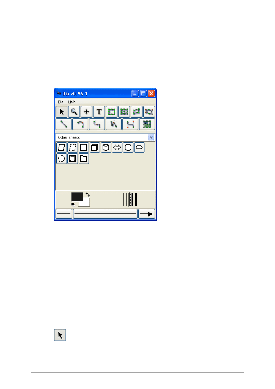
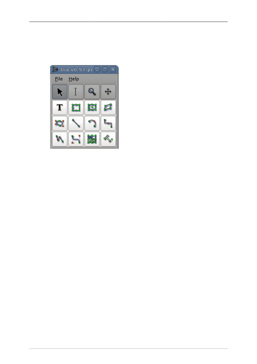
4.1. Dia Toolbox Overview
Figure 4.1. Dia Toolbox
When Dia is executed, two windows open: the canvas, which contains the diagram, and the Toolbox,
which contains the object palettes and other controls. The Toolbox is divided into three regions. The
top region contains 14 buttons. The first three are controls used to adjust the diagram. The next 11 are
the icons for the built-in basic objects.
The middle portion of the Toolbox contains the selected Special Objects. This is used to select among
the many built-in object sheets supplied with Dia, such as UML, Flowchart, Network, etc.
The bottom portion of the Toolbox contains special controls that set default properties for objects placed
on the canvas. These include foreground color, background color, and line width. There are also three
controls that set the default properties for line objects. These are beginning arrow style, ending arrow
style, and line style.
4.1.1. Modify Control
Figure 4.2. Modify Control

Objects and the Toolbox
12
The Modify control is the default setting when using Dia. This control allows you to select one or more
objects on the canvas. After an object is added to the diagram, the Modify control is automatically
selected for you. This makes it easy to add an object and then continue working without having to
reselect the Modify control.
Tip
You can toggle between an object control and the Modify control using the Space key.
For example, say you wish to add several Box objects to the diagram. First, click on the
Box icon and click on the canvas to add the Box. At this point, the Modify control will
be selected automatically. To reselect the Box control, press the Space key. Now you can
click on the canvas again to add a second Box object. Continue to press Space and then
click to add as many Box objects as desired.
Tip
You can customize Dia to disable the automatic selection of the Modify control. See
Customization / User Interface for more information.
4.1.2. Magnify Control
Figure 4.3. Magnify Control
The Magnify control is one method for zooming in or out. See The Canvas / Zooming for more
information about zooming. The Magnify control stays active until you press one of the other controls.
4.1.3. Scroll Control
Figure 4.4. Scroll Control
The Scroll control is used to move around the diagram. When this control is active, the mouse pointer
changes to a hand. When the Scroll control is active, you can scroll around the diagram by clicking
anywhere on the canvas and dragging the mouse. The diagram scrolls within the canvas window. The
Scroll control stays active until you press one of the other controls.
4.1.4. Basic Objects
After the Modify, Zoom, and Scroll controls, the next 11 buttons allow you to place Dia's basic objects
on the canvas. See Basic Objects Introduction for more information on Dia's basic objects.
Objects and the Toolbox
13
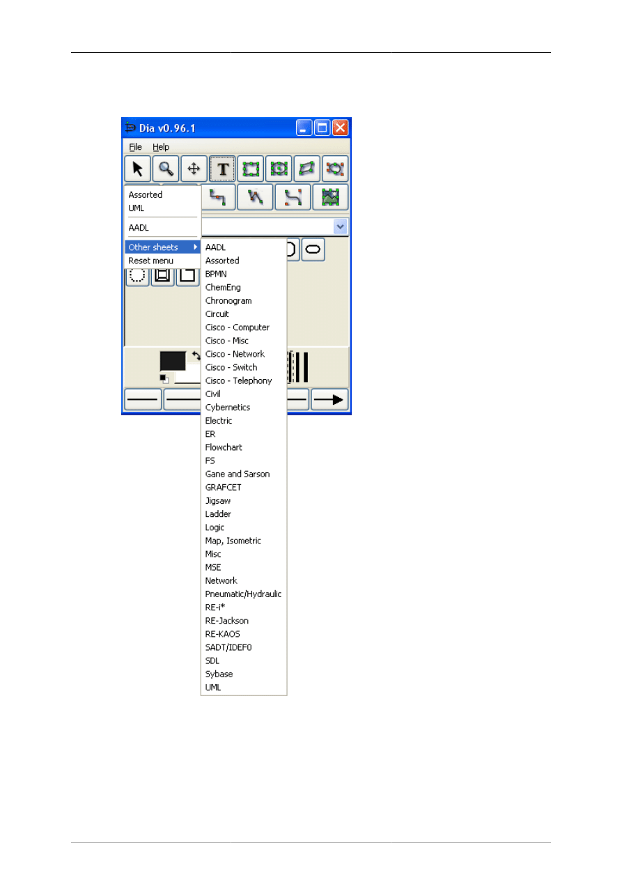
4.1.5. Special Objects
Figure 4.5. Special Objects
On the Toolbox, just below the basic object icons, is a drop-down listbox that allows you to select a
sheet of special objects to be included in the diagram. As you can see from the screenshot above, Dia
provides a large number of special objects. To use a special object, first select the desired sheet using
this drop-down listbox. Then, just click on the desired object and click on the canvas to insert the object.
See Special Object Categories for more information on the various types of special objects available.
Objects and the Toolbox
14
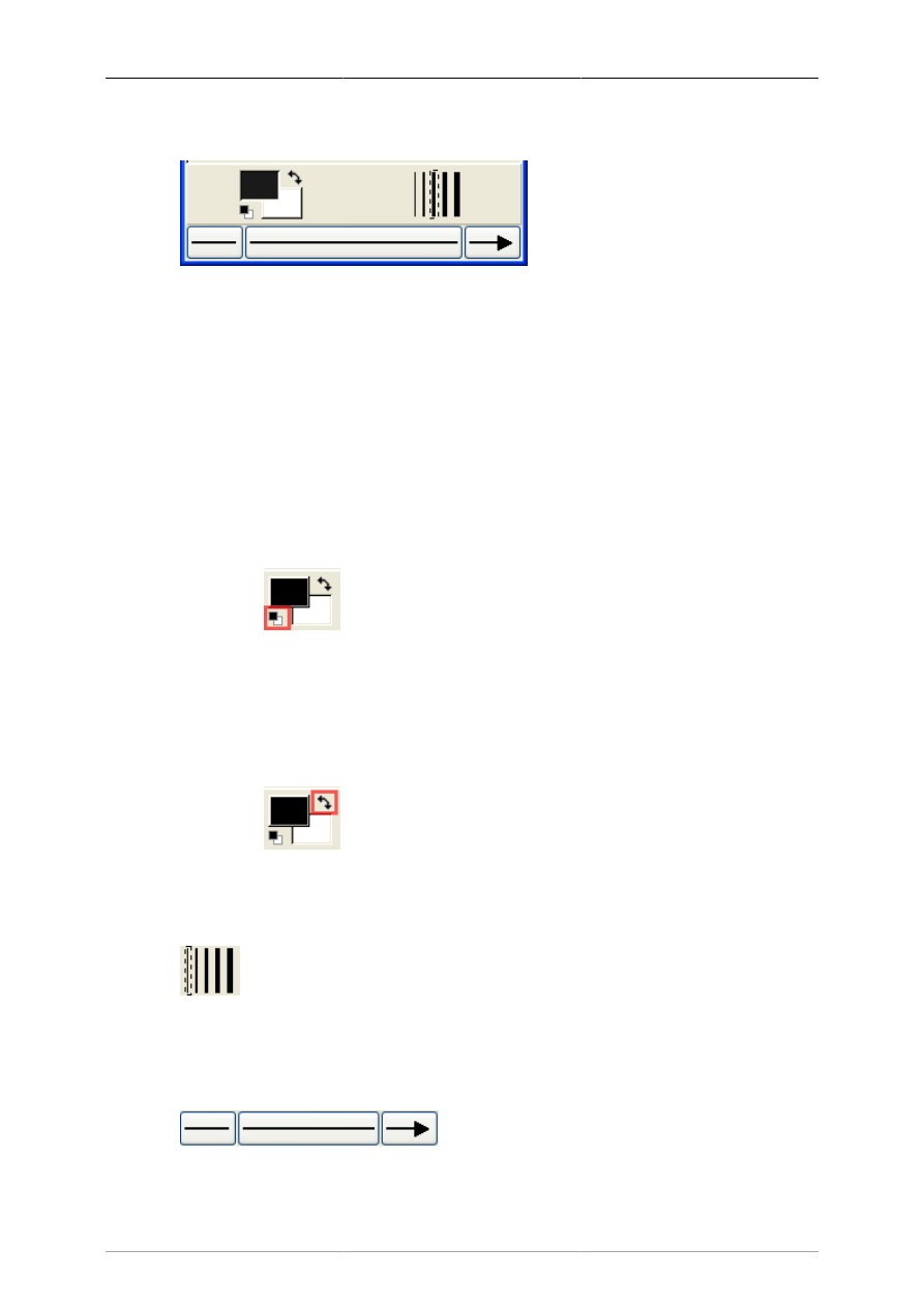
4.1.6. Default Color, Line Width, and Line Style
Figure 4.6. Default Color, Line Width, and Line Style
Below the special objects palette are controls for setting the default foreground and background color,
line width, and line style. These controls all set default properties for new objects being added to the
canvas. They do not affect the properties of existing objects already on the palette. These settings stay
in effect for all future Dia sessions, until they are changed.
The two squares on the left allow you to set the default foreground and background colors for all new
objects being added to the diagram. If you double-click on the upper square (i.e., the black one in the
screenshot above), you can set the default foreground color for all new objects. Double-clicking on the
lower square (white in the screenshot) allows you to select the default background color. See Objects /
Colors for more information about selecting colors.
Tip
Figure 4.7. Restore Default Colors Button
To set the colors back to the default, click on the black and white box to the bottom left
of the color selector.
Tip
Figure 4.8. Reverse Colors Button
To inverse the colors, click on the little arrow to the top right of the two boxes.
Figure 4.9. Default Line Width
To the right of the two squares are five lines of increasing width. To select the desired default line width,
simply click on it. A dashed-rectangle indicates which width is currently selected.
Figure 4.10. Arrow and Line Style

Objects and the Toolbox
15
At the bottom of the Toolbox are three buttons. The left button allows you to select the default arrow
shape for the beginning of a line. In the screenshot this is defaulting to "no arrow". The right button
allows you to select the default arrow shape for the end of a line. Since only lines have arrows, these
buttons only affect line objects and have no effect on other shapes. The middle button allows you to
select the default line style (solid, dashed, etc.).
Note
The line-width and line style settings affect all basic objects. For shapes, these settings
determine the line properties of the shape outlines. These settings also are used for some
special objects (e.g., Flowchart objects). Other special objects (e.g., AADL objects) have
fixed line widths and are not affected by these settings.
4.2. Using Objects
4.2.1. Adding Objects
Adding objects to the Dia canvas is done by clicking on the desired object's icon button in the Toolbox
and then clicking on the canvas at the desired insertion point. The selected object will be inserted at
that point.
Tip
You can quickly add multiple objects of the same type to the diagram using the Space key
to toggle between the Modify control and the desired object. For example, say you wish
to add several Box objects to the diagram. First, click on the Box icon and click on the
canvas to add the Box. At this point, the Modify control will be selected automatically.
To reselect the Box control, press the Space key. Now you can click on the canvas again
to add a second Box object. Continue to press Space and then click to add as many Box
objects as desired.
Tip
If you are using different colors or line styles for different objects, one trick to save time is
to create a separate file of sample objects with the desired properties on a separate diagram.
Then copy and paste these objects onto your working diagram as you need them.
4.2.2. Moving Objects
When an object is inserted into the canvas, the desired object will appear with small green boxes (known
as handles) around the border.
Figure 4.11. Object Handles
To move an object, click anywhere inside the object (or somewhere on a line other than a handle) and
drag the mouse to the desired location on the canvas. For line objects, you need to click on the line.
Tip
When moving an object, be sure not to click on a handle. Otherwise, you will resize the
object instead of moving it.
Objects and the Toolbox
16
4.2.3. Resizing Objects
Handles are used to change the size of the object. To expand an object, just click a handle and drag it
away from the center of the object. To shrink an object, drag a handle toward its center. The object's
size will change as you drag the mouse. If an object has a fixed aspect ratio, changing one dimension
automatically changes the other. If an object has a free aspect ratio, you can change one dimension (e.g.,
height) without affecting the other (e.g., width). Some objects have a property setting that determines
whether the aspect ratio is fixed or free.
4.2.4. Deleting Objects
To delete an object, click on the object to select it. The handles will display, which indicates that the
object is selected. Then press the Delete key or select Edit->Delete from the menu.
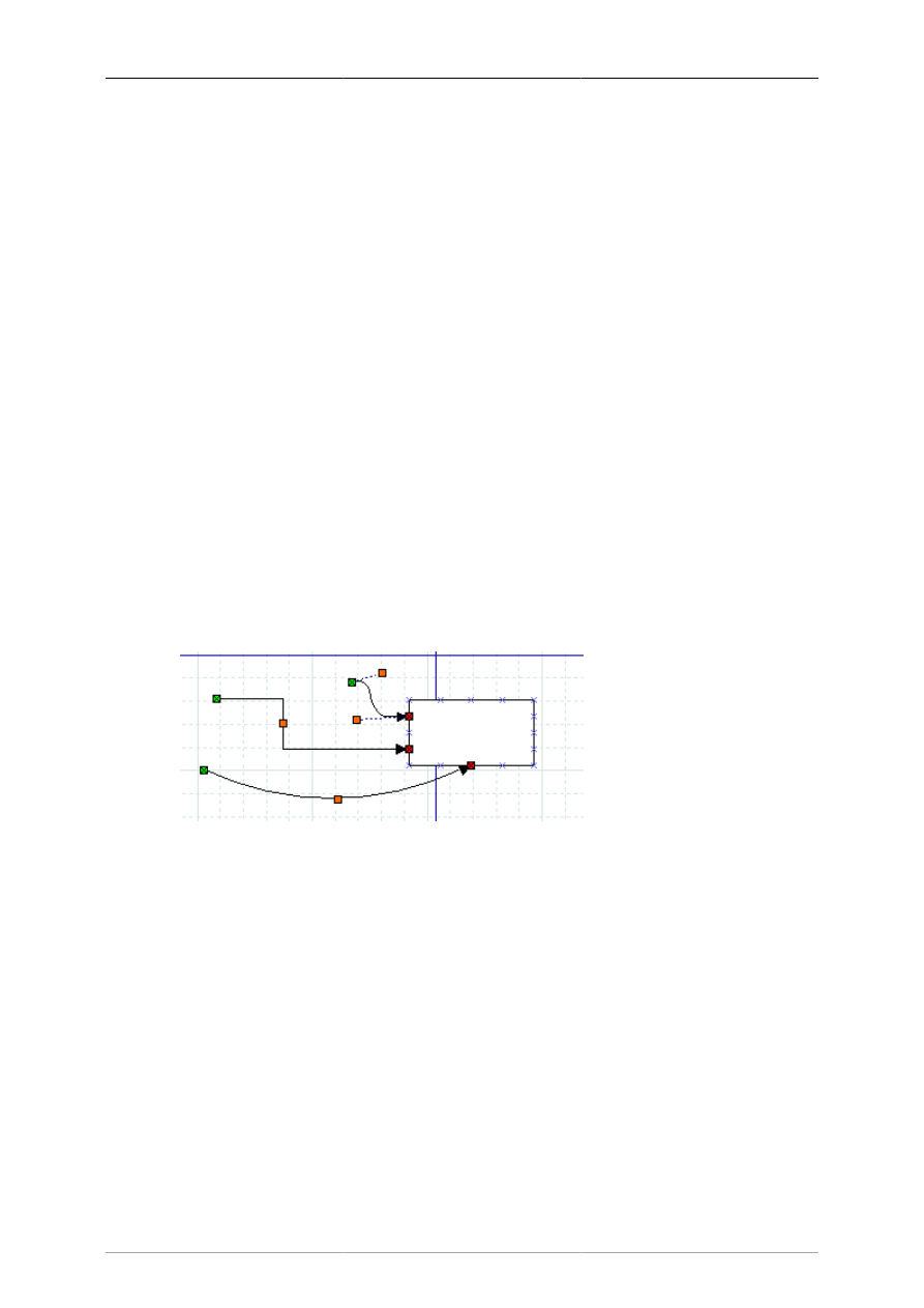
4.2.5. Connecting Objects With Lines
In many diagrams, shapes are connected to each other using one of the basic line objects. When a shape
is not selected, a number of connection points are displayed on its borders as small "x" figures. There
is also a connection point in the middle of each shape. Lines also have connection points where other
lines can connect.
Lines have handles on each end that are used to connect them to other objects. These handles are green
if the line is not connected and red if it is connected. Lines also have orange handles that are used to
shape the line. The figure below shows several lines with green handles on the unconnected end and
red handles on the connected end.
Figure 4.12. Line Handles
To connect two shapes with a line:
1. Select the desired line (Line, Zigzagline, etc.) by clicking on the Toolbox icon.
2. You can either click on the canvas to place the line on the diagram and then drag the "from" end of
the line to the desired connection point of the first object.
Or you can save a step by clicking directly on the desired connection point of the first object. In this
case, the line will display with the "from" end of the line already connected to the first object.
In either case, when the "from" end of the line is connected, it's "from" handle will be red.
3. Click on green handle at the "to" end of the line and drag it to the desired connection point on the
second object. When the line is connected, the outline of the object being connected will turn red,
as shown in the figure below.
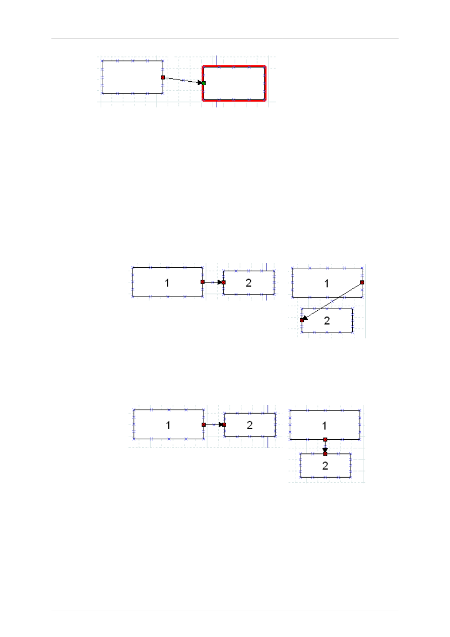
Objects and the Toolbox
17
Figure 4.13. Line Connected
At this point, the two objects are connected. If you move either object, the line will stretch to keep
them connected. If you move the line, it will disconnect from both objects. If you do this by mistake,
you can undo using Ctrl+Z or Edit->Undo.
At any time, you can disconnect or connect to a new point by clicking on the "from" or "to" handle and
dragging it to a new location on the diagram.
Tip
If you connect a line to a fixed point on a shape's perimeter, it will stay connected to this
point when the object is moved.
Figure 4.14. Fixed Connection Point
If you connect a line to the middle of an object, when you move the object the displayed
connection point moves automatically, so you don't need to change the connection point.
Figure 4.15. Middle Connection Point
Note that, when a line is connected to the middle of an object, the line's connection handle
is still positioned on the perimeter of the object. So to move the line's connection point,
drag on the line's handle (as opposed to the middle of the object).
Tip
If you connect a Line or Polyline object to the middle of a shape when you first place the
line on the canvas, you need to be careful when connecting the "to" end of the line. Be sure
to click on the line's handle and not on the surrounding area within the shape. If you click
Objects and the Toolbox
18
on the surrounding area inside the shape, you will select the shape and not the line's handle.
If this happens, click outside the shape to deselect it and then carefully click on the "x" in
the middle of the object (not on the line's arrow). The handle will display, and you can drag
it to the desired location. Note that the handle will display as red, because it is connected to
the middle. Also note that you need to drag it outside the shape before you can see the line.
See Basic Objects / Line for more information on the different lines available.
4.2.6. Entering Text
Text can be entered by selecting the object and then typing the text. The font, size, alignment, and other
formatting properties can be changed by double-clicking the object.
Here are some important tips regarding short-cut keys when entering text.
Figure 4.16. Edit Menu Text Commands
Tip
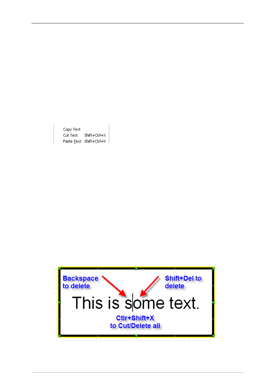
The normal Copy / Cut / Paste keys (Ctrl+C, Ctrl+X, Ctrl+V) work on entire objects, not
on text. The Edit menu contains the commands Copy Text, Cut Text (Shift+Ctrl+X), and
Paste Text (Shift+Ctrl+V) to copy, cut, and paste just the text contents of an object. Note
that when you paste text into an object, the text is formatted according to the Dia object
properties, not the text source.
Tip
You cannot select a section of text inside an object with the mouse (this moves the object).
You can insert characters at the current cursor position just by typing. You can delete the
character to the left of the mouse using Backspace. IMPORTANT: The Del key deletes the
entire object, not the text to the right of the cursor. Use Shift+Del, Ctrl+Del, or Alt+Del to
delete the text to the right of the cursor. (Use Ctrl+Z or Edit->Undo if you delete an object
by mistake.) To delete all of the text in an object, use the Cut (Shift+Ctrl+X).
Figure 4.17. Deleting Text
Objects and the Toolbox
19
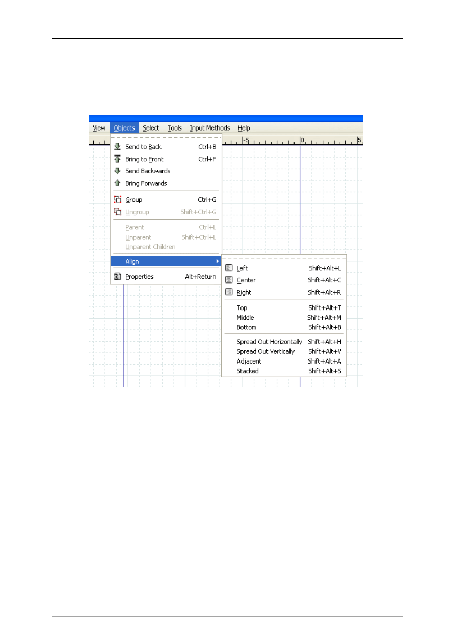
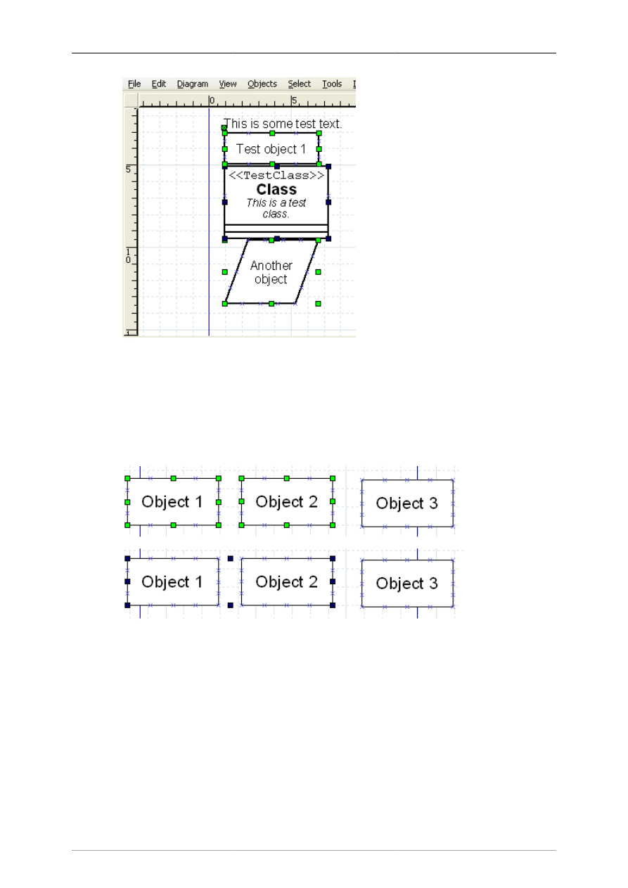
4.2.7. Aligning Objects
Dia provides several options to help arrange multiple objects without needing to move each object
individually. These are available on the Objects->Align menu choice shown below.
Figure 4.18. Objects / Align Options
4.2.7.1. How To Align Objects
To align objects, first select the objects to align (see Selecting Objects ) and then execute one of the
align commands, using either the menu or the shortcut key. The order in which objects are selected does
not matter.
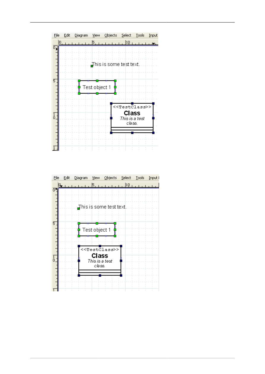
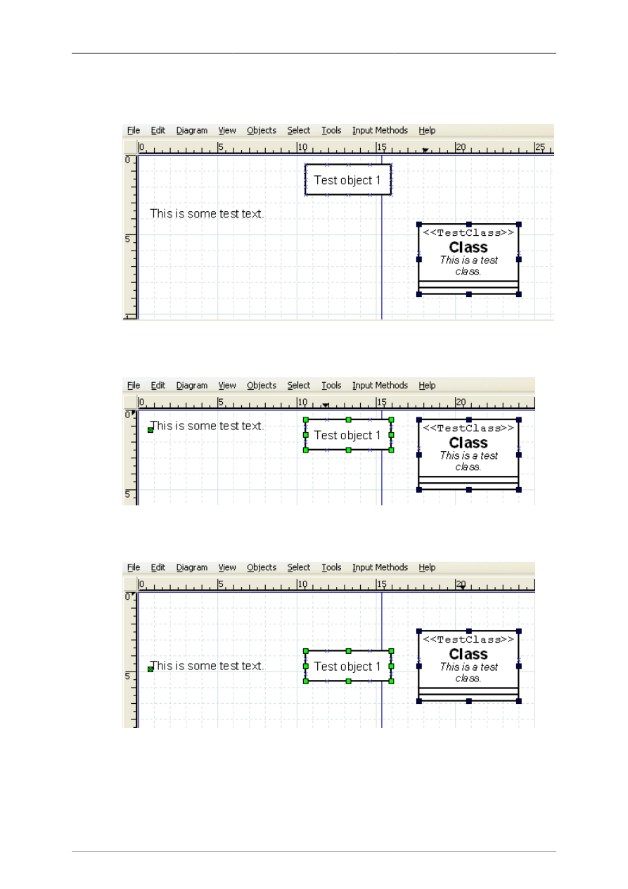
4.2.7.2. Left, Center, and Right Align
The align left, right, and center are used to align objects arranged vertically on the canvas. The align left
aligns the selected objects to the left edge of the left-most object. Similarly, the align right aligns the
selected objects to the right edge of the right-most object. Align center aligns the center of each object
to the mid-point between the extreme left and extreme right edge of all selected objects. Examples of
align left, center, and right are shown below.
Objects and the Toolbox
20
Figure 4.19. Before Left, Center, Right Align
Figure 4.20. Align Left
Objects and the Toolbox
21
Figure 4.21. Align Center
Figure 4.22. Align Right
4.2.7.3. Top, Middle, and Bottom Align
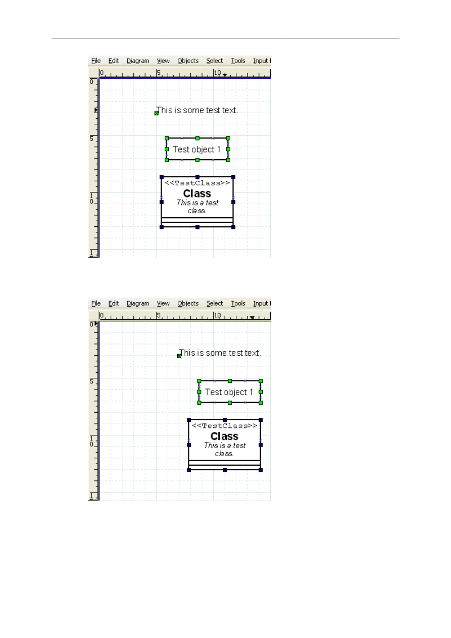
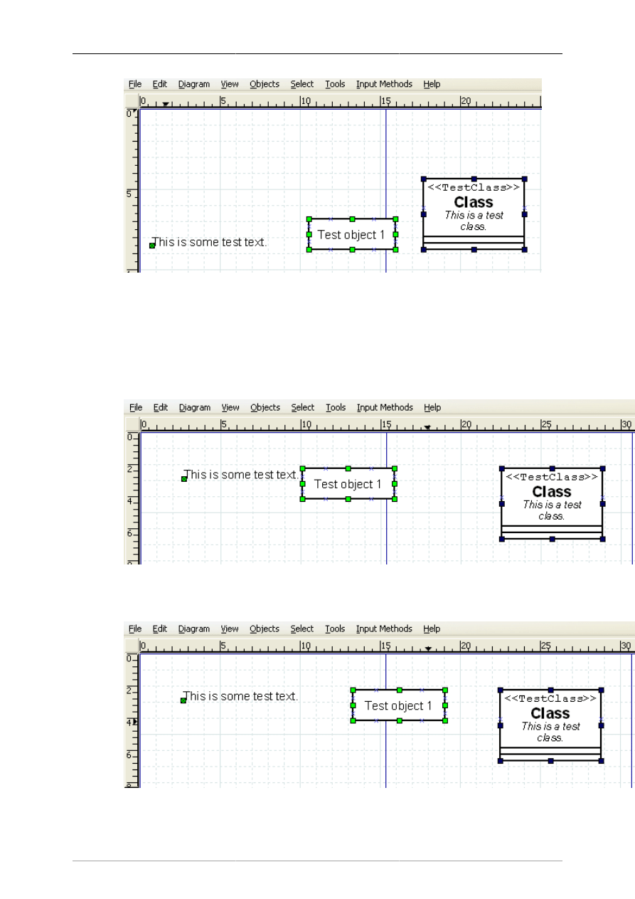
The align top, middle, and bottom are used to align objects arranged horizontally on the canvas. The
align top aligns the selected objects to the top edge of the upper-most object. Similarly, the align bottom
aligns the selected objects to the bottom edge of the lowest object. Align middle aligns the middle of
Objects and the Toolbox
22
each object to the mid-point between the extreme top and extreme bottom edge of all selected objects.
Examples of align top, middle, and bottom are shown below.
Figure 4.23. Before Top, Middle, Bottom Align
Figure 4.24. Align Top
Figure 4.25. Align Middle
Objects and the Toolbox
23
Figure 4.26. Align Bottom
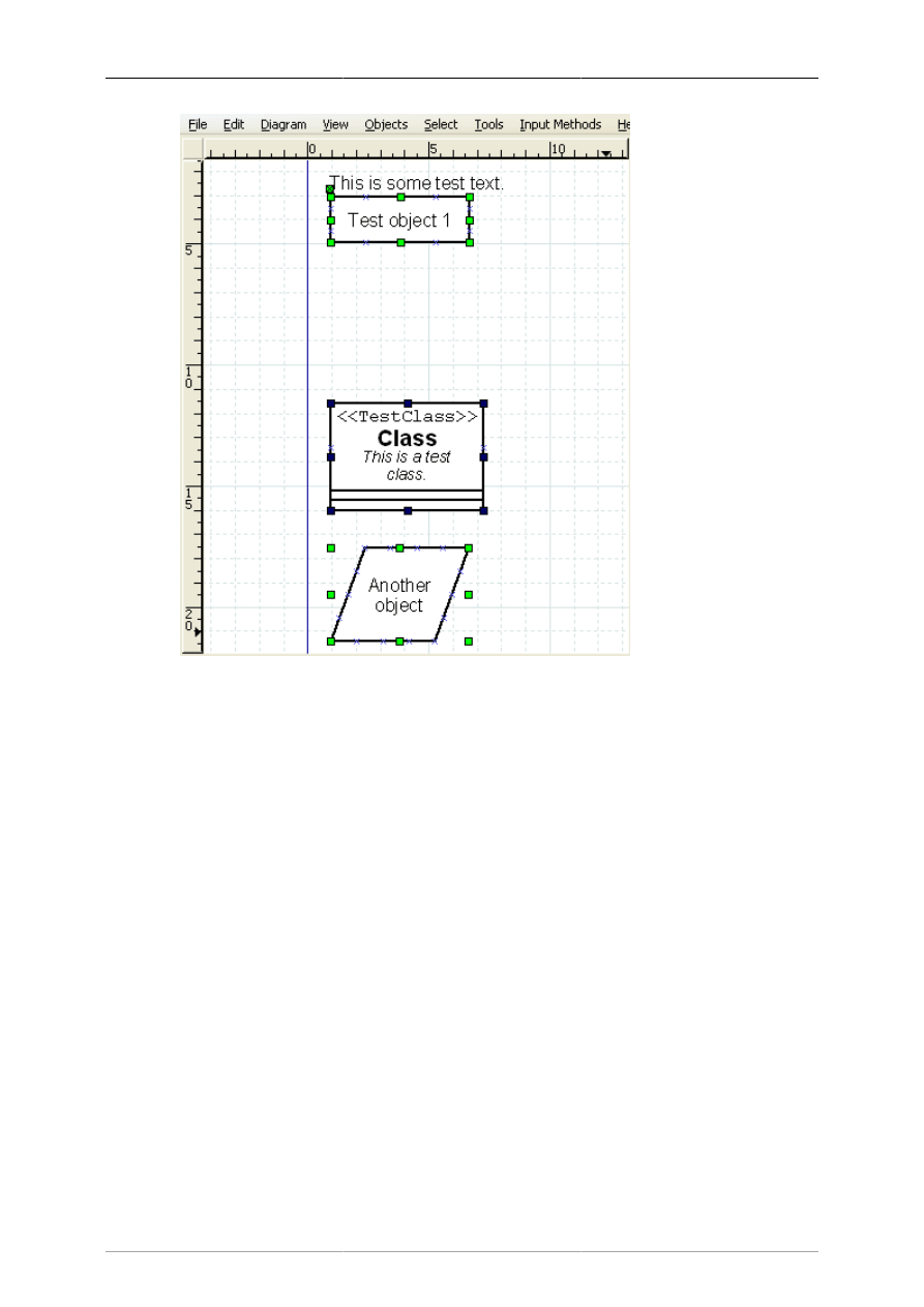
4.2.7.4. Spread Out Horizontally and Vertically
The Align / Spread Out commands can be used to create uniform spacing for objects arranged either
horizontally or vertically. Examples of these commands are shown below.
Figure 4.27. Before Spread Out Horizontally
Figure 4.28. After Spread Out Horizontally
Objects and the Toolbox
24
Figure 4.29. Before Spread Out Vertically
Objects and the Toolbox
25
Figure 4.30. After Spread Out Vertically
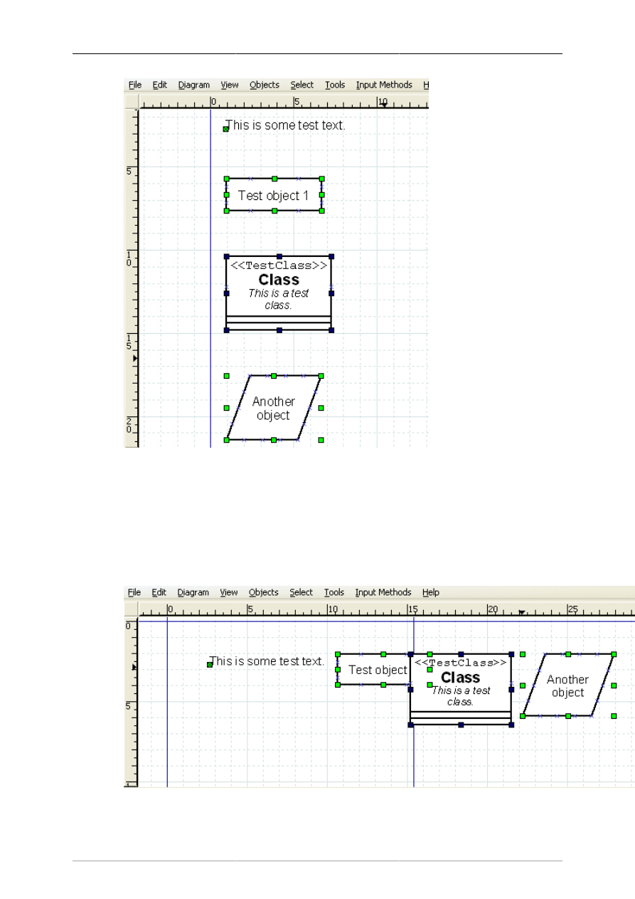
4.2.7.5. Align Adjacent or Stacked
The Align / Adjacent command is used to place objects next to each other with no horizontal space in
between. The Align / Stacked is used to place objects directly on top of each other, with no vertical space
in between. Examples of these commands are shown below.
Figure 4.31. Align / Adjacent
Objects and the Toolbox
26
Figure 4.32. Align / Stacked
4.2.8. Grouping Objects
Grouping allows you to treat several objects as a single entity. A group enables you to fix the position
of the member objects in relation to each other and to change the properties of all member objects at one
time. To create an object group, select two or more objects and then select Objects->Group.
Figure 4.33. Before and After Group Create
When the group is created or subsequently selected, a set of black handles displays around the outside
of the group, as shown in the figure above. At this point, you can move the entire group just like you
would move a single object. Just click and drag on any of the objects in the group.
You can also change the properties of all objects in a group by double-clicking or using the right-click
context menu. See Changing Properties for a Group of Objects for more information.
4.3. Object Properties
The properties of an object control it's appearance. Properties include text font and appearance; line
width, style, and color; transparency (i.e., draw background yes or no); foreground and background
Objects and the Toolbox
27
color; and any other settings that control the way an object is displayed. Different types of objects have
different sets of properties.
The specific properties of an object are determined in two different ways. The default settings in force
at the time the object is added to the canvas determine the object's initial properties. Once objects are
placed onto the diagram, their properties may be set using the Properties dialog box for the object or
for a group of objects.
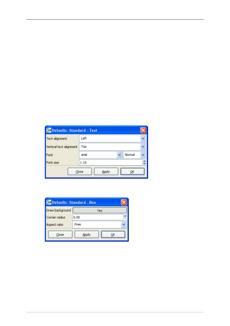
4.3.1. Sources of Default Properties
An object's default properties are set in two places within Dia. First, as discussed above in Default Color,
Line Width, and Line Style, default values for the foreground and background color; the line width; and
the line style of all basic objects and some special objects are determined by settings on the Toolbox. For
basic lines, the default beginning and ending arrow styles are also determined by the Toolbox settings.
The rest of an object's default properties can be set using the Defaults: Properties dialog box for each
object. This is opened by double-clicking on the object's icon on the Toolbox. Since the available
properties for each type of object can be different, each object's default properties dialog is different.
Below are examples of the default properties dialog for the basic Text and Box objects.
Figure 4.34. Default Text Properties
Figure 4.35. Default Box Properties
For objects that include text, the dialog will normally include the text alignment, the font name, the font
modifier (normal, bold, etc.), and the font size (in centimeters, not points). This makes it possible to set
defaults for text display for any object that can contain text.
4.3.2. Changing Object Properties
Once objects are placed onto the diagram, their properties can be changed either individually or as a
member of a group.

Objects and the Toolbox
28
4.3.2.1. Changing Properties for One Object
To change the properties of an individual object, either double-click on the object or select the object,
right-click to display the context menu, and select the Properties option. In either case, the Properties
dialog for the selected object will display, allowing you to change any of the object's properties.
Note
If multiple objects are selected, you can still change the properties of one of the selected
objects by double-clicking that object. This will only change the properties of the one
object you double-clicked.
4.3.2.2. Changing Properties for a Group of Objects
You can change the properties of a group of objects at one time by selecting two or more objects and
then selecting Objects -> Group to create a group. Once the group is created, you can set properties for
all objects in the group. To do this, either double-click on the group or right-click to display the context
menu and select the Properties option. The Properties: Group dialog will display. Only properties that
pertain to all of the selected objects will display in the dialog. If your group contains only objects of one
type, then all of the properties for that object type will display.
For example, if a group contains all basic Line objects, all of the Line properties will display in the
Properties: Group dialog. If a group contains a basic Line and a basic Box, the Properties: Group dialog
will only show Line width, Line color, and Line style, since these are the properties these objects have
in common.
Changing properties for a group is a powerful feature of Dia. For example, say you have a large diagram
and you need to change the line style of all the basic Line objects everywhere in the diagram. You can
accomplish this easily with the following steps.
1. Select one basic Line object.
2. Use Select -> Same Type to select all of the basic Line objects on the diagram.
3. Use Objects -> Group to create a group for the selected objects.
4. Double-click on the group and make your property changes.
5. Use Objects -> Ungroup to remove the group.
With this technique, you can quickly change the properties of many objects. This also works with
selections containing multiple object types, as long as all of the selected objects have the properties you
want to change.
4.4. Colors
All objects in Dia have color attributes. Lines have line color. Shapes have line color and fill color. Text
and other objects that contain text have text color. In addition, the Diagram -> Properties allows you to
set colors for Background, Grid Lines, and Page Breaks. Finally, the Toolbox allows you to set default
foreground and background colors for new objects.
In most cases, there are two methods for selecting a color. First, you can select a color from a list of
colors provided in the drop-down listbox by each color property.
Objects and the Toolbox
29
Figure 4.36. Color Listbox
The list contains five primary colors (black, white, red, green, and blue) plus custom colors that have
been previously used. You can just select a color from the list or select "More colors..." to display the
Select color box. The Select color box allows you to select any color. It is explained in the next section.
4.4.1. Select Color Box
Figure 4.37. Select Color Box
The Colors selector box contains 6 zones:
1. The colors wheel allows you to select a color using the mouse. Select the color you want from the
outer ring. A white or black line shows the current position on the ring. Select the darkness or lightness
you want using the inner triangle. A white or black circle shows the current position in the triangle.
You can click or drag on either surface. The currently-selected color displays in the right side of the
rectangle just below the circle.
2. Below the color wheel there are two rectangles. The left one displays the current color of the object,
the right one the new color (i.e., the one you currently have chosen using the colors wheel). Pressing
the OK button will set the object to the new color.

Objects and the Toolbox
30
Just to the right of these rectangles, there is a pipette button. When you click this button, the mouse
pointer changes to a pipette. When the pipette is active, you can click on the canvas or any open
application window (Like The Gimp), and select any color!
Note
On Windows, you can only select from colors on the Dia canvas.
3. In the lower right there is a predefined color palette. Click on any of these to choose the color.
4. In the upper center there are settings for Hue, Saturation, and Value (HSV). You can select a color
by typing a numeric value or by using the increment / decrement controls. Note that when you enter
a value here, the color wheel selection changes to reflect the new color.
5. To the right, there are settings for Red, Green, and Blue. These work the same as the HSV controls.
6. In the middle of the box is a place to enter a Color name. This supports standard color names
or HTML-style hexadecimal color values. (See HTML4.01 colors on http://www.w3.org), and
hexadecimal values (0-9A-F) on 3 or 6 octets.
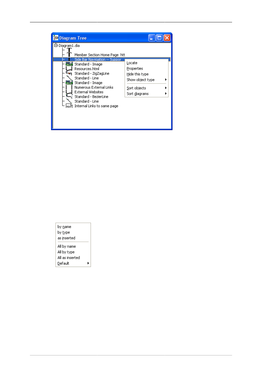
4.5. Diagram Tree
The Diagram Tree provides an alternative method of working with a diagram. This window displays a
list of all objects in the diagram in a scrolling list box. By right-clicking on an object, you can perform
a number of operations.
4.5.1. Opening the Diagram Tree
The Diagram Tree is toggled on or off by selecting File -> Diagram Tree from the Toolbox menu bar
or by pressing F8 when the Toolbox is in focus. When this is toggled on, the Diagram Tree window
displays. The window closes when this is toggled off.
4.5.2. Working With the Diagram Tree
Actions on the Diagram Tree affect the diagram canvas. If you double-click on a diagram name in the
list, that diagram window comes into focus on your desktop. If you click an object on the list, that object
is selected in the diagram on the canvas, just as if you had clicked on it on the canvas. If you right-click
on the Diagram tree list, a context menu displays with six options, as shown in the figure below.
Objects and the Toolbox
31
Figure 4.38. Diagram Tree
These options are explained below.
• Locate will bring the selected object into view on the canvas. This can be useful if you are trying to
find an object in a large diagram.
• Properties will display the properties dialog for the selected object. See Object Properties for more
information.
• Hide this type will cause all objects of this type to be removed from the list. They are still in the
diagram, just not visible in this window.
• Show object type will display a list of any object types you have hidden using Hide this type. You
can select a hidden object type to restore it to the list.
• Sort objects brings up a sub-menu of sort options as shown in the figure below.
Figure 4.39. Diagram Tree Sort Options
• by name: sorts list by the text entered into the object.
• by type: sorts list by the object type (Box, Line, etc.).
• as inserted: sorts list in the order the objects were added to the diagram.
• All by name: same as by name except that it sorts all open diagrams, not just the selected one.
• All by type: same as by type except that it sorts all open diagrams, not just the selected one.
• All as inserted: same as as inserted except that it sorts all open diagrams, not just the selected one.

Objects and the Toolbox
32
• Default: allows you to select which of the three sort types (by name, by type, or as inserted) to use
by default. Initial default is as inserted.
• Sort diagrams allows you to sort diagrams if you have more than one diagram open during the session.
The sort options are by name or as inserted (meaning the order in which the diagrams were opened).
33
Chapter 5. Basic Objects
5.1. Basic Objects Introduction
Figure 5.1. Basic Objects
Dia has a dozen basic objects: Text, Box, Ellipse, Polygon, Beziergon, Line, Arc, Zigzagline, Polyline,
Bezierline, Image and Outline.
5.1.1. Text
Dia supports the use of text as its own type of object. Text can be placed on the canvas by clicking on
the text button on the toolbox. For tips on editing text, see Entering Text in the Using Objects chapter.
Note
Text in Dia can use almost any font available in the system. But if you plan to exchange
diagrams with people using a different plattform, it would be samrt to restrict yourself to
a common subset.
The text object, and several other objects, offers direct text entry in the diagram. Text can be entered
by selecting the object and then typing the text. The font, size, and other formatting properties can be
changed by double-clicking the object.
Here are some important tips regarding short-cut keys when entering text.
• The normal Copy / Cut / Paste keys (Ctrl+C, Ctrl+X, Ctrl+V) don't work for text. They work for
entire objects. Use Ctrl+Shift+X to cut and Ctrl+Shift+V to paste just the text in an object. There is
no shortcut to copy just the text.
Note
When you paste text into an object, the text is formatted according to the Dia object
properties, not the text source.
• You cannot select a section of text inside an object with the mouse (this moves the object). You can
insert characters at the current cursor position just by typing. You can delete the character to the left
of the mouse using Backspace.

Basic Objects
34
Note
The DEL key used to delete the entire object, now it should work as expected: it either
deletes the object or the text to the right of the cursor depending on the editing mode. If
you delete something (text or object) by accident use Edit->Undoor Ctrl+Z if you delete
an object by mistake.) To delete all of the text in an object, use the Cut (Ctrl+Shift+X).
• If you are using a non-default font or font size, one trick for productivity is to create a palette of empty
objects with the desired font settings on a separate diagram. Then copy and paste these objects onto
your working diagram as you need them (i.e., instead of using the Toolbox icons).
5.1.2. Box
The boxes in Dia can be customized to be any size desired by the user. The properties available are:
• Corner Rounding - Causes the corners to be rounded instead of hard edges.
• Draw Background - Keeps the center clear or fills with the background color.
5.1.3. Ellipse
An ellipse is a shape which has all rounded sides, such as a circle or an oval.
5.1.4. Polygon
A polygon is any closed shape made up of straight lines. The polygon tool, allows the user to draw any
shape with all straight lines.
5.1.5. Beziergon
A beziergon is similar to the polygon as the user defines the shape. However, it differs in that it allows
curves to exist in the shape.
5.1.6. Line
A Line is a simple straight line. Unlike the other lines, the simple Line does not have any handles to
allow the shape to be altered. It just has two connection handles, one at each end.
5.1.7. Arc
An Arc is a line which has been bent to create a semi-circle shape. Drag the orange handle in the middle
to alter the curve of the arc.
5.1.8. Zigzagline
A Zigzagline is a line which has sharp, 90 degree turns in it. Zigzaglines have two special properties,
Corner radius and Autoroute. Corner radius allows you to round the corners of the line. On the Properties
page, enter a number between 0 and 10.00, where 0 = square corners and 10.00 = maximally-rounded
corners.
Autoroute is a yes/no property. If yes, the line is automatically routed between the start and end points
with the minimum number of segments. If you move or change the shape of the line, the Autoroute
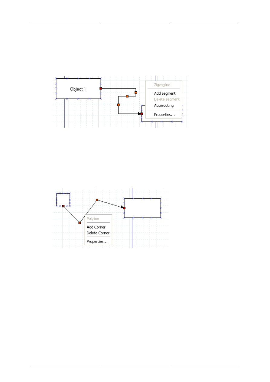
Basic Objects
35
property is automatically set to no. Autoroute can be set on the Properties page or using the right-click
menu.
Zigzaglines also allow you to add or delete line segments. This can be useful if you need the line to
turn several corners (e.g., to traverse around some other objects) or to get the arrow pointed in the right
direction. To add or delete a segment, right-click on the line at the point on the line where you want to
add or delete and select Add segment or Delete segment.
Figure 5.2. Zigzagline Right-Click Menu
5.1.9. Polyline
A Polyline has multiple segments like a zigzagline, but can have turns of any angle. A Polyline starts
with one segment. You add more segments by right-clicking and selecting Add segment from the menu.
Like the Zigzagline, the Polyline has a Corner radius value between 0 and 10.00, where 0 = sharp corners
and 10.00 = maximally-rounded corners.
Figure 5.3. Polyline Right-Click Menu
5.1.10. Bezierline
A Bezierline is a line which has curves in it. The Bezierline's shape is edited by clicking and dragging
the green and orange dots. The green dots customize the size while the orange dots customize the angles
at which the line curves. With a right-click menu, you can add or delete segments. If you add one or
more segments, three additional properties are available.
• Symmetric control causes any dragging action on the added segment to be symmetrical around this
point.
• Smooth control allows you to pull away from the middle point independently but rotations around
the middle point are symmetrical.
• Cusp control allows you to drag each handle independently, and actions on one handle have no effect
on the other one.
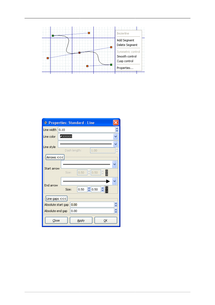
Basic Objects
36
Figure 5.4. Bezierline Right-Click Menu
5.1.11. Line Properties
All lines share the following properties: width, color, style, and arrows. These properties may be edited
using the Properties dialog box shown below.
Figure 5.5. Standard Line Properties
5.1.11.1. Line Width
The line width is measured in centimeters and can be entered manually or by using the increment /
decrement buttons.
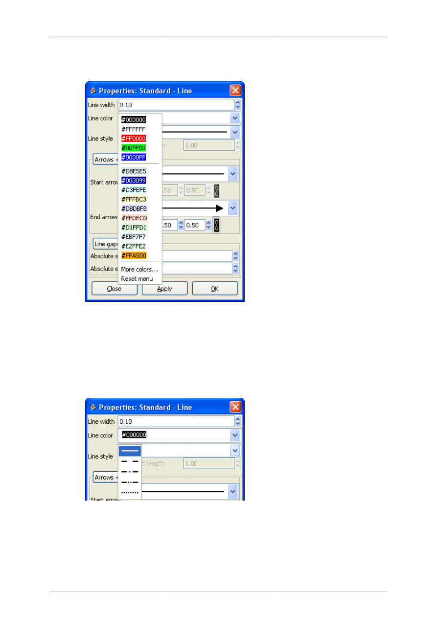
Basic Objects
37
5.1.11.2. Line Color
Figure 5.6. Line Colors
Line colors are edited by opening the Line color drop-down listbox and either selecting one of the choices
on the list or "More colors...", which opens the Select color dialog. See Colors for more information
on selecting colors.
5.1.11.3. Line Style
Figure 5.7. Line Styles
The style of the line (solid, dots, etc.) can be changed to one of the five options shown above using the
Line style drop-down listbox. If you select a line style with dashes, you may also enter a dash length,
measured in centimeters.
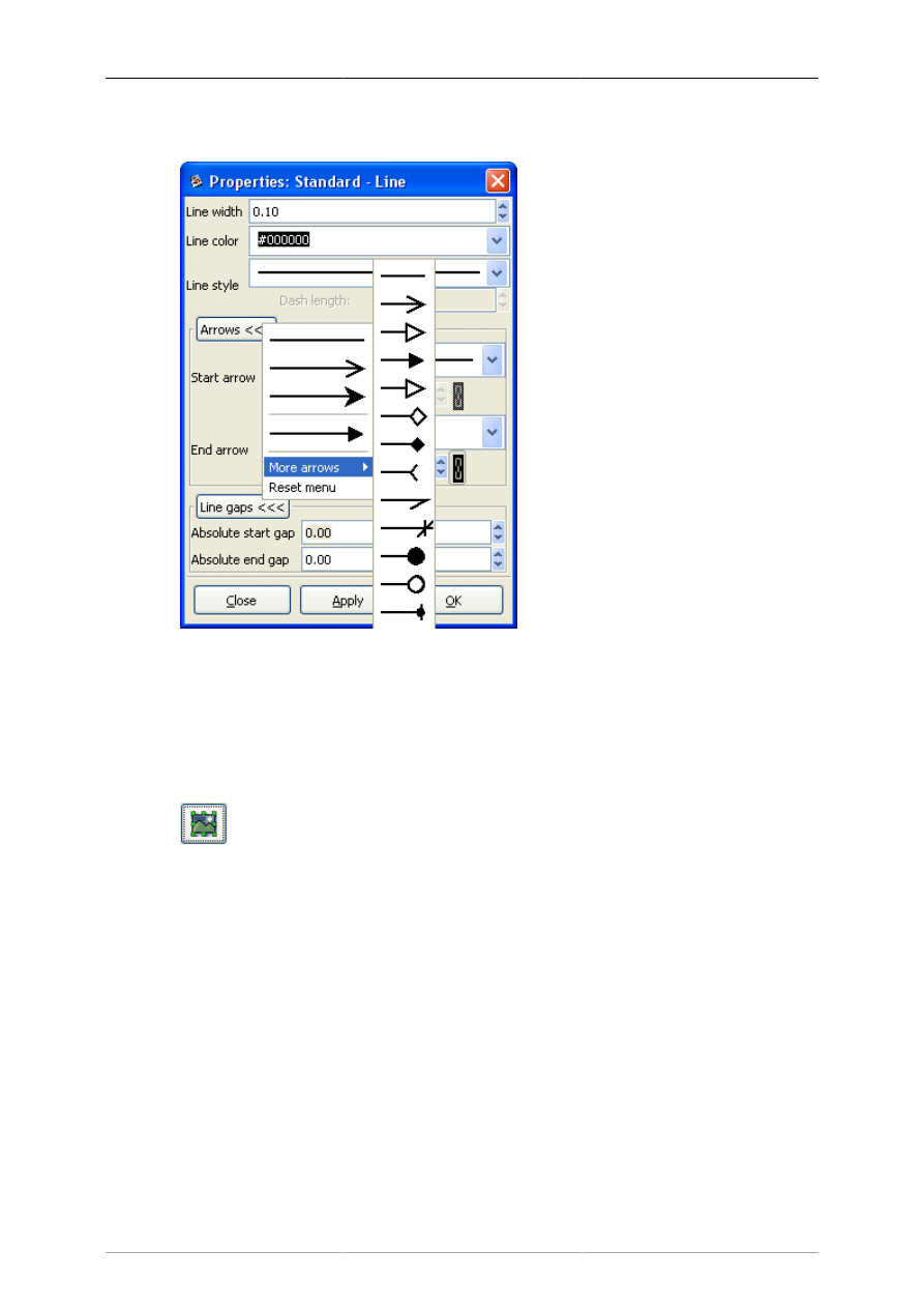
Basic Objects
38
5.1.11.4. Arrows
Figure 5.8. Line Arrows
The start and end arrow style can be changed using the drop-down listboxes in the dialog. A large number
of options are available. If you don't want any arrow, just select the plain line at the top of the list.
5.1.12. Image
Figure 5.9. Image
A diagram can contain images as well as shapes. To add an image, click on the Image icon and click
on the canvas. An object that says "Broken Image" will appear. Double-click it to open the properties
dialog. Then click on "Browse" and select your file. Click "OK" and then the image will display on the
diagram. You can resize the image as desired using the object handles.
The following image are usually supported for inclusion in Dia diagrams:
• BMP
• JPEG
• PNG
• SVG
• XPM

Basic Objects
39
The exact list depends on your system configuration (the concrete import format filters available to
gdk-pixbuf).
5.1.13. Outline
One of the most requested features for Dia is rotated text; shortly before having transformation
capabilities for everything ;-) The Outline object is a small step in that direction. It has known limitations
in convenience (you need to open the properties dialog to change the text) and rendering style (Dia's
drawing model does not yet allow to render holes).
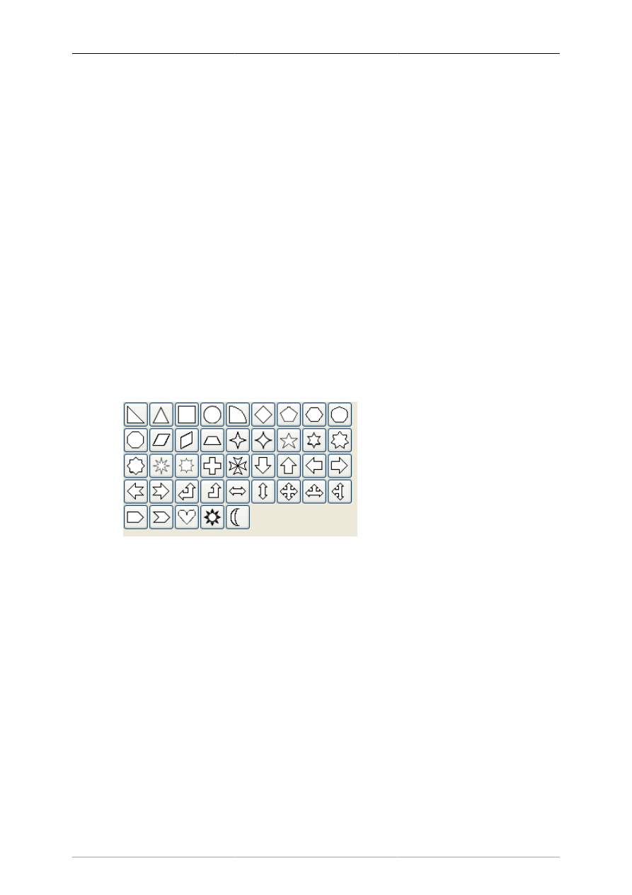
40
Chapter 6. Special Objects
6.1. Special Objects
Special objects are sets of objects designed to serve specific needs. They are organized into categories
called sheets. The middle section of the Toolbox allows you to select a sheet of special objects. When
you do this, the objects on this sheet display on the Toolbox and can be added to your diagram just like
basic objects. Dia supports numerous predefined categories.
The predefined sheets are designed to group related objects together so you can see all of the objects you
are likely to need on the same sheet. However, it is easy to modify the predefined sheets. See Organizing
Sheets and Objects for more information.
It is also possible to create your own objects and sheets without programming. Custom shapes can be
created with an XML file that describes the shape. See Custom Shape Module for more information
on custom shapes.
6.1.1. Special Object Categories
6.1.1.1. Assorted
Figure 6.1. Assorted
Assorted Geometric Shapes. The purpose of this sheet is to provide a selection of simple and convenient
preset shapes so that users need not create spend time creating their own basic shapes. The set includes
shapes with constrained ratio such as perfect Circles, Squares, various type of Triangle and Crosses.
These objects do not allow text to be entered inside the shape.
6.1.1.2. Chemical Engineering
A collection of shapes for modeling the process of Chemical Engineering.
6.1.1.3. Chronogram
Uses objects to be used in a chronographic design. These are common place in time lines.
6.1.1.4. Circuit
A group for people interested in creating diagrams of electrical circuits.
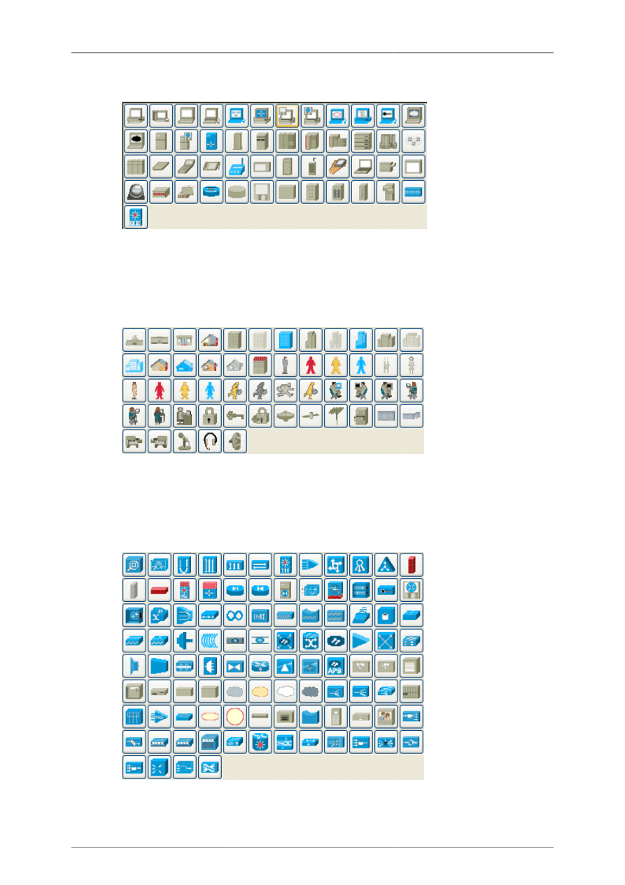
Special Objects
41
6.1.1.5. Cisco - Computer
Figure 6.2. Cisco - Computer
Cisco - Computer includes shapes representing computer equipment from Cisco, a manufacturer of
Computer Networking Equipment.
6.1.1.6. Cisco - Misc
Figure 6.3. Cisco - Misc
Cisco - Misc includes miscellaneous shapes from Cisco, a manufacturer of Computer Networking
Equipment.
6.1.1.7. Cisco - Network
Figure 6.4. Cisco - Network
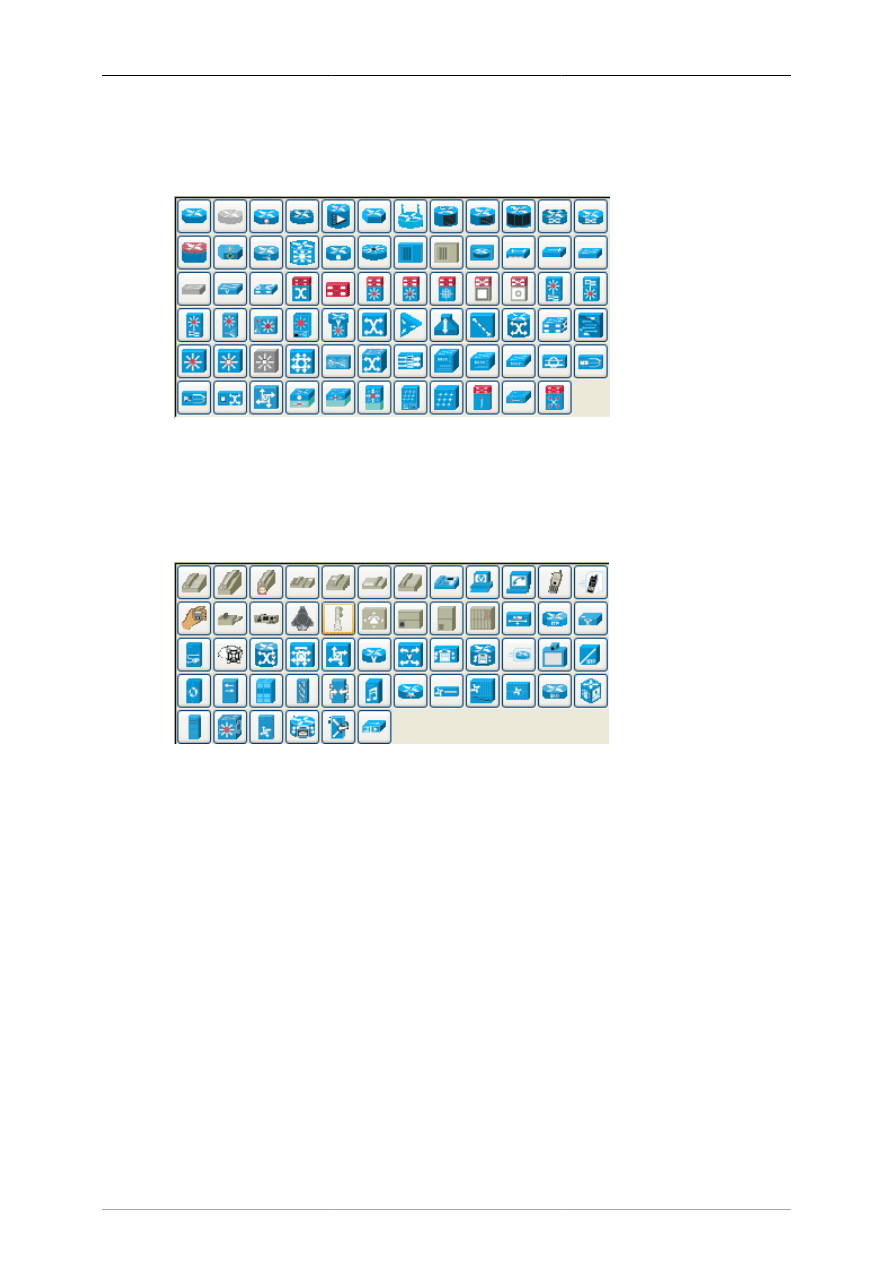
Special Objects
42
Cisco - Network includes shapes representing network equipment from Cisco, a manufacturer of
Computer Networking Equipment.
6.1.1.8. Cisco - Switch
Figure 6.5. Cisco - Switch
Cisco - Switch includes shapes representing switch equipment from Cisco, a manufacturer of Computer
Networking Equipment.
6.1.1.9. Cisco - Telephony
Figure 6.6. Cisco - Telephony
Cisco - Telephony includes shapes representing telephony equipment from Cisco, a manufacturer of
Computer Networking Equipment.
6.1.1.10. Civil
Civil Engineering components.
6.1.1.11. Cybernetics
Shapes for creating diagrams of Cybernetic Circuits.
6.1.1.12. DIN Electrical
DIN style electrical control schematics (electrical controls in manufacturing automation).
6.1.1.13. ER
Editor for Entity Relations (ER) Diagrams. Entity Relationship diagrams are used to represent high level
descriptions of conceptual models in terms of how each data entity relates to other data in the model.
They are most commonly used to model the structure of data to be stored in a database.
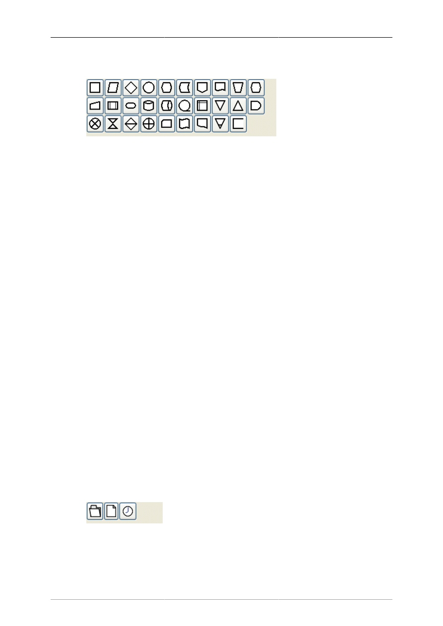
Special Objects
43
6.1.1.14. Flowchart
Figure 6.7. Flowchart
A group dedicated to providing the user shapes which are commonly used in flow charts. Flow charts
can be routinely found in computer programming, marketing, economics, and any other semi-linear
operation which requires planning. Most flowchart objects allow entry of text.
6.1.1.15. FS (Function Structure)
Editor for Function Structure (FS) Diagrams. Note that the Objects require the use of the context menu
to access much of the functionality of these objects.
6.1.1.16. GRAFCET
Grafcet (or IEC 61131-3 SFC) diagrams. Used in graphical programming and documenting sequential
processes in manufacturing automation.
A chart shows the step, the action, the transition, and the condition associated with the transition.
6.1.1.17. Istar
Istar is agent-oriented modeling framework. Istar is also written as i*.
6.1.1.18. Jackson
Jackson Software Design (JSD) method Diagrams.
6.1.1.19. KAOS
KAOS Diagrams.
6.1.1.20. Map 3D Isometric
Pseudo 3D isometric shapes for creating Directional Maps. Microsoft Visio calls these shapes Map,
Directional Map 3D.
6.1.1.21. Misc.
Figure 6.8. Misc
Miscellaneous shapes that do not fit into any of the other groups. Includes some File system shapes and
an animated clock object that updates in real time.
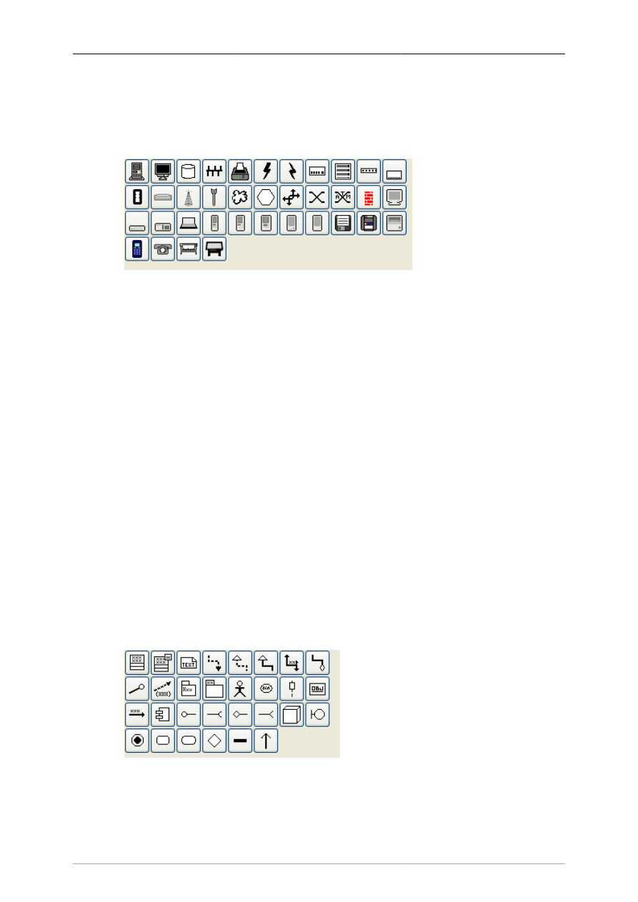
Special Objects
44
6.1.1.22. MSE
Mobile Subscriber Equipment Components, as used by the United States Army.
6.1.1.23. Network
Figure 6.9. Network
Used by network administrators to create a design of their network.
6.1.1.24. PLC Ladder
PLC 'Ladder' graphical programming (electrical controls in manufacturing automation).
6.1.1.25. Pneumatic/Hydraulic
Allows diagramming of a device which employs hydraulics.
6.1.1.26. SADT
Structured Analysis Design Technique.
6.1.1.27. SDL
Specification and Description Language (SDL) SDL is used to describe the behavior of interactive time
based systems. SDL was originally focused on telecommunication systems, but has also come to be used
to describe process control and real-time applications in general.
6.1.1.28. Sybase
Designs diagrams display the flow of a Sybase computer network.
6.1.1.29. UML
Figure 6.10. UML
Unified Modeling Language (UML). UML is a modeling and specification language commonly used to
create diagrams showing the structure of object-oriented computer programming code, particularly for
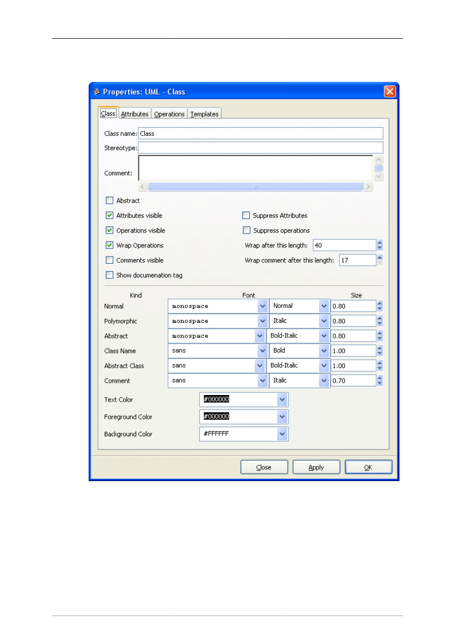
Special Objects
45
large scale projects. Some UML objects are complex and have extensive properties for various types of
text entries, as shown in the screenshot below.
Figure 6.11. UML Class Properties
6.1.2. Organizing Sheets and Objects
It is possible to modify the way objects are grouped into sheets. Say, for example, that most of the object
you need are on one sheet but you also need some objects from a second sheet. To keep everything you
need on one sheet, you can copy objects from one sheet to another as follows:
1. On the Toolbox menu, select File->Sheets and Objects. This will display the dialog shown in the
figure below.
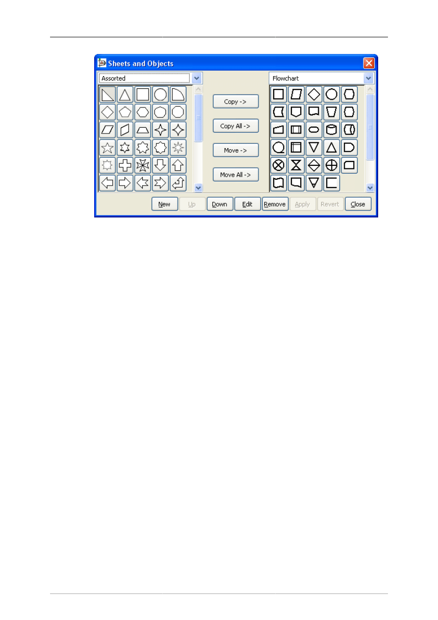
Special Objects
46
Figure 6.12. Sheets and Objects
2. Using the drop-down listbox on the left side, select the sheet you want to copy from. On the right,
select the sheet you want to copy to.
3. Click on the object you wish to copy on the left side and press the Copy button.
4. Repeat for any other objects you want to copy. When you are done, press the Apply button on the
bottom to save your changes.
From now on, the new objects will be listed on the sheet on the right. You can also remove objects from
sheets and move objects from one sheet to another. You can also use the Up and Down buttons to change
the order of the objects within a sheet.
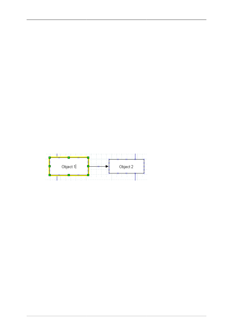
47
Chapter 7. Selecting Objects
7.1. Selection Introduction
Selecting one or more objects is a very common task when using Dia. Whenever you wish to move,
copy, delete, or edit an object or change it's properties, you must first select it. You can also work with
a set of selected objects -- for example, to move a group of related objects while keeping their relative
positions in tact or to change the properties of a group of objects.
Selecting objects can be done in several ways, including clicking with the mouse, selecting by area, or
using the Select menu to perform additional selection options.
7.2. How To Select Objects
7.2.1. Selecting a Single Object
To select a single object, just click it with the mouse. Also, when an object is first placed on the canvas,
it is automatically selected.
Once an object is selected, its handles are illuminated. For shapes, the handles are green points on its
corners and sides. For a line, the handles are green or red at the ends, and orange in the middle. Once the
object is selected, you may work with it as desired. To access the object's properties, you can double-
click it or right-click and select Properties from the pop-up menu.
Figure 7.1. Selected Object
7.2.2. Deselecting Objects
You can deselect one or more selected objects by double-clicking on any empty space on the canvas
or by selecting any other object. The handles will diObjects / Align Optionssappear, indicating that the
object is no longer selected. Selecting the Layers option from the Diagram menu will also deselect all
selected objects.
7.2.3. Selecting Multiple Objects
Multiple selection is useful when you want to apply the same operation to two or more objects. When
selected, you may work with these objects as a set or individually. See the section Working With Selected
Objects for more information.
Dia provides a number of ways to select multiple objects. These are outlined below. Note that either
double-clicking on an empty region of the canvas or single-clicking on an unselected object deselects
all selected objects.
7.2.3.1. Shift+Click Selection
A simple way to select two or more objects is to hold the Shift key down while clicking the objects with
the mouse. The Shift+Click acts as a toggle. If you Shift+Click once, the object is selected. Shift+Click
a second time to deselect the object.
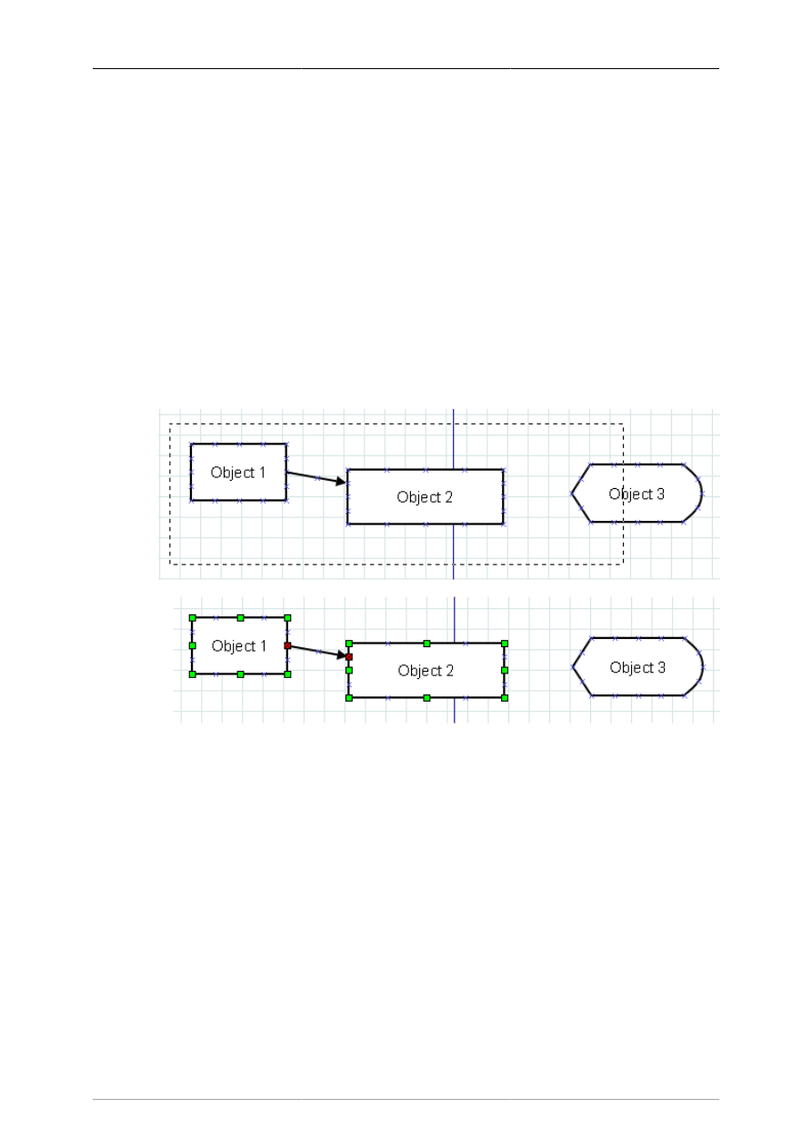
Selecting Objects
48
Tip
You can combine Shift+Click with any of the other methods outlined below to either select
an additional object or deselect a selected object.
Note
When you have a set of objects selected, it is still possible to resize or change the properties
of one object without affected the other selected objects. See the section Working With
Selected Objects for more information.
7.2.3.2. Select By Area
You can select all of the objects within a rectangular region of the screen by placing the mouse pointer
to the upper left of the top-left object in the set and then dragging the mouse to a point below and to the
right of the lower-right object in the set. A thin dashed rectangle will be drawn on the canvas as shown
in the screenshot below. All objects that COMPLETELY FIT inside this rectangle are selected. Objects
that are only partly inside the rectangle are not selected.
Only objects entirely inside rectangle are selected.
Figure 7.2. Select By Area Example
Tip
You can select multiple regions using select by area. Objects previously selected will
continue to be selected as long as you don't deselect all (e.g., by double-clicking on an
empty region of the canvas or by clicking on an unselected object without using the Shift
key). As noted above, you can also use Shift+Click to select or deselect an individual
object at any time.
Tip
Normally, selecting from top-left to bottom-right is the same as a "reverse drag" -- starting
on the bottom-right and dragging toward the top-left. However, you can set an option in Dia
that allows you to select objects that are only partially contained in the selection rectangle
when you "reverse drag". See User Interface / Reverse Dragging for more information.

Selecting Objects
49
7.2.3.3. Select All
The Select menu shown below has six options for selecting multiple objects. The first option is All.
Figure 7.3. Select Menu
You can select all objects on the canvas using the Select->All option or by pressing Ctrl+A. This selects
all objects whether they are visible or not.
Note
As with any of the selection methods, if you are using layers, only objects in the current
layer will be selected. See Managing Layers for more information on working with layers.
7.2.3.4. Select None
Select->None option will deselect all objects. It has the same effect as double-clicking on a blank region
of the canvas.
7.2.3.5. Select Invert
This option allows you to select all objects except for those currently selected. Say, for example, that
you have 20 objects and wish to select all but two of them. You can do this by (1) selecting the two
objects to be excluded and then (2) using the Select->Invert menu (or Ctrl+I). This will deselect the two
currently-selected objects and select the 18 unselected objects.
Tip
Another way to do this is to Select->All (or Ctrl+A) and then use Shift+Click to deselect
the objects you don't need.
7.2.3.6. Select Transitive
Objects in Dia can be connected using lines. The Select Transitive and Select Connected options allow
you to select objects based on how they are connected.
The Select Transitive option selects ALL objects connected directly or indirectly to the currently selected
objects, no matter how many levels deep the connection might be. To use this, select one or more objects
and then choose Select->Transitive. All objects connected to the initially selected objects will be added
to the selected set.
7.2.3.7. Select Connected
This option is similar to Select Transitive except that it only adds objects that are immediately connected
to an already-selected object. To use this option, first select one or more objects. Then choose Select-

Selecting Objects
50
>Connected. Any objects that are directly connected to the currently selected objects will be added to
the selected set.
Note
The Select Connected option only goes out one level. For example, if box A is connected
by a line to box B, and box A is selected, Select->Connected will only select the line, not
box B. If you do Select->Connected a second time, then box B will also be connected.
You can use Select->Transitive to select all objects connected to the currently selected
objects in one operation.
7.2.3.8. Select Same Type
This option allows you to select all objects that are the same type of object as one already selected. To
use this option, select one or more objects and then choose the Select->Same Type option. All objects
that are the same type as one of the previously selected objects will be added to the set of selected objects.
For example, if you want to select all of the Line objects on your diagram, select one Line object and
then use Select->Same Type to select all other lines.
Tip
The menu choice Select->Same Type can be combined with the menu choice Objects-
>Group to quickly change one or more properties of all objects of one type on your
diagram. See Changing Properties for a Group of Objects for more information.
Note
The object type must match exactly. For example, a Line object and a Zigzagline object
are different types.
7.3. Working With Selected Objects
Once you have a set of selected objects, there are several things you may do with them.
7.3.1. Operations on All Selected Objects
The following operations can be done on all selected objects as a set.
7.3.1.1. Move Selected Objects
You can move selected objects as a group, without changing their relative positions. To do this, place
the mouse pointer inside a shape or on a blank spot on a line that is part of the selected set and then
drag to the desired new location.
Tip
Be sure to avoid placing the mouse on an object's handle, or this will resize the object
instead of moving the selected set of objects.
7.3.1.2. Copy, Cut, Paste, Duplicate, Delete
You can perform any of the normal edit operations on a set of selected objects, just as you would for a
single object, using either the shortcut key or the Edit menu. For example, to Duplicate a set of selected
objects, select Edit / Duplicate or press Ctrl+D. A copy of the entire set of objects will be created on

Selecting Objects
51
your canvas, just below and to the left of the original objects. Note that when you Duplicate or Paste a
set of objects, after the operation only the newly-created objects are selected.
7.3.1.3. Working With Individual Objects
While a set of objects is selected, you may still resize or modify a single object's properties without
losing the currently selected set. To resize an object, place the mouse pointer over the desired handle of
the object and drag the handle to resize. To view or change an object's properties, double-click anywhere
on the object and the properties dialog box will display.
For line objects, you may change the line's connection points and change the shape of the line while a
line is part of a selected set. Just place the pointer on the desired handle of the line and drag it as needed.
Tip
When pulling up the properties dialog, be sure not to double-click on the blank canvas or
all of the objects will be deselected.
7.3.1.4. Creating an Object Group
As noted above, it is easy to create and remove sets of selected objects, and a selection can be removed
accidentally by double-clicking on a blank area of the canvas. If you wish to keep a set of selected objects
as a permanent group so that you will not accidentally deselect them, you can create an object group.
Just select Objects->Group to create the group. You can select Objects->Ungroup to remove the group.
See Grouping Objects for more information on groups.

52
Chapter 8. Loading and Saving
Diagrams
8.1. Loading and Saving Introduction
Dia follows the saving model common to most desktop applications: you must explicitly save any
canvases that you wish to retain for future use. To save a file, choose File->Save from the Main Popup
Menu. The result is a standard save dialog. Your canvas is saved in Dia XML format. No file extension
is automatically added, so it is a good idea to explicitly add '.dia' to the name you enter.
To load a canvas from a file previously saved by Dia or created by another application, select File-
>Open... from the Main Menu Bar. The result is an open dialog; select the file you want and choose
Open. The open dialog is standard apart from the popup menu labeled Determine file type. Choose the
format of the file to open (Dia XML or Drawing Interchange) if Dia does not correctly determine the
file format unassisted.
An alternate file-loading method is to start Dia from the command line with the name of the file to open
given as an argument.
8.2. File Types
A few words on file types are in order. You should be aware that not all format of files can be re-loaded
into Dia after saving and that most supported file formats lose information to some degree.
8.2.1. Dia Native Diagram Files
The only format guaranteed to be lossless is Dia XML. Happily, you are unlikely to accidentally save
in a lossy format because File->Save always produces a file in Dia XML format.
Files in Dia XML format are automatically compressed using gzip to save disk space. This is almost
necessary since, without compression, even simple diagrams are very large because they store much
redundant information. Dia XML files are already compressed, so further compressing them using other
archive formats will not help make them significantly smaller.
8.2.2. Import Formats
Dia is able to import the following file types:
• Scalable Vector Graphics (.svg)
• AutoCad Drawing eXchange Format (.dxf)
• XFig File Format (.fig)
• GdkPixbuf bitmap graphics (.bmp, .gif, .jpg, .png, .pnm, .ras, .tif)
8.2.3. Exporting: Support for Other Formats
Dia supports exporting to many other types of file, such as:
• Computer Graphics Metafile (.cgm)
• Dia Native Diagram (.dia)
• Dia Shape File (.shape)

Loading and Saving Diagrams
53
• AutoCad Drawing eXchange Format (.dxf)
• HP Graphics Language (.plt, .hpgl)
• Encapsulated Postscript (.eps, .epsi)
• Portable Network Graphics (.png)
• Scalable Vector Graphics (.svg)
• Scalable Vector Graphics gzip compressed (.svgz)
• TeX Metapost macros (.mp)
• TeX PSTricks macros (.tex)
• WordPerfect Graphics (.wpg)
• XFig format (.fig)
• XSLT (eXtensible Stylesheet Language Transformation) (.code)
Dia cannot load files in most of these formats. These formats are useful for diagrams that you need to
use in another application or to distribute to users of another operating system that Dia does not support.
To create a file in one of these formats, select File->Export... from the Main Popup Menu. Choose a
name and the desired format in the resulting dialog, which works like a save dialog. An appropriate file
extension is automatically added.
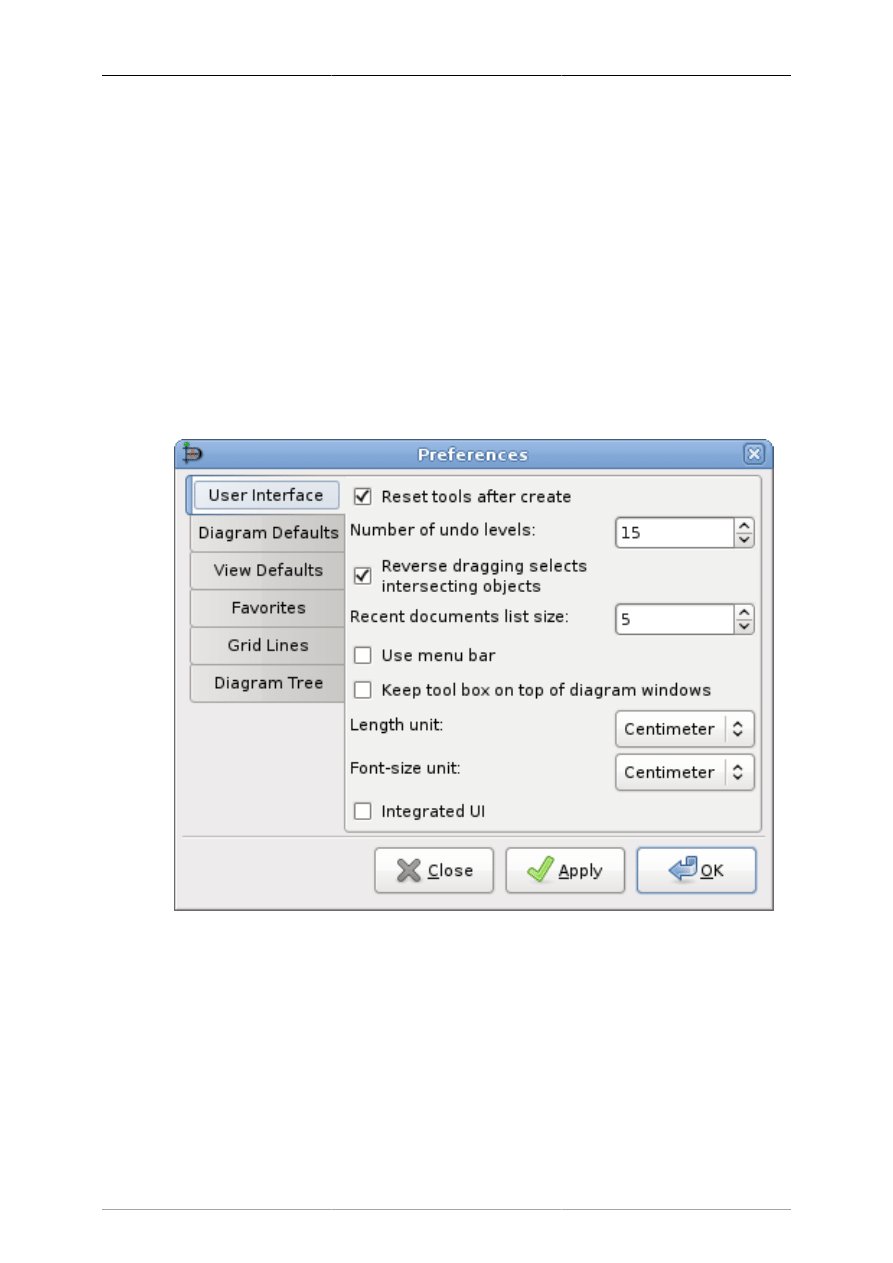
54
Chapter 9. Customization
9.1. Preferences Dialog
Dia allows you to set a number of customization options that modify how the program works.
These options are set by selecting the File->Preferences from the Toolbox Menu Bar. This opens the
Preferences dialog. This dialog has tab panes grouping related preferences like: User Interface, Diagram
Defaults, View Defaults and Grid Lines.
After you have made all the changes you want, click on OK to apply the changes and close the
Preferences dialog. To cancel the changes and return to previous values, click the Close button. You
may preview the effect of your changes using the Apply button.
9.1.1. User Interface
Figure 9.1. User Interface
The User Interface tab pane allows you to change the way Dia works. The configurable properties in
the User Interface tab are explained below.
• Reset tools after create causes the Modify tool to be selected automatically each time an object has
been added to the diagram. This allows you to add an object and then use the Modify tool to select
objects without having to go back to the Toolbox.
If the Reset tools button is not checked, then the current object tool will "stick" until another tool is
chosen. This is useful if you want to draw many shapes using the same tool repeatedly. However, in
this case, you will need to manually select the Modify tool in order to select objects.

Customization
55
Tip
As an alternative to unchecking this box, you can press the Space key after inserting an
object to reselect the last object. See Adding Objects for more information.
• Compress saved files provides the option to have Dia XML files compressed into much smaller files
using gzip or to leave the Dia XML files as plain text so that they can be more easily edited using
other software.
• Number of undo levels customizes how many steps that the undo tool remembers. The higher the
number, the more steps you can undo to fix an error. However, more undo levels requires more
computer memory. Setting the undo level to zero allows the program an unlimited number of undo
levels, subject to the available computer memory.
• Reverse dragging selects intersecting objects allows you to create selections by area that only need
to cover part of the object you want to select. Normally when you select objects by area, you need to
create a selection around the whole of the object you want to select in order to select it. Also, normally
dragging from the top-left to the bottom-right is the same as "reverse dragging" -- dragging from the
bottom-right to the top-left.
If this option is checked, dragging from the bottom-right to the top-left allows you to select objects
that only partially fall into the selection rectangle. Dragging from the top-left to bottom-right still
works the same -- objects are only selected if the whole object is inside the selection rectangle.
This option gives you two different ways to select by area, depending on which way you drag the
mouse.
• Recent Documents list size allows you to set how many items will be shown in the Recent Documents
section of the File menu.
• When Use menu bar is checked, the pull-down menus appear at the top of each Diagram, and the
object context menus are accessed by right-clicking on a selected object. If this box is unchecked,
these menus do not display at the top of the diagram. Instead, these menus are selected by right-
clicking on the canvas, and the object context menus are selected by middle-clicking (on a three-
button mouse) on a selected object.
Note
If you do not have a three-button mouse, you will need to have this box checked.
Otherwise, you will not be able to access the object context menus.
• Keep tool box on top of diagram windows ensures that the Toolbox window is always in front of all the
diagram windows which makes it easier to keep track of and have quick access to the tool at all times.
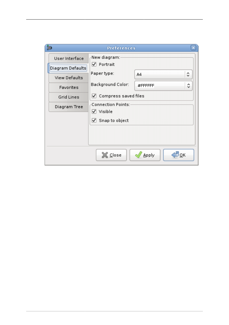
Customization
56
9.1.2. Diagram Defaults
Figure 9.2. Diagram Defaults
The Diagram Defaults tab allows you to set default properties for all new diagrams. These are explained
below.
• Portrait indicates that the diagram is in portrait orientation on the page. If this is unchecked, then
landscape orientation is assumed.
• Paper type allows you to select from a list of paper sizes (e.g., A4, Letter, etc.).
• Background color allows you to set a default background color for all new diagrams. See Colors for
more information on setting colors.
• New Window: Width allows you to set default width (in pixels) of the window when a new diagram
is created. You can either enter a number manually or use the increment / decrement buttons.
• New Window: Height allows you to set default height (in pixels).
• New Window: Magnify allows you to set the default zoom value (in percent) for a new diagram. You
can either enter a number manually or use the increment / decrement buttons.
• Connection Points: Visible determines whether connection points will be visible by default on new
diagrams. When working with a diagram, this can be toggled on or off using the View->Show
Connection Points on the Diagram menu bar.
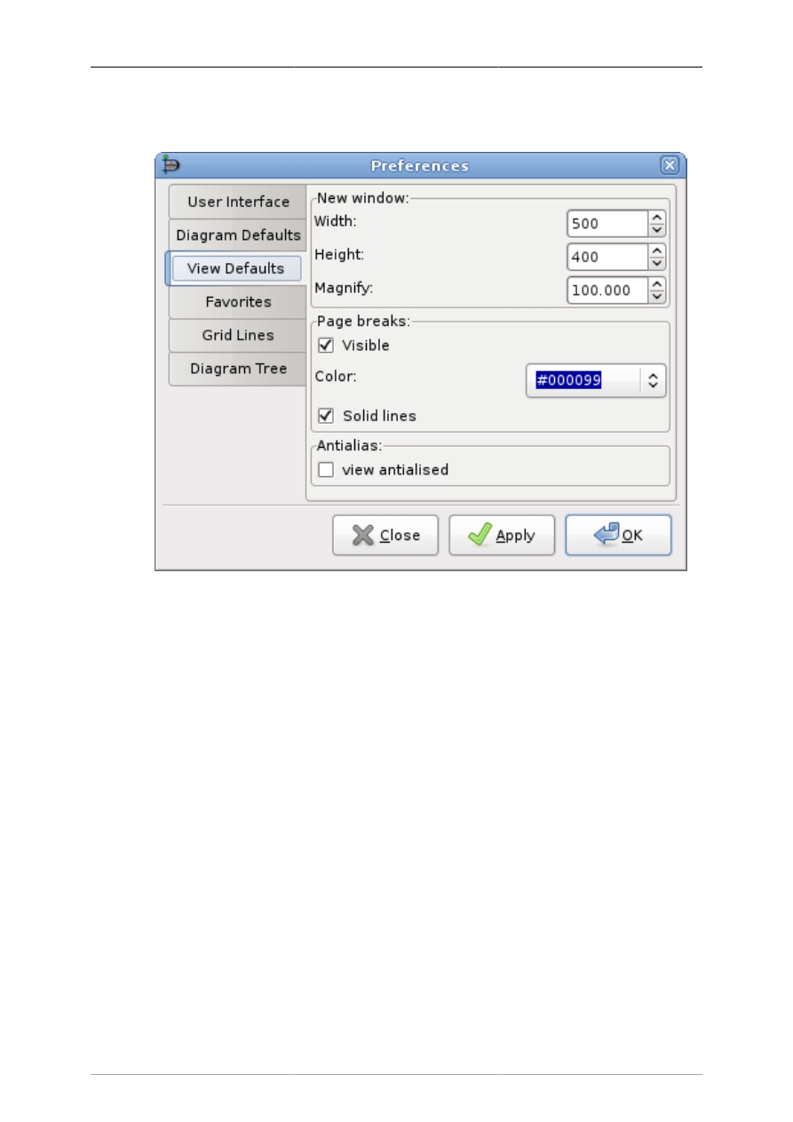
Customization
57
9.1.3. View Defaults
Figure 9.3. View Defaults
This tab allows you to set default properties for the Page break lines.
• Page Breaks: Visible controls whether page break lines will be visible.
• Color allows you to select the default color of the page break lines. This can be changed for a single
diagram using the Colors tab on the Diagram -> Properties menu choice from the Diagram menu bar.
• Solid lines determines whether the page break lines appear as solid lines or as dashed lines.
9.1.4. File export favorites
When exporting files there are often multiple filters capable to save to one format. This preference allows
to choose the one used, when not explicit selected in the file export dialog, i.e. By extension gets used.
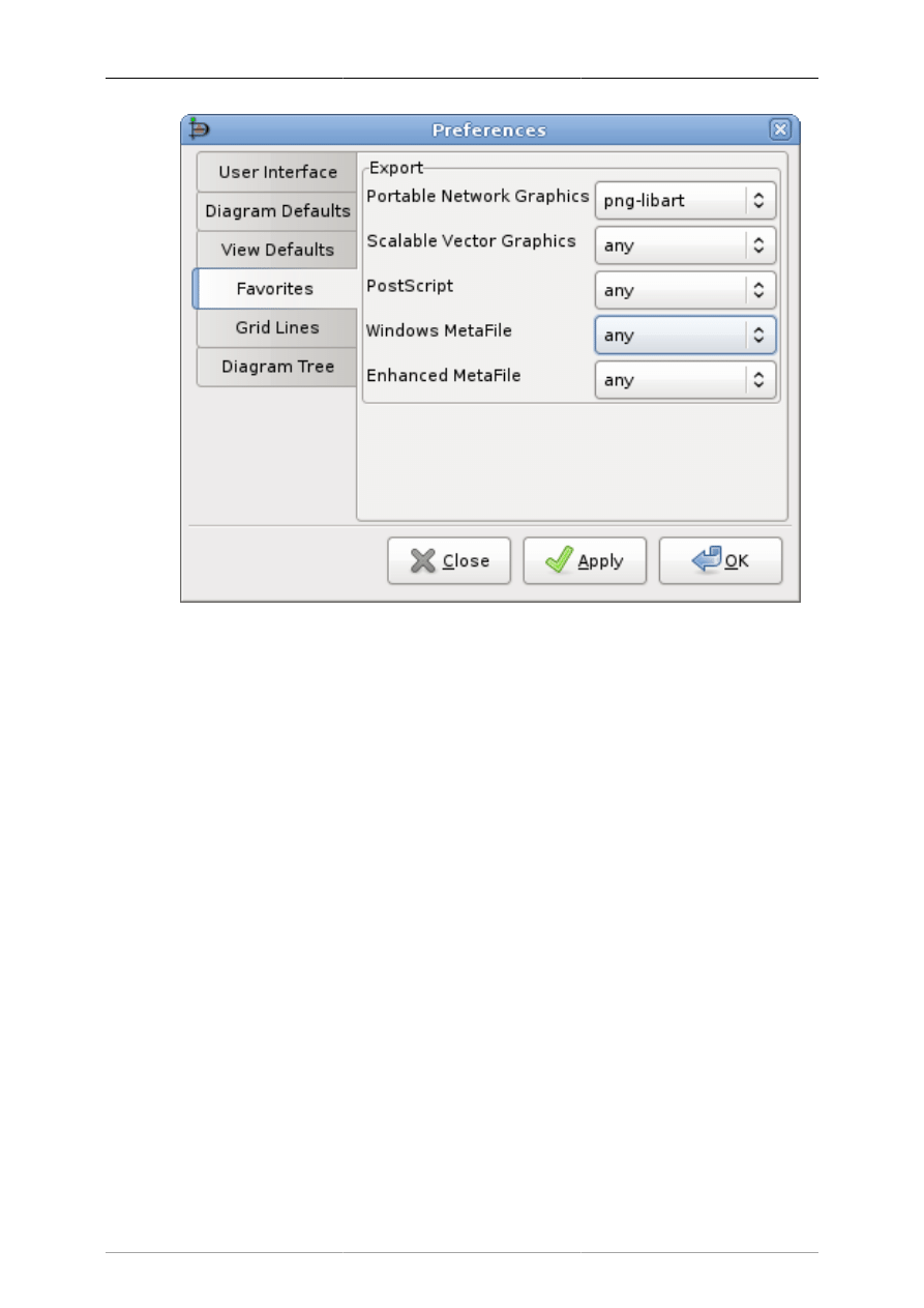
Customization
58
Figure 9.4.
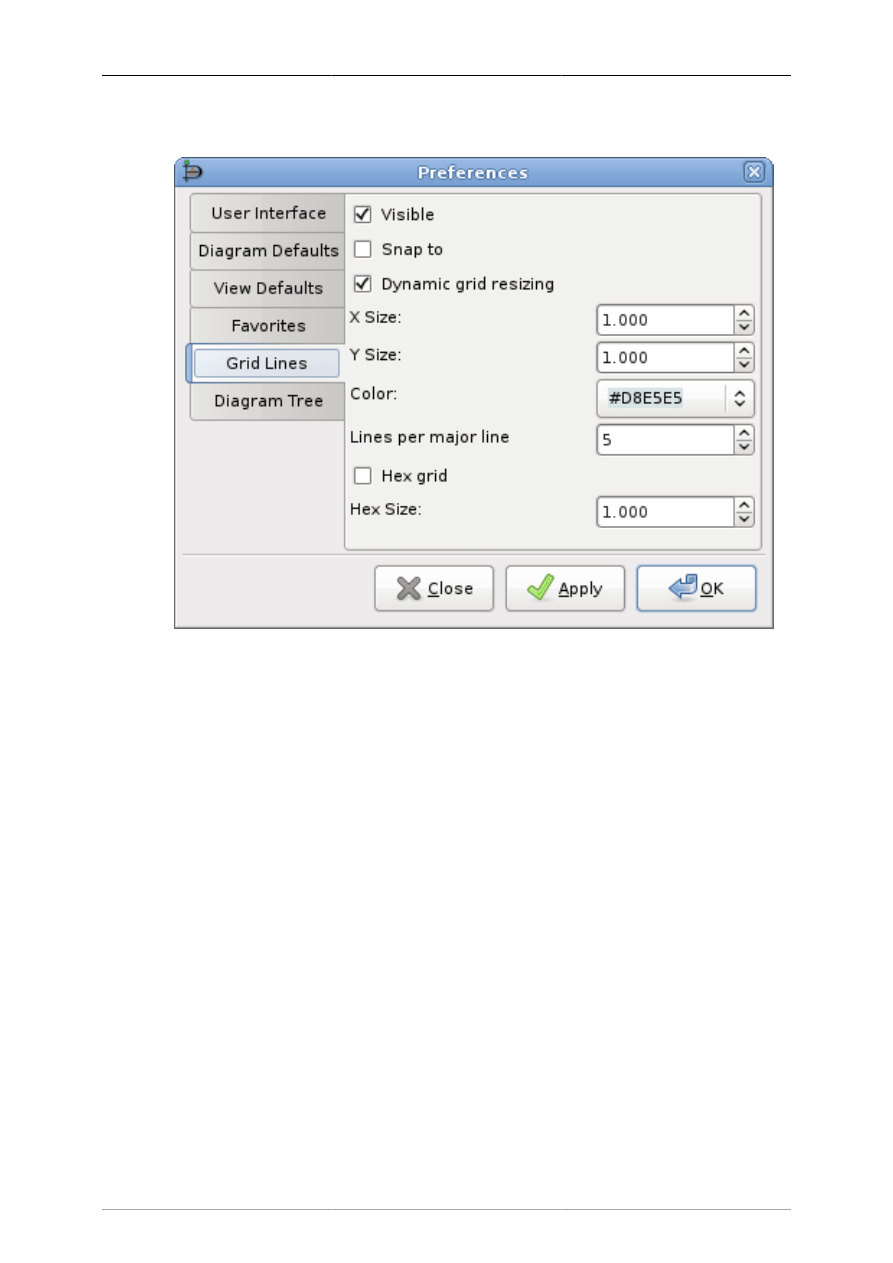
Customization
59
9.1.5. Grid Lines
Figure 9.5. Grid Lines
This tab allows you to set default properties for Grid Lines. These may be changed for an individual
diagram by selecting the Diagram->Properties from the Diagram menu bar and then selecting the Grid
tab. These options are explained below.
• Visible determines whether, by default, grid lines will be visible on new diagrams.
• Snap to determines whether, by default, new diagrams will have snap-to-grid enabled. Snap-to-grid
forces object edges to move to the nearest grid line intersection. This makes it easier to align objects,
as separate objects snap to the same line. This feature can be toggled on or off using the snap-to-grid
button on the bottom of the Toolbox. See Canvas / Grid Lines for more information. This can also be
toggled using the View->Snap To Grid option on the Diagram menu bar.
• Dynamic grid resizing determines whether the grid size changes as the diagram is zoomed in or out.
If this box is checked, then the grid lines display as the same size no matter how the diagram zoom
is changed. In this case, the X Size and Y Size values have no effect.
If this box is unchecked, then the grid size is set in absolute terms according to the X Size and Y Size
values (in centimeters). In this case, the appearance of the grid will change as the zoom changes, so
the grid lines will move closer when you zoom out and will spread out as you zoom in.
• X Size determines the distance, in centimeters, between grid lines along the horizontal axis. This only
takes effect if Dynamic grid resizing is unchecked.
• Y Size determines the distance, in centimeters, between grid lines along the vertical axis. This only
takes effect if Dynamic grid resizing is unchecked.
• Color sets the display color of the grid lines.
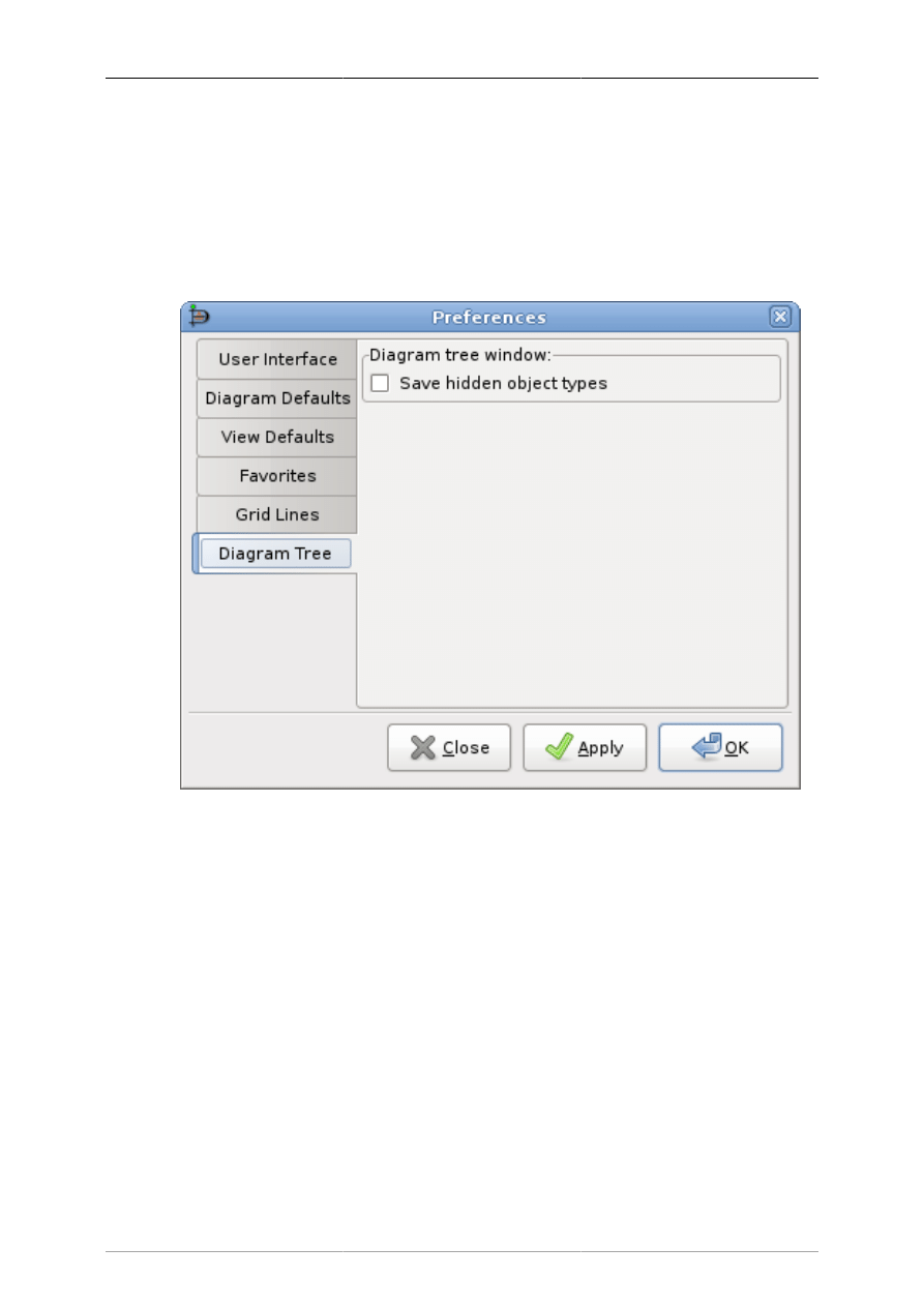
Customization
60
• Lines per major line determines the spacing of major (i.e., solid) grid lines. For example, a value of
5 means that every 5th grid line is solid.
• Hex grid allows you to have a grid of hexagons instead of a rectangular grid.
• Hex size determines the size of the hexagons, in centimeters, in the hex grid. This option only applies
if Hex grid is checked.
9.1.6. Diagram Tree
Figure 9.6. Diagram Tree
This tab refers to the Diagram Tree window, which can be opened from the Toolbox menu bar using
the File -> Diagram Tree choice or by pressing F8. In the Diagram Tree window, you can right-click on
an object and select "Hide this type" from the context menu. This removes objects of this type from the
Diagram Tree window. See Objects and the Toolbox / Diagram Tree for more information.
The Save Hidden object types box controls whether "Hide this type" is permanent or only for the current
Dia session. If the Save hidden object types box is checked, then the program will remember which types
you have selected to hide in the Diagram Tree. When Dia is restarted, these object types will continue to
be hidden in this window. If this box is unchecked, any time the program restarts, all objects will again
display in the Diagram Tree window.
Note
You can restore hidden object types by selecting the type from the list in the "Show object
type" option in the context menu of the Diagram Tree window.

61
Chapter 10. Managing Layers
10.1. Introduction to Layers
In Dia, diagrams consist of the canvas object, layer objects, and diagramming element objects. The layer
object can be likened to that of a sheet that sits on top of a canvas. Each sheet can then have diagramming
elements added to it to make up a diagram. Each diagram consists of at least one layer and each diagram
can consist of as many layers as required by the diagramming author.
As a general purpose, layers aim at being a shortcut for grouping related objects within a diagram. They
allow you to isolate the different parts of a diagram, in the way which you can decide to show only
certain parts of it and not some others will stay hidden even when exporting or printing the diagram.
Tip
Use the --show-layers command line switch to control which layers are visible when batch
exporting.
Inside a layer, any operation you would like to perform on objects are possible through the Main Popup
Menu, then you can act on objects just the way you use to.
Tip
Only objects present in the current layer can be selected. If an object doesn't want to be
selected, you should check if it is laying in the current layer or not.
Each new diagram comes with the default layer labeled "Background". Of course you can change its
name and settings to customize it to your needs as you can do with any other layer.
You can use layers to create overlay slide show by drawing each incremental slide in a layer and
manipulating which layers are visible. If you want to automate post processing such slide show, you
can use --show-layers command line switch. For example: dia --show-layers=Background,Slide3 --
filter=eps-builtin --export=foo.eps foo.dia will export the Background and Slide3 layers, i.e. the eps
output has only these two layers and none others. You would then repeat the export for each combination
of layers you need to produce your slides. Using this switch and a shell script or Makefile you can
automate the export process quite well.
10.2. Managing Layers Basics
The Layers dialog is used to manage the order and visibility of each layer in a diagram.
10.2.1. Create a New Layer
Creating a new layer is possible by clicking on the New Layer button at the bottom left of the dialog.
Since the Layers dialog is not diagram specific but application specific, you will have to choose in which
diagram the new layer must go in. To do so, at the top of the Layers dialog, select the diagram you
wanted to receive the new layer and then add this new layer to the selected diagram.
The newly created layer will be placed on top of the stack and will become the current layer of the
selected diagram.
Then it's possible to edit any new object of your choice, copy and paste from any other layer or diagram
as you could do it in single layer diagram.

Managing Layers
62
10.2.2. Selecting Layers
A layer is said as being activated when it is selected in the Layers dialog. To select a layer simply click
on its name in the dialog. The selected layer will then become highlighted. Changes to the diagram are
made to the currently selected layer only.
Note
Only one layer can be selected at a time. That way you can do anything you like in this
selected layer without affecting other layers on your diagram.
10.2.3. Ordering Layers
Next to the New Layer button at the bottom of the Layers dialog, are two useful buttons which allow
you to set the stack order of each layer you created.
Those two buttons are used to raise and lower layers in the hierarchy of layers. The button with the up
arrow is used to raise the active layer while the other is for lower the position within the hierarchy.
Ordering layers can be useful when you want hide some parts of an object with another one.
10.2.4. Deleting Layers
When a layer is not required you can delete it. When deleting a layer, it and all of the objects contained
in the layer are removed from the canvas. Layers are deleted by clicking on the Delete Layer button. Of
course this will only affect the currently selected layer.
Doing so on regular basis is the better way to keep your diagram clean and light for when you want to
export it to another format other than the native Dia format.
10.2.5. Renaming Layers
Layers can be renamed to express the part of the diagram they represent, giving them the ability to be
rapidly located among others. Most importantly, layers can be shown or hidden depending on what part
of the diagram you would like to show.
Double-clicking on the name of the layer opens the Edit Layer Attributes dialog, which displays the
current name of the layer in a textbox. Enter a new name for the layer in the textbox. To confirm the
changes, depress the OK button. Selecting the Cancel button will close the Edit Layer Attributes dialog
without making any changes.
Tip
Naming layers that describe the purpose of the layer is a useful way to remember what it
is for. Don't hesitate to create many different layers in your diagram, Dia doesn't constrain
you on the number of layers you've created, so feel free to adjust the hierarchy of the
diagram to your own needs.
10.3. Viewing Layers
Now that you've seen what are the basics of manipulating layers, you will more easily understand why
layers are such a powerful tool when you are building and maintaining diagrams with Dia.
Understanding what layers are for can dramatically improve the quality and the visual effect your
diagrams will produce.

Managing Layers
63
For instance, imagine you are building a diagram with lots of objects in it, like an Electrical or UML
diagram, if you drop all of your objects in the same layer, meaning the background, after a while you
will get a huge unmanageable draft you won't be able to do anything with it. It will be a pain to change
anything in it, you will waste time trying to remember what object is connected to that object which
seems to take all the space in the middle of the mixed up objects you already put there.
Since Dia is a Structured Diagram Builder, all the diagrams you will build with it will be naturally
structured and broken down to many little pieces. Using a layered approach better manages lots of pieces
with more ease and efficiency than you could do with a single monolithic block of objects.
Note
By definition, a diagram should be structured. So breaking it down into several logical parts
should be an easy process. That's where layers become a very useful and important tool for
the management of the content of diagrams. They allow you to isolate each of these parts
in separated slides, so it becomes a real pleasure to manipulate them in any way you like.
The Eye Icon to the left of the layer name is what make layers so useful. It allows you to show or hide
the corresponding layer. Meaning if for any reason you decided to not show a particular layer, simply
click on the Eye Icon and the layer and everything it contains will disappear from the Canvas. If you
hold down the Shift key and click Eye Icon you can hide all the other layers except for the current layer,
and if you click again while still holding the Shift key all Layers will be shown again.
Viewing only certain layers is really useful when you want manipulate a small part of your diagram
without affecting the rest. Some users create separate layers to hold all their text objects and use different
layers to hold translations into other languages. You can also work that way if you want to print your
diagram on different pages or testing different settings which can affect the layout of that part. Again,
feel free to experiment with layers, if set up properly they can make your diagram look much better.
Note
In Dia, Layers creation and manipulation are as common as drawing or selecting objects
in the diagram. You must get your hands on them, because you will probably have to use
them anytime you will want to create a new diagram.

64
Chapter 11. Custom Shape Module
11.1. Custom-shape Module introduction
The custom shape module allows you to create new shapes for Dia without writing any C code. Instead,
you just have to write a simple XML file describing the shape. This opens up the job of creating new
shapes for dia to non programmers as well.
The actual shape is described using a subset of the SVG specification. The line, polyline, polygon,
rect, circle, ellipse, path and g elements are supported. Note that the path element only supports the
M,m,L,l,H,h,V,v,C,c,S,s,A,a,Z and z commands. Transformations and CSS units are not supported (only
`user' units are), and only a limited set of the CSS attributes are supported.
A number of connection points can be associated with the shape, which are specified in the same
coordinate system as the shape description.
A text box can be associated with the shape. The text box is also specified in the same coordinate system
as the shape description.
To choose size and position of the text box, you can think of one rectangle to contain the text box, and
another one to contain all other svg elements (call it the image rectangle): When you get the shape to the
canvas, and write some text, all of it has to go inside the text box; if necessary, this text box will grow,
and, in the same proportion, the image rectangle will also grow.
The rest is taken care of for you (resizing, moving, line connection, loading, saving, undo, etc).
11.2. Shapes
A typical shape file may look something like this:
<?xml version="1.0"?>
<shape xmlns="http://www.daa.com.au/~james/dia-shape-ns"
xmlns:svg="http://www.w3.org/2000/svg">
<name>Circuit with identifiers - NPN Transistor</name>
<icon>npn.xpm</icon>
<connections>
<point x="0" y="0"/>
<point x="6" y="-4"/>
<point x="6" y="4"/>
</connections>
<aspectratio type="fixed"/>
<textbox x1="4" y1="-3" x2="12" y2="3" />
<svg:svg>
<svg:line x1="0" y1="0" x2="3" y2="0" />
<svg:line x1="3" y1="-3" x2="3" y2="3" />
<svg:line x1="3" y1="-2" x2="6" y2="-4" />
<svg:line x1="3" y1="2" x2="6" y2="4" />
<svg:polyline points="5,4 6,4 5.6154,3.0769" />
</svg:svg>

Custom Shape Module
65
</shape>
Only the
name
and
svg
elements are required in the shape file. The rest are optional.
The
name
element give the name of the object. The name is a unique identifier for this shape that is
used for saving and loading.
As in the example, you may use "compound names". Many shapes have first part of its name to indicate
the sheet in which they appear, but this is optional.
The
icon
element specifies an xpm file or a png file that is used as the icon in the dia toolbox. The
filename can be relative to the shape file. If it is not given, a default custom shape icon will be used.
The
connections
section specifies a number of connection points for the shape. The coordinate
system for these points is the same as the coordinate system used in the svg shape description.
The
aspectratio
element allows you to specify how the shape can be distorted. The three
possibilities are:
•
<aspectratio type="free"/>
- Any aspect ratio is OK (the default)
•
<aspectratio type="fixed"/>
- Fix the aspect ratio for this shape.
•
<aspectratio type="range" min="n" max="m"/>
- Give a range of values.
The last option allows you to specify a range of allowable amounts of distortion, which may be useful
in some cases.
The
textbox
element allows you to associate some text with the shape. The syntax is:
<textbox x1="left" y1="top" x2="right" y2="bottom"/>
(Only one textbox per shape) Where the attributes give the bounds of the text box in the same coordinate
system as the SVG shape description.
There are some optional attributes on <textbox/> namely
resize="no" :
by default the textbox is resized with the text
align="center" :
"center" is default, also "left" and "right" can be used
Shapes are given a default size on creation. If that default size does not fit your needs you can overwrite
it by (one or both): <default-width>1cm</default-width> <default-height>3cm</default-height> The
default unit "cm" can be omitted.
The
svg
element describes the shape. The width and height attributes are ignored, and only given to
comply with the SVG specification. For more information on SVG, see the W3C pages about the format
at: http://www.w3.org/Graphics/SVG
The next section details what parts of the SVG spec can be used in shape files.
11.3. The Shape Description
The Scalable Vector Graphics format is used to describe the shape. That is why the separate namespace
is used for that part of the file.

Custom Shape Module
66
11.3.1. Style attribute
Each of the SVG drawing elements understands the style attribute. The attribute should be of the form:
<svg:whatever style="name1: value1; name2: value2; ... name42: value42"/>
Currently only the following style attributes are understood:
•
stroke-width
- The width of the line, relative to the user specified width.
•
stroke-linecap
- The line cap style. One of
butt
,
round
,
square
,
projecting
(a
synonym for
square
), or
default
.
•
stroke-linejoin
- The line join style. One of
miter
,
round
,
bevel
or
default
.
•
stroke-pattern
- The dash pattern. One of
none
,
dashed
,
dash-dot
,
dash-dot-dot
,
dotted
or
default
.
•
stroke-dashlength
- The length of the dashes in the dash pattern, in relation to the user selected
value (
default
is a synonym for 1.0).
•
stroke
- The stroke colour. You can use one of the symbolic names
foreground
,
fg
,
default
,
background
,
bg inverse
,
text
or
none
, or use a hex colour value of the form
#rrggbb
.
•
fill
- The fill colour. The same values as for stroke are used, except that the meaning of
default
and
inverse
are exchanged. By default, elements are not filled, so to get the default fill, use "
fill:
default
"
Tip
So to draw a rectangle with a hairline stroke, the following would do the trick:
<svg:rect style="stroke-width: 0" x="..." y="..." width="..." height="..."/>
Ordinates x and y grow as in Dia.
11.3.2. Recognised drawing elements
The recognised drawing elements are:
•
<svg:g>
This is the group element. You can place other drawing elements inside it. The contents of the style
attribute on a group element will propagate to the contained elements (unless they override it).
•
<svg:line x1="..." y1="..." x2="..." y2="..."/>
This element is a line.
•
<svg:polyline points="...."/>
This is a polyline. That is, a number of connected line segments. The points attribute holds the
coordinates of the end points for the line segments. The coordinates are separated by white space or
commas. The suggested format is "x1,y1 x2,y2 x3,y3 ...".

Custom Shape Module
67
•
<svg:polygon points="...."/>
This is a polygon. The points argument has the same format as the polyline.
•
<svg:rect x1="..." y1="..." width="..." height="..."/>
This is a rectangle. The upper left corner is (x1,y1), and the lower right corner is
(x1+width,y1+height).
•
<svg:image
x1="..."
y1="..."
width="..."
height="..."
xlink:href="..." />
This is an external image. The upper left corner is (x1,y1), and the lower right corner is
(x1+width,y1+height). Their are two forms of links supported, an absolute filename of the form
"
file:///home/user/image.png
" or a relative one without the "
file://
" prefix like in
"
image.png
". The latter form is preferred because it is installation independent. The filename is
relative to the shape file placement. In the above example PNG and shape need to be in the same
directory.
•
<svg:circle cx="..." cy="..." r="..."/>
This is a circle with centre (cx,cy) and radius r.
•
<svg:ellipse cx="..." cy="..." rx="..." ry="..."/>
This is a ellipse with centre (cx, cy) and radius rx in the x direction and ry in the y direction.
•
<svg:path d="...."/>
This is the most complicated drawing element. It describes a path made up of line segments and bezier
curves. It currently does not support the elliptic arc or quadratic bezier curves. The d string is made up
of a number of commands of the form "
x arg1 arg2 ...
" where x is a character code identifying
the command, and the arguments are numbers separated by white space or commas. Each command
has an absolute and relative variant. The absolute one are spelled with an upper case letter. The relative
ones are spelled with a lower case letter, and use the end point of the previous command as the origin.
The supported commands are:
•
M x,y
- Move cursor
•
L x,y
- Draw a line to (x,y)
•
H x
- Draw a horizontal line to x
•
V y
- Draw a vertical line to y
•
C x1,y1 x2,y2, x3,y3
- Draw a bezier curve to (x3,y3) with (x1,y1) and (x2,y2) as control
points. C (uppercase) indicates that absolute coordinates will follow; c (lowercase) indicates that
relative coordinates will follow.
•
S x1,y1 x2,y2
- Same as above, but draw a `smooth' bezier. That is, infer the first control
point from the previous bezier. S (uppercase) indicates that absolute coordinates will follow; s
(lowercase) indicates that relative coordinates will follow.
•
A (rx ry x-axis-rotation large-arc-flag sweep-flag x y)+
- Draw an
elliptical arc from the current point to (x, y). The size and orientation of the ellipse are defined
by two radii (rx, ry) and an x-axis-rotation. The center is automatically calculated. large-arc-flag
and sweep-flag contribute to the automatic calculations and help determine how the arc is drawn.
A (uppercase) indicates that absolute coordinates will follow; a (lowercase) indicates that relative
coordinates will follow.
•
Z
- Close the path.

Custom Shape Module
68
If the path is closed with
z
or
Z
, then it can be filled. Otherwise, it will just be drawn.
•
<svg:text x="..." y="..." style="...">...</svg:text>
A text in the shape. The text has to be enclosed in the tags
The parameters are:
•
x,y
- The text position
•
style
- Text formatting options
The following style options are supported:
•
font-size
- font size in pt
11.4. Shapes in Shapes aka. Subshapes
Adding indepentently resizable symbols into your custom shapes is possible by creating subshapes. This
is done by some extra attributes on the group element.
<svg:g
dia:subshape="true"
dia:v_anchor="fixed.bottom"
dia:h_anchor="fixed.left"
dia:default_scale="1.0">
dia:v_anchor[Definition:
Supported values:
"fixed.top"
"fixed.bottom"
"proportional"
]
The vertical anchoring of the subshape.
dia:h_anchor [Definition:
Supported values are:
"fixed.left"
"fixed.right"
"proportional"
]
The horizontal anchoring of the subshape.
dia:default_scale
currently unused
11.5. Extented Attributes
To extend your custom shape with custom attributes you can put something like:
<ext_attributes>
<ext_attribute name="Integer" type="int" />
<ext_attribute name="String" type="string" />
<ext_attribute name="Float" type="real" />
</ext_attributes>

Custom Shape Module
69
between the
<shape></shape>
tags. The effect will be some custom properties in your object. They
are editable by the properties dialog and will be loaded and saved with your diagram. To programatically
access them use
"custom:<name>"
11.6. The Sheet description
You can put several shapes in one sheet: the shapes you create or any other shape or object "belonging"
to other sheets.
A simple sheet file may look something as this:
<?xml version="1.0" encoding="utf-8"?>
<sheet xmlns="http://www.lysator.liu.se/~alla/dia/dia-sheet-ns">
<name>Circuit with identifiers</name>
<name xml:lang="es">Circuito con identificadores</name>
<description>Components for circuit diagrams</description>
<description xml:lang="es">Componentes para diagramas de circuitos</description>
<contents>
<object name="Circuit with identifiers - NPN Transistor">
<description>A bipolar npn transistor</description>
<description xml:lang="es">Un transistor bipolar npn identificable</description>
</object>
<object name="UML - Objet">
<description>An UML object</description>
<description xml:lang="es">Un objeto UML</description>
</object>
</contents>
</sheet>
11.7. How Dia helps to create and manage
sheets and shapes.
You can use Dia with its available elements to draw a shape and then export it to a shape file, by using
File (of diagram)->Export->By extension->Shape.
But until now, this shapes don't have any text box. (They are expected to manage some svg:text but not
a text box). If you need one, you can edit the file.
Together with the shape file, you get a png file (after accepting the proposed size) which can be used
for the shape's icon.
By using File(of principal menu)->Sheets and Objects you can create new sheets; and add, remove and
parcially edit shapes; and copy or move shapes from one sheet to other.
11.8. Design Notes
The custom shape code is designed so that a sheet of objects can be self contained in a single directory.
Installing new shapes can be as easy as untaring a .tar.gz file to ~/.dia/shapes or $(prefix)/share/dia/
shapes, with the sheet description going to ~/.dia/sheets

Custom Shape Module
70
If you have any suggestions for this code, please tell me.
James Henstridge
<james@daa.com.au>
with some modifications written by Dolores Alia de
Saravia
<loli@unsa.edu.ar>

71
Chapter 12. Dia command line
12.1. Introduction
Dia can be used via command line, And, more, FROM command-line (batch treatment, e.g. to export
to another file format). Do not forgot
--nosplash
option in case of usage of dia from command line,
to avoid Dia's splash screen.
12.2. Command line manual

Dia command line
72
Name
dia — a diagram drawing program
Synopsis
dia
[
-c
] [
--credits
] [
-e OUTPUT
] [
--export=OUTPUT
] [
-L LAYER,LAYER,...
] [
--show-layers=LAYER,LAYER,...
] [
-h
] [
--help
] [
-n
] [
--nosplash
] [
-s WxH
] [
--size=WxH
] [
-t FORMAT
] [
--filter=FORMAT
] [
-v
] [
--version
] [file ...]
Description
Dia is used to create diagrams. Dia has a number of basic tools, like lines and boxes but can also
dynamically load sheets. A sheet is a collection of tools that are used in a certain type of diagram.
Most diagram objects in Dia have connection points. Lines can be connected to these connection points
and this way graph structures can be formed. When objects are moved or resized the connections will
follow the objects.
Diagrams drawn in Dia can be exported as PostScript.
Options
Dia accepts the following options:
-c
--credits
Display credits list and exit.
-e OUTPUT
--
export=OUTPUT
Export loaded file to OUTPUT and exit.
-h
--help
Display a list of all commandline options.
-n
--nosplash
Do not show the splash screen.
-s WxH
--size=WxH
Export loaded file in decimal given width and/or height. It is
allowed to only select width or height. E.g.
--size=520x
exports an image that is 520 pixels wide, while
--size=x900
exports an image of 900 pixels height.
Note
This option is currently only implemented for the
PNG export filter.
-L LAYER,LAYER,...
--show-
layers=LAYER,LAYER,...
Only include specified layers when exporting. Layers can be
specified either as a layer name, the layer number or a numeric
range X-Y of layers. --show-layers=background,2-5 shows the
layer named background and layers 2-5, --show-layers=2- shows
layers 2 and up.
-t FORMAT
--export-to-
format=FORMAT
Export loaded file in FORMAT and exit. Format are described
below.
-v
--version
Display dia version and exit.
Export Formats
The following export formats are supported by dia.
•
cgm
(Computer Graphics Metafile, ISO 8632)

Dia command line
73
•
dia
(Native dia diagram)
•
dxf
(Drawing Interchange File)
•
eps
or
eps-builtin
or
eps-pango
(Encapsulated PostScript)
The format specifications
eps
and
eps-pango
both use the font renderer of the Pango library, while
eps-builtin
uses a dia specific font renderer. If you have problems with Pango rendering, e.g.
Unicode, try
eps-builtin
instead.
•
fig
(XFig format)
•
mp
(TeX MetaPost macros)
•
plt
or
hpgl
(HP Graphics Language)
•
png
(Portable Network Graphics)
•
shape
(Dia Shape File)
•
svg
(Scalable Vector Graphics)
•
tex
(TeX PSTricks macros)
•
wpg
(WordPerfect Graphics)
•
wmf
(Windows MetaFile)
Files
dia creates a directory
.dia
in the user's home, which contains different files to store user preferences.
To reset dia to it's default behaviour, just remove the respective file:
•
defaults.dia
: contains default values for elements (XML format).
•
diarc
: keeps dia preferences (ASCII).
•
history
: keeps the list of last edited diagrams (ASCII).
•
menurc
: contains an automated accelerator map dump (Lisp).
•
persistence
: contains GUI information, e.g. open windows (XML).
•
pluginrc
: the list of loaded plugins (XML).
See Also
X (1)
xfig (1)
inkscape (1)
Copyright
Copyright 1999 Alexander Larsson.
Permission to use, copy, modify, and distribute this software and its documentation for any purpose and
without fee is hereby granted, provided that the above copyright notice appear in all copies and that both
that copyright notice and this permission notice appear in supporting documentation.

Dia command line
74
Authors
Alexander Larsson
This manual was written by Fredrik Hallenberg.

75
Chapter 13. Authors
Dia was created by Alexander Larsson and is currently maintained by Lars Clausen and other dedicated
volunteers. To find more information about Dia, please visit the official web page, live.gnome.org/
Dia. Please send all comments, suggestions, and bug reports to the GNOME bug tracking database.
(Instructions for submitting bug reports can be found on-line.) If you are using GNOME 1.1 or later,
you can also use Bug Report Tool (bug-buddy), available in the Utilities submenu of Main Menu, for
submitting bug reports. You can also sign up to the Dia mailing list.
This manual was written by Henry House (
<hajhouse@houseag.com>
) , Judith Samson
(
<judith@samsonsource.com>
), Kevin Breit (
<battery841@mypad.com>
) and Alan
Horkan (
<horkana@tcd.ie>
. It was significantly expanded and revised in August 2007 by Mark
Dexter (
<dextercowley@gmail.com>
. Please send all comments and suggestions regarding this
manual to the GNOME Documentation Project by sending an email to
<docs@gnome.org>
. You
can also add your comments online by using the GNOME Documentation Status Table.

76
Chapter 14. License
14.1. License
This program is free software; you can redistribute it and/or modify it under the terms of the GNU
General Public License as published by the Free Software Foundation; either version 2 of the License,
or (at your option) any later version.
This program is distributed in the hope that it will be useful, but WITHOUT ANY WARRANTY;
without even the implied warranty of MERCHANTABILITY or FITNESS FOR A PARTICULAR
PURPOSE. See the GNU General Public License for more details.
A copy of the GNU General Public License is included as an appendix to the GNOME Users Guide.
You may also obtain a copy of the GNU General Public License from the Free Software Foundation
by visiting their Web site or by writing to
Free Software Foundation, Inc.
59 Temple Place - Suite 330
Boston, MA 02111-1307
USA
Document Outline
- Dia
- Table of Contents
- Chapter 1. Introduction
- Chapter 2. Quickstart
- Chapter 3. The Canvas
- Chapter 4. Objects and the Toolbox
- Chapter 5. Basic Objects
- Chapter 6. Special Objects
- 6.1. Special Objects
- 6.1.1. Special Object Categories
- 6.1.1.1. Assorted
- 6.1.1.2. Chemical Engineering
- 6.1.1.3. Chronogram
- 6.1.1.4. Circuit
- 6.1.1.5. Cisco - Computer
- 6.1.1.6. Cisco - Misc
- 6.1.1.7. Cisco - Network
- 6.1.1.8. Cisco - Switch
- 6.1.1.9. Cisco - Telephony
- 6.1.1.10. Civil
- 6.1.1.11. Cybernetics
- 6.1.1.12. DIN Electrical
- 6.1.1.13. ER
- 6.1.1.14. Flowchart
- 6.1.1.15. FS (Function Structure)
- 6.1.1.16. GRAFCET
- 6.1.1.17. Istar
- 6.1.1.18. Jackson
- 6.1.1.19. KAOS
- 6.1.1.20. Map 3D Isometric
- 6.1.1.21. Misc.
- 6.1.1.22. MSE
- 6.1.1.23. Network
- 6.1.1.24. PLC Ladder
- 6.1.1.25. Pneumatic/Hydraulic
- 6.1.1.26. SADT
- 6.1.1.27. SDL
- 6.1.1.28. Sybase
- 6.1.1.29. UML
- 6.1.2. Organizing Sheets and Objects
- 6.1.1. Special Object Categories
- 6.1. Special Objects
- Chapter 7. Selecting Objects
- Chapter 8. Loading and Saving Diagrams
- Chapter 9. Customization
- Chapter 10. Managing Layers
- Chapter 11. Custom Shape Module
- Chapter 12. Dia command line
- Chapter 13. Authors
- Chapter 14. License
Wyszukiwarka
Podobne podstrony:
dia manual
dia manual
dia manual
dia manual
PANsound manual
als manual RZ5IUSXZX237ENPGWFIN Nieznany
hplj 5p 6p service manual vhnlwmi5rxab6ao6bivsrdhllvztpnnomgxi2ma vhnlwmi5rxab6ao6bivsrdhllvztpnnomg
BSAVA Manual of Rabbit Surgery Dentistry and Imaging
Okidata Okipage 14e Parts Manual
Bmw 01 94 Business Mid Radio Owners Manual
Manual Acer TravelMate 2430 US EN
manual mechanika 2 2 id 279133 Nieznany
4 Steyr Operation and Maintenance Manual 8th edition Feb 08
Oberheim Prommer Service Manual
cas test platform user manual
Kyocera FS 1010 Parts Manual
juki DDL 5550 DDL 8500 DDL 8700 manual
Forex Online Manual For Successful Trading
więcej podobnych podstron