
Lattice and Other Graphics in R
J H Maindonald
Centre for Mathematics and Its Applications
Australian National University.
c
J. H. Maindonald 2008. Permission is given to make copies for personal study and class use.
June 9, 2008
Languages shape the way we think, and determine what we can think about.
[Benjamin Whorf.]
S has forever altered the way people analyze, visualize, and manipulate data... S is an elegant, widely
accepted, and enduring software system, with conceptual integrity, thanks to the insight, taste, and
effort of John Chambers.
[From the citation for the 1998 Association for Computing Machinery Software award.]
2
John H. Maindonald, Centre for Mathematics & Its Applications, Mathematical Sciences Institute,
Australian National University, Canberra ACT 0200, Australia, john.maindonald@anu.edu.au
http://www.maths.anu.edu.au/~johnm
There will be occasional references to
DAAGUR: Maindonald, J. H. & Braun, J. B. 2007. Data Analysis & Graphics Using R. An Example-
Based Approach. Cambridge University Press, Cambridge, UK, 2007.
http://www.maths.anu.edu.au/~johnm/r-book.html
Useful Web Sites for Australasian R Users:
CRAN (Comprehensive R Archive Network): http://cran.r-project.org
To obtain R and associated packages, use the nearest mirror.
http://mirror.aarnet.edu.au/pub/CRAN or http://cran.ms.unimelb.edu.au/.
Windows, Linux, Unix and MacOS X versions are available, at no cost.
R homepage: http://www.r-project.org/
Wikipedia: http://en.wikipedia.org/wiki/R_(programming_language)
R-downunder: http://www.stat.auckland.ac.nz/mailman/listinfo/r-downunder
For other useful web pages, click on the menu item R help, and look under Resources on the
browser window that pops up.
Source of Information on R Graphics:
Helpful books on R graphics, with web sites that give code, are:
Paul Murrell: R Graphics. Chapman and Hall/CRC 2006.
(http://www.stat.auckland.ac.nz/~paul/RGraphics/rgraphics.html)
Deepayan Sarkar: Lattice. Multivariate Data Visualization with R. Springer 2008.
(http://lmdvr.r-forge.r-project.org).
The CRAN Graphics task view (http://cran.ms.unimelb.edu.au/web/views/Graphics.html)
has summary information on a rich variety of R graphics packages.
Note also Hadley Wickham’s forthcoming book on ggplot2. A draft is available from http://had.
co.nz/ggplot2.
Contents
5
Installation of R and of R Packages . . . . . . . . . . . . . . . . . . . . . . . . . . . . .
5
Installation of packages from the command line . . . . . . . . . . . . . . . . . .
5
The R Commander . . . . . . . . . . . . . . . . . . . . . . . . . . . . . . . . . . . . . .
6
7
and allied functions . . . . . . . . . . . . . . . . . . . . . . . . . . . . . . . . .
7
Plotting Mathematical Symbols . . . . . . . . . . . . . . . . . . . . . . . . . . . . . . .
9
Summary . . . . . . . . . . . . . . . . . . . . . . . . . . . . . . . . . . . . . . . . . . .
9
. . . . . . . . . . . . . . . . . . . . . . . . . . . . . . . . . . . . . . . . . . .
9
11
Lattice Graphics vs Base Graphics . . . . . . . . . . . . . . . . . . . . . . . . . . . . .
11
Groups within Data, and/or Columns in Parallel . . . . . . . . . . . . . . . . . . . . .
12
Lattice Parameters and Graphics Features . . . . . . . . . . . . . . . . . . . . . . . . .
14
Point, line and fill color settings
. . . . . . . . . . . . . . . . . . . . . . . . . .
15
Parameters that affect axes, tick marks, and axis labels . . . . . . . . . . . . .
16
A further example . . . . . . . . . . . . . . . . . . . . . . . . . . . . . . . . . .
17
Keys – auto.key, key & legend . . . . . . . . . . . . . . . . . . . . . . . . . .
18
Panel Functions and Interaction with Plots . . . . . . . . . . . . . . . . . . . . . . . .
19
Panel functions . . . . . . . . . . . . . . . . . . . . . . . . . . . . . . . . . . . .
19
Interaction with Lattice Plots . . . . . . . . . . . . . . . . . . . . . . . . . . . .
20
Displays of Distributions . . . . . . . . . . . . . . . . . . . . . . . . . . . . . . . . . . .
22
Stripplots, dotplots and boxplots . . . . . . . . . . . . . . . . . . . . . . . . . .
22
. . . . . . . . . . . . . . . . . . . . . . . . . . . . .
22
Lattice graphics functions – Further Points
. . . . . . . . . . . . . . . . . . . . . . . .
23
Help on lattice functions . . . . . . . . . . . . . . . . . . . . . . . . . . . . . . .
23
Selected Lattice Functions . . . . . . . . . . . . . . . . . . . . . . . . . . . . . .
23
25
Examples . . . . . . . . . . . . . . . . . . . . . . . . . . . . . . . . . . . . . . . . . . .
25
27
Books and Papers on R . . . . . . . . . . . . . . . . . . . . . . . . . . . . . . . . . . .
27
Web-Based Information . . . . . . . . . . . . . . . . . . . . . . . . . . . . . . . . . . .
27
Graphics . . . . . . . . . . . . . . . . . . . . . . . . . . . . . . . . . . . . . . . . . . . .
28
3

4
CONTENTS
Chapter 1
Preliminaries
1.1
Installation of R and of R Packages
Installation of R First download and install R from a CRAN site, e.g.
http://cran.ms.unimelb.edu.au/ or
http://mirror.aarnet.edu.au/pub//CRAN/
Windows an MacOS X users should download the relevant executable,
(e.g. R-2.7.0-win32.exe for Windows, or R-2.7.0.dmg for MacOS X),
and open the downloaded file (e.g., click on it) to start insallation
Installation of R Packages (Windows & MacOS X)
Start R (e.g., click on the R icon). Then use the relevant menu item
to install packages via an internet connection.
This is (usually) easier than downloading, then installing.
Locating packages The CRAN task views may be a good first place to go.
For installation, follow the instructions in the text box. For installing packages, Windows users
will first need to specify a mirror. In Australia, specify the Australian mirror.
A fresh install is typically required to take advantage of new major releases (e.g. moving from a
2.6 series release to a 2.7 series release) when they appear. For working through these notes, version
2.7.0 or later should be installed.
1.1.1
Installation of packages from the command line
For packages where there are dependencies, installation from the command line may be an attractive
way to go. First, start R, perhaps by clicking on an R icon. Make sure that you have a live internet
connection.
For the R Commander, enter:
i n s t a l l . p a c k a g e s ( " R c m d r " , d e p e n d e n c i e s = T R U E )
Doing the installation this way ensures that other packages that R Commander may want get installed
at the same time. One of those packages is the rgl 3D graphics package that I will describe briefly.
Other graphics packages that this installs are scatterplot3d, vcd (visualization of categorical data) and
colorspace (for generation of color palettes, etc).
A further package that will be discussed here, the ggplot2 package, is not an R commander
suggested package, and requires separate installation. Enter, at the command line:
i n s t a l l ( " g g p l o t 2 " , d e p e n d e n c i e s = T R U E )
5

6
CHAPTER 1. PRELIMINARIES
1.2
The R Commander
The R commander gives a graphical user interface (GUI) to a wide range of abilities, in the base R
system and in R packages. This includes graphical abilities, in the lattice and rgl packages as well as
in base graphics.
To start the R commander, start up R and enter:
l i b r a r y ( R c m d r )
This opens an R Commander script window, with the output window underneath. This window can
be closed by clicking on the
×
in the top left hand corner. If thus closed, enter Commander() to
reopen it again later in the session.
If you installed from the Windows menu, you are likely to be missing some of the suggested pack-
ages, needed to use some of the R commander’s features. If so, then upon starting the R commander,
you will be asked whether you want to install them.
You may be asked, when you start the R commander, whether you want to install any missing
packages, required if you are to use all of the R commander’s features. (If you installed from the
Windows menu, you are likely to be missing some of the suggested packages.)
From GUI to writing code:
The R commander displays the code that it generates. Thus, users
can take this code and modify it. Even if the R commander does not do quite what is wanted, it may
be possible to use R commander to generate relevant code, which can then be modified.
The active data set:
The R commander has the notion of an active data set. Here are alternative
ways in which a data set can be made active.
Start by clicking on the Data drop-down menu. Then
– Click on Active data set, and pick from among data sets, if any, in the workspace.
– Click on Import data, and follow instructions, to read in data from a file. The data set is
read into the workspace, at the same time becoming the active data set.
– Click on New data set . . . , then entering data via a spreadsheet-like interface.
– Click on Data in packages, click on Read Data from Package, then identify one of the at-
tached packages and choose a data set from among those that are included with the package.
– Also possible is the loading of data from an R image (.RData or .rda) file; click on
Load data set . . .
Creating graphs:
To draw graphs
Start by clicking on the Graphs drop-down menu. Then
– Click on Scatterplot . . . to obtain a scatterplot. This uses the function
scatterplot()
from the car package, which is an option rich interface to functions that are in base graphics.
– Click on X Y conditioning plot . . . for lattice scatterplots and panels of scatterplots.
– Click on 3D graph to obtain a 3D scatterplot, using the R Commander function scatter3d()
that is an interface to functions in the rgl package.
Often, R commander can be used to give a rough approximation to the graph that is required.
Modification of the code that R commander generates may then provide the required graph.
Statistics (& fitting models):
Click on the Statistics drop down menu to get summary statistics
and/or carry out variou statistical tests. Also, click here to fit models.
*Models:
Click here to extract information from model objects once they have been fitted. To fit
the model in the first place, go to the Statistics drop down menu, and click on Fit models

Chapter 2
Base Graphics
Base Graphics implements a relatively “traditional” style of graphics:
Plots go to one or more pages of a graphics device (screen, or hardcopy)
plot()
, etc.
Sets up figure region, with user region inside, usually starts the graph.
Other functions that initiate a graph include
hist()
and
boxplot()
.
Typically, it also creates the main part, or all, of the graph.
Use
points()
,
lines()
,
text()
,
mtext()
,
axis()
,
rug()
,
identify()
, etc.,
to add to the graph.
Plot
y
vs
x
with(women, plot(height, weight)) # Older syntax
plot(weight ∼ height, data=women) # Newer syntax (graphics formula)
Caveat
Some base graphics functions do not take a
data
parameter
To see some of the possibilities that traditional (or base) R graphics offers, enter
d e m o ( g r a p h i c s )
Press the Enter key to move to each new graph.
2.1
plot()
and allied functions
Here are two examples.
l i b r a r y ( D A A G )
a t t a c h ( e l a s t i c b a n d )
# R can now f i n d d i s t a n c e & s t r e t c h
p l o t ( d i s t a n c e ~ s t r e t c h )
p l o t ( ACT ~ year , d a t a = austpop , t y p e = " l " )
p l o t ( ACT ~ year , d a t a = austpop , t y p e = " b " )
d e t a c h ( e l a s t i c b a n d )
Figure 2.1 demonstrates some of the features of base graphics. It is highly flexible, but often
requires a great deal of attention to detail. There are annoying inconsistencies.
Users who execute the code as it stands will notice that the layout is different; there will be bigger
margins, and the tick labels and the axis labels will be further out. To get the layout shown, there
were some small changes to parameter settings:
# # I n v o k e o n c e d e v i c e is open , and b e f o r e s t a r t i n g the p l o t
o l d p a r < - par ( mar = rep (2 ,4) , x a x s = " i " , y a x s = " i " , mgp = c ( 1 . 5 , 0 . 7 5 , 0 ) )
The existing parameter settings are stored in
oldpar
, so that they can be restored later. Margins are
reduced in size (
mar = rep(2,4)
) so that each margin has room for two lines of text only. The figure
7
8
CHAPTER 2. BASE GRAPHICS
##A: Set up plotting region, but (type="n") do not plot. Suppress axes & axis labels
plot(0 ~ 0, xlim=c(0, 26.5), ylim=c(−0.05, 34.25), xlab="", ylab="", type="n", axes=FALSE)
##B: Plot symbols 0 − 25. Overlay with numbers 0 − 25
●
●
grayscale <− gray(seq(from=0.1, by=0.05, length=13))
xpos <− seq(from=1, by=2, length=13); ypos <− rep(23,13); ypos2 <− ypos−2
points(ypos ~ xpos, cex=3, col=grayscale, pch=0:12)
●
●
●
●
●
points(ypos2 ~ xpos, cex=3, col=rev(grayscale), pch=13:25)
0
1
2
3
4
5
6
7
8
9
10
11
12
13
14
15
16
17
18
19
20
21
22
23
24
25
text(ypos ~ xpos, labels=paste(0:12), cex=0.75)
text(ypos2 ~ xpos, labels=paste(13:25), cex=0.75)
##C: Enlarged and/or coloured symbols or text
xpos <− c(21.5, 23.5, 25.5); ypos <− rep(18, 3); ypos2 <− ypos−2
points(ypos ~ xpos, pch=0:2, cex=4:2, col=gray(c(.2, .4, .6)))
●
text(ypos2 ~ xpos, labels=letters[1:3], cex=2:4, col=gray(c(.2, .4, .6)))
a
b
c
##D: Positioning of label with respect to a point
xpos <− c(22.5, 21.5, 22.5, 23.5)
ypos <− c(10, 11, 12, 11)
points(ypos ~ xpos, pch=16, cex=1.5, col=gray((1:4)/5))
●
●
●
●
posText <− c("below (pos=1)", "left (2)", "above (3)", "right (4)")
below (pos=1)
left (2)
above (3)
right (4)
text(ypos ~ xpos, posText, pos=1:4)
##E: Sides (margins) are numbered 1, ...4. Label them acordingly
Side 4
Side 1
Side 2
Side 3
mtext(side=4, line=0.5, text="Side 4", adj=1) # Flush right on margin (Flush left: adj=0)
## Center labels in margins 1 to 3
for (i in 1:3) mtext(side=i, line=0.5, text=paste("Side",i))
## Label selected plotting positions
labpos <− c(0, 10:12, 16, 18, 21, 23)
for (pos in labpos) axis(side=4, at=pos, las=2)
0
10
11
12
16
18
21
23
Figure 2.1: Here are illustrated a number of features of traditional graphics plots. The code reproduces
the points, labels, ticks, tick labels and axis labels, but not the printing of the code in the figure region.
2.2. PLOTTING MATHEMATICAL SYMBOLS
9
area will take in the exact x- and y-limits (
xaxs="i", yaxs="i"
), rather than extending slightly
beyond those limits. The margin parameters are set so that labels will be printed 1.5 lines out from
the margin, tick labels 0.75 lines out from the margin, and ticks right on the margin.
For information on possible settings for graphics parameters, see
help(par)
. Most parameters
can be set either in a call to
par()
or in the function call. Some can only appear in a call to
par()
and others only in a function call.
2.2
Plotting Mathematical Symbols
Lattice, as well as base graphics users, can take advantage of the features described here.
Both
text()
and
mtext()
will take an expression rather than a text string, as in the x-axis label
of Figure 2.2. Observe that an arbitrary character string can appear as a variable in an expression.
The operator ’*’ juxtaposes the separate elements of the “expression”.
●
●
●
●
●
●
●
●
●
●
●
●
●
●
●
●
●
●
●
●
●
●
●
●
●
●
●
●
●
●
●
●
●
●
●
●
●
● ●
●
●
●
● ●
●
●
●
●
●
●
●
●
●
●
●
●
●
●
●
●
●
●
●
●
● ●
●
●
●
●
●
●
●
●
●
●
●
●
●
●
●
●
●
●
●
●
●
●
●
●
●
●
●
●
●
●
●
●
●
●
●
●
●
●
●
●
●
●
●
●
●
●
●
●
●
●
●
●
●
●
●
●
●
●
●
●
●
●
●
●
●
●
●
●
●
●
●
●
●
●
●
●
●
●
●
●
●
●
●
●●
●
●
●
●
●
●
●
●
●
●
●
●
●
●
●
●
●
●
●
●
●
●
●
●
●
●
●
●
●
●
●
●
●
●
●
●
●
●
●
●
●
●
●
●
●
●
●
●
●
●
●
4.0
4.5
5.0
5.5
6.0
6.5
12
14
16
18
Red cell count (10
12
L
−−
1
)
Hemaglobin (
g
⋅⋅
d
aL
−−
1
)
Figure 2.2: Hemaglobin concentration vs red cell count, for 202
Australian athletes. The SI symbol ’daL’ is ’decaliters’.
par ( f a m i l y = " T i m e s " )
p l o t ( hg ~ rcc , d a t a = ais ,
x l a b = e x p r e s s i o n ( " Red c e l l c o u n t ( "
* 1 0 ^ 1 2 * i t a l i c ( l )^{ -1}
* " ) " ) ,
y l a b = e x p r e s s i o n ( " H e m a g l o b i n ( "
* g * dot ( " " )
* daL ^{ -1} * " ) " ))
Note that
=
must appear as
==
, as in:
# # C o d e u s e d for p l o t :
r < - seq (0.1 , 8.0 , by = 0 . 1 )
p l o t ( r , pi * r ^2 , x l a b = e x p r e s s i o n ( R a d i u s == r ) ,
y l a b = e x p r e s s i o n ( A r e a == pi * r ^2) , t y p e = " l " )
# NB : Use == , w i t h i n an e x p r e s s i o n , to p r i n t =
2.3
Summary
The functions
plot()
,
points()
,
lines()
,
text()
,
mtext()
,
axis(), identify()
etc. form
a suite that plots points, lines and text.
Note the alternatives
plot(x, y)
,
plot(y ∼ x)
2.4
Exercises
1. Check the distributions of head lengths (
hdlngth
) in the
possum
data set. Compare the following
forms of display:
a) a histogram (
hist(possum$hdlngth))
;
b) a stem and leaf plot (
stem(qqnorm(possum$hdlngth))
;
c) a normal probability plot (
qqnorm(possum$hdlngth))
; and
d) a density plot (
plot(density(possum$hdlngth)).
What are the advantages and disadvantages of these different forms of display?

10
CHAPTER 2. BASE GRAPHICS
2. For the columns of the data frame
nihills
, examine the distribution using histograms, density
plots and normal probability plots.
Repeat the exercise with the logarithms of the data values.
3. Use
mfrow()
to set up the layout for a 3 by 4 array of plots. In the top 4 rows, show normal
probability plots for four separate ‘random’ samples of size 10, all from a normal distribution.
In the middle 4 rows, display plots for samples of size 100. In the bottom four rows, display
plots for samples of size 1000. Comment on how the appearance of the plots changes as the
sample size changes.
4.
(a) The function
runif()
can be used to generate a sample from a uniform distribution, by
default on the interval 0 to 1. Try
x <- runif(10)
, and print out the numbers you get.
Then repeat exercise 6 above, but taking samples from a uniform distribution rather than
from a normal distribution. What shape do the points follow?
(b) Repeat exercise (a), but for other distributions such as chi-square (
rchisq()
) and t (
rt()
)
(try, e.g., degrees of freedom 1, 5 and 40).
5. The data set
LakeHuron
(datasets package) has mean July average water surface elevations, in
feet, IGLD (1955) for Harbor Beach, Michigan, on Lake Huron, Station 5014, for 1875-1972.
Use the following to create a data frame that has the same information:
h u r o n < - d a t a . f r a m e ( y e a r = as ( t i m e ( L a k e H u r o n ) , " v e c t o r " ) ,
m e a n . h e i g h t = L a k e H u r o n )
a) Plot
mean.height
against year.
b) Use
identify()
to determine which years correspond to the lowest and highest mean levels.
That is, type
i d e n t i f y ( h u r o n $ year , h u r o n $ m e a n . height , l a b e l s = h u r o n $ y e a r )
and use the left mouse button to click on the lowest point and highest point on the plot. To
quit, press both mouse buttons simultaneously.
c) As in the case of many time series, the mean levels are correlated from year to year. To see
how each year’s mean level is related to the previous year’s mean level, use
lag . p l o t ( h u r o n $ m e a n . h e i g h t )
This plots the mean level at year i against the mean level at year i-1.
d) *Now explain why the following code achieves the same effect:
p l o t ( L a k e H u r o n )
i d e n t i f y ( L a k e H u r o n , l a b e l s = t i m e ( L a k e H u r o n ))
e) *Use the function
acf()
to plot the autocorrelation function. Compare with the result from
the
pacf()
(partial autocorrelation). What are the graphs telling you? (For an explanation of
the autocorrelation function, look up “Autocorrelation” on Wikepedia.)

Chapter 3
Lattice Graphics
Lattice Graphics:
Lattice
Lattice is a flavour of trellis graphics
(the S-PLUS flavour was the original)
Grid
grid is a low-level graphics system. It was used to build lattice.
For grid, see Part II of Paul Murrell’s R Graphics
Lattice
Lattice is more structured, automated and stylized.
vs base
Much is done automatically, without user intervention.
Changes to the default style are harder than for base.
Lattice
Lattice syntax is consistent and tightly regulated
syntax
For lattice, graphics formulae are mandatory.
Lattice (trellis) graphics functions allow the use of the layout on the page to reflect meaningful
aspects of data structure. Different levels of a factor may appear in different panels. Or they may
appear in the same panel, distinguished by color and/or symbol. If lines or smooth curves are added,
there is a different line or curve for each different group.
Similar considerations apply when columns of data are plotted in parallel. Different columns may
appear in different panels. Or they may appear in the same panel, distinguished by color and/or
symbol.
To see some of the possibilities that lattice graphics offers, enter
l i b r a r y ( l a t t i c e )
d e m o ( l a t t i c e )
3.1
Lattice Graphics vs Base Graphics
Contrast the different ways that base and lattice graphics are designed to operate.
• In base graphics, a graphics page (possibly the first of a sequence of pages) opens when a device
is opened. Plots then go to the page or pages. For a screen device, plots go to the screen. For
a hardcopy device, plots usually go, in the first place, to a file.
• Lattice functions create trellis objects. Objects can be created even if no device is open. Such
objects can be updated. Objects are plotted (by this time, a device must be open), either when
output from a lattice function goes to the command line (thus implicitly invoking the
print()
command), or by the explicit use of
print()
.
11

12
CHAPTER 3. LATTICE GRAPHICS
The updating feature allows the graphics object to be built up in steps, or even modified. Additionally,
abilities that were added relatively late in lattice’s development make it possible to adds new features
to the “printed” page, after a style of use that is common in base graphics.
The lattice package comes already installed with all the binary distributions that are supplied from
CRAN (Comprehensive R Archive Network: http://mirror.aarnet.edu.au/pub//CRAN/). For use
in an R session, it must first be attached.
l i b r a r y ( l a t t i c e )
Now compare:
p l o t ( ACT ~ year , d a t a = a u s t p o p )
# B a s e g r a p h i c s
x y p l o t ( ACT ~ year , d a t a = a u s t p o p )
# L a t t i c e g r a p h i c s
In both cases, if these are typed from the command line, a graph is plotted. The reason is different
in the two cases:
•
plot()
gives a graph as a side effect of the command.
•
xyplot()
generates a graphics object. As this is ouptut to the command line, the object is
“printed”, i.e., a graph appears.
The following makes this clear: The following makes clear the difference between the two functions:
i n v i s i b l e ( p l o t ( ACT ~ year , d a t a = a u s t p o p ))
# A g r a p h is p l o t t e d
i n v i s i b l e ( x y p l o t ( ACT ~ year , d a t a = a u s t p o p ))
# G r a p h d o e s a p p e a r
The function
invisible()
suppresses the command line printing. Hence
invisible(xyplot(...))
does not yield a graph.
Inside a function,
xyplot(...)
prints a graph only if it appears as the return value from the
function, i.e. usually, as the final line. In a file that is sourced, no graph will appear. Inside a function
(except as mentioned), or in a file that is sourced, there must be an explicit
print()
, i.e.
p r i n t ( x y p l o t ( ACT ~ year , d a t a = a u s t p o p ))
3.2
Groups within Data, and/or Columns in Parallel
Here are selected lines from the data set
grog
(DAAGxtras package):
Beer
Wine
Spirit
Country
Year
1
5.24
2.86
1.81
Australia
1998
2
5.15
2.87
1.77
Australia
1999
. . . .
9
4.57
3.11
2.15
Australia
2006
10
4.50
2.59
1.77
NewZealand
1998
11
4.28
2.65
1.64
NewZealand
1999
. . . .
18
3.96
3.09
2.20
NewZealand
2006
There are three drinks (liquor products), shown in different columns, and two countries, occupying
rows that are indexed by the factor
Country
. The lattice function
xyplot()
can accommodate any
of the following possibilities:
3.2. GROUPS WITHIN DATA, AND/OR COLUMNS IN PARALLEL
13
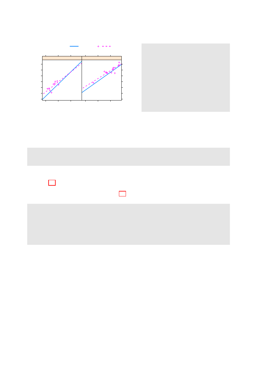
• Different symbols and/or colors are used for different drinks, within the one panel. Different
panels must then be used for different countries, as in Figure 3.1.
Or if different countries are
shown in the same panel, then different panels must be used for the different drinks.
• Use a 3 drinks × 2 countries, or 2 countries × 3 drinks layout of panels.
Where plots are superposed in the one panel and, e.g. regression lines or smooth curves are fitted,
this will be done separately for each different set of points. The separate sets may be distinguished
by colour, and/or they may be distinguished by different symbols and/or line styles.
Amount consumed (per person)
1
2
3
4
5
1998
2000
2002
2004
2006
●
●
●
●
●
●
●
●
●
Australia
1998
2000
2002
2004
2006
●
●
●
●
●
●
●
●
●
NewZealand
Beer
Spirit
Wine
●
Figure 3.1: Australian
and New Zealand ap-
parent per person an-
nual consumption (in
liters) of the pure al-
cohol content of liquor
products, for 1998 to
2006.
Simplified code for Figure 3.1 is:
x y p l o t ( B e e r + S p i r i t + W i n e ~ Y e a r | Country , d a t a = grog , o u t e r = FALSE ,
a u t o . key = l i s t ( c o l u m n s = 3 ) )
To obtain various enhancements that give Figure 3.1, specify:
g r o g p l o t < -
x y p l o t ( B e e r + S p i r i t + W i n e ~ Y e a r | Country , d a t a = grog , o u t e r = FALSE ,
a u t o . key = l i s t ( c o l u m n s = 3 ) )
u p d a t e ( g r o g p l o t , y l i m = c (0 ,5.5) ,
x l a b = " " , y l a b = " A m o u n t c o n s u m e d ( per p e r s o n ) " ,
par . s e t t i n g s = s i m p l e T h e m e ( pch = c (1 ,3 ,4)))
The footnote
has alternative code that updates the object, then uses an explicit
print()
.
Observe that:
• Use of
Beer+Spirit+Wine
gives plots for each of
Beer
,
Spirit
and
Wine
. With
outer=FALSE
,
these appear in the same panel.
• Conditioning by country (
| Country
) gives separate panels for separate countries.
• The function
simpleTheme()
is convenient for setting or changing point and line settings.
1
The data (dataset
grog
, from DAAGxtras) are 1998 – 2006 Australian and New Zealand apparent per person annual
consumption (in liters) of the pure alcohol content of
Beer
,
Wine
and
Spirit
. Data, based on Australian Bureau of
Statistics and Statistics New Zealand figures, are obtained by dividing estimates of total available alcohol by number
of persons aged 15 or more.
2
## Update trellis object, then print
frillyplot <-
update(grogplot, ylim=c(0,5.5),
xlab="", ylab="Amount consumed (per person)",
par.settings=simpleTheme(pch=c(1,3,4)))
print(frillyplot)

14
CHAPTER 3. LATTICE GRAPHICS
The plot superimposes the separate plots (two panels each):
x y p l o t ( B e e r ~ Y e a r | Country , d a t a = g r o g )
# P l o t for B e e r
x y p l o t ( S p i r i t ~ Y e a r | Country , d a t a = g r o g )
# P l o t for S p i r i t
x y p l o t ( W i n e ~ Y e a r | Country , d a t a = g r o g )
# P l o t for W i n e
For separate panels for the three liquor products (different levels of
Country
can now use the same
panel), specify
outer=TRUE
:
x y p l o t ( B e e r + S p i r i t + W i n e ~ Year , g r o u p s = Country , o u t e r = TRUE ,
d a t a = grog , a u t o . key = l i s t ( c o l u m n s =2) )
Here is a summary of the syntax:
Overplot (a single panel)
Separate panels (conditioning)
Levels of a factor
Beer ∼ Year, groups=Country
Beer ∼ Year | Country
Beer+Wine+Spirit ∼ Year,
Columns in parallel
outer=FALSE
outer=TRUE
3.3
Lattice Parameters and Graphics Features
Lattice parameter settings
1. Changes to the defaults for points and lines are most easily made using the function
simpleTheme()
(in recent versions of lattice).
2. Axis, axis tick, tick label and axis label parameters are conveniently set using the parameter
scales
in the function call.
3. Lattice objects can be created, then updated to incorporate changes to parameter settings.
4. Note also the parameters
aspect
(aspect ratio) and
layout
(# rows × # columns × # pages).
3.3. LATTICE PARAMETERS AND GRAPHICS FEATURES
15
3.3.1
Point, line and fill color settings
Lattice point, line & related settings
First use
simpleTheme()
to create a “theme” with the new settings:
miscSettings <- simpleTheme(pch = c(1,3,4), cex=1.25)
Alternatives are then:
(i) Supply the “theme” to
par.settings
in the function call.
xyplot(Beer+Spirit+Wine ~ Year | Country, outer=FALSE,
auto.key=list(columns=3), data=grog,
par.settings=miscSettings)
[This stores the settings with the object. These stored settings over-ride the global settings at
the time of printing.]
(ii) Supply the “theme” to
trellis.par.set()
, prior to plotting:
trellis.par.set(miscSettings)
xyplot(Beer+Spirit+Wine ~ Year | Country, outer=FALSE,
auto.key=list(columns=3), data=grog)
[Makes the change globally, until a new trellis device is opened]
The function
simpleTheme()
creates a “theme”, i.e., a list of parameter settings, in a form that can
be supplied: (i) in the argument par.settings in the graphics function call; or (ii) in the argument
theme in a call to trellis.par.set(), prior to calling the graphics function; or (iii) in the argument
theme to
trellis.device()
.
Note the use of the function
trellis.device()
to open a new graphics device. By default, it has
retain=FALSE
, so that parameters are reset to their defaults for the relevant device.
The following changes the plotting symbols to symbols 1, 3 and 4, as in Figure 3.1. It also increases
the size of points by 25%:
m i s c S e t t i n g s < - s i m p l e T h e m e ( pch = c (1 ,3 ,4) , cex = 1 . 2 5 )
x y p l o t ( B e e r + S p i r i t + W i n e ~ Y e a r | Country , o u t e r = FALSE ,
a u t o . key = l i s t ( c o l u m n s =3) , d a t a = grog , y l i m = c (0 ,5.5) ,
par . s e t t i n g s = m i s c S e t t i n g s ,
x l a b = " " , y l a b = " A l c o h o l c o n s u m p t i o n ( per p e r s o n ) " )
Where there are a small number of points, it can be helpful to show them as large solid dots. The
following affects all subsequent plots, until changed or until a new device is opened:
t r e l l i s . par . set ( s i m p l e T h e m e ( pch = 16 , cex = 2 ) )
When there are a large number of points, it may be helpful to set the background transparency
alpha
(c.f., also,
alpha.points
and
alpha.line
) to a value less than 1, so that regions where there are
many overlapping points can be readily identified.
Where changes go beyond what
simpleTheme()
allows, it is necessary to know the names under
which settings are stored. To inspect these, type:
> n a m e s ( t r e l l i s . par . get ())
[1] " f o n t s i z e "
" b a c k g r o u n d "
" c l i p "
. . .
[ 2 8 ] " par . sub . t e x t "

16
CHAPTER 3. LATTICE GRAPHICS
The settings that are of interest can then be inspected individually. Section 14.12 of DAAGUR has
brief details. For a visual display that shows default settings for points, lines and fill colour, try the
following:
t r e l l i s . d e v i c e ( c o l o r = F A L S E )
s h o w . s e t t i n g s ()
t r e l l i s . d e v i c e ( c o l o r = T R U E )
s h o w . s e t t i n g s ()
The following sets the fontsize. Note that there are separate settings for text and symbols:
t r e l l i s . par . set ( l i s t ( f o n t s i z e = l i s t ( t e x t = 7 , p o i n t s = 4 ) ) )
3.3.2
Parameters that affect axes, tick marks, and axis labels
Axis, tick, tick label and axis label settings – the
scales
argument
• Tick positions and tick labels:
jobplot <- xyplot(Ontario+BC ~ Date, data=jobs)
## Half-length ticks, each quarter, Label years, Add key
tpos <- seq(from=95, by=0.25, to=97)
tlabs <- rep(c("Jan95", "", "Jan96", "", "Jan97"),
c(1,3,1,3,1))
update(jobplot, auto.key=list(columns=2), xlab="",
scales=list(tck=0.5, x=list(at=tpos, labels=tlabs)))
A logarithmic scale, and/or
relation="sliced"
• Use a Logarithmic scale (here, natural logarithmic)
logplot <- xyplot(Ontario+BC ~ Date, data=jobs, outer=TRUE,
xlab="", scales=list(y=list(log="e")))
• Slice the scale
update(logplot, scales=list(y=list(relation="sliced")))
Scales may have
relation="fixed"
, or
relation="sliced"
, or
relation="free"
The data frame
jobs
(DAAG) has numbers in the Canadian labour force, for each of six different
regions, by month over January 1995 to December 1996. The regions appear as columns of the data
frame
jobs
. The following plots these in parallel, on the one panel:
x y p l o t ( O n t a r i o + Q u e b e c + BC + A l b e r t a + P r a i r i e s + A t l a n t i c ~ Date , d a t a = jobs ,
y l a b = " N u m b e r of j o b s " , t y p e = " b " , o u t e r = FALSE ,
a u t o . key = l i s t ( s p a c e = " r i g h t " , l i n e s = T R U E ))
To get a good visual indication of relative changes over time, however, a “sliced” logarithmic scale
is needed. The following saves for later enhancement a simplified of the plot shown in Figure 3.2,
giving it the name
jobs.xyplot
:
# # S a v e the g r a p h i c s object , for l a t e r u p d a t i n g
j o b s . x y p l o t < -
x y p l o t ( O n t a r i o + Q u e b e c + BC + A l b e r t a + P r a i r i e s + A t l a n t i c ~ Date ,
d a t a = jobs , t y p e = " b " , l a y o u t = c (3 ,2) , y l a b = " N u m b e r of j o b s " ,
s c a l e s = l i s t ( y = l i s t ( r e l a t i o n = " s l i c e d " , log = T R U E )) , o u t e r = T R U E )
3.3. LATTICE PARAMETERS AND GRAPHICS FEATURES
17
Figure 3.2: Labor force numbers (1000s) for various regions of Canada. Labels on the vertical axis
show both numbers and log
e
of numbers. Distances between ticks are 0.02 on the log
e
scale, i.e., a
change of almost exactly 2%.
Month
Number of workers
1737
(7.46)
1772
(7.48)
1808
(7.5)
1845
(7.52)
Jan95 Jul95 Jan96 Jul96
BC
1366
(7.22)
1394
(7.24)
1422
(7.26)
Alberta
973
(6.88)
992
(6.9)
1012
(6.92)
Jan95 Jul95 Jan96 Jul96
Prairies
5115
(8.54)
5219
(8.56)
5324
(8.58)
5432
(8.6)
Ontario
Jan95 Jul95 Jan96 Jul96
3165
(8.06)
3229
(8.08)
3294
(8.1)
Quebec
934
(6.84)
953
(6.86)
973
(6.88)
Atlantic
The sliced scale gives each panel the slice of the scale that is needed for points in that panel. A
logarithmic scale makes equal relative changes equidistant.
The labeling can be greatly improved. In Figure 3.2 the y-axis label shows number of jobs, with
the logarithms of the numbers given in parentheses. Additionally, dates of the form
Jan95
label the
x-axis. In the following code, observe the use of
update()
to specify tick positions and tick labels for
the graphics object
jobs.xyplot
.
y l a b p o s < - exp ( p r e t t y ( log ( u n l i s t ( j o b s [ , -7])) , 1 0 0 ) )
y l a b e l s < - p a s t e ( r o u n d ( y l a b p o s ) , " \ n ( " , log ( y l a b p o s ) , " ) " , sep = " " )
# # C r e a t e a d a t e o b j e c t ’ s t a r t o f m o n t h ’; use t h i s i n s t e a d of ’ Date ’
a t d a t e s < - seq ( f r o m =95 , by =0.5 , l e n g t h =5)
d a t e l a b s < - f o r m a t ( seq ( f r o m = as . D a t e ( " 1 J a n 1 9 9 5 " , f o r m a t = " % d % b % Y " ) ,
by = " 6 m o n t h " , l e n g t h =5) , " % b % y " )
u p d a t e ( j o b s . xyplot , x l a b = " " , b e t w e e n = l i s t ( x =0.5 , y =1) ,
s c a l e s = l i s t ( x = l i s t ( at = atdates , l a b e l s = d a t e l a b s ) ,
y = l i s t ( at = ylabpos , l a b e l s = y l a b e l s ) , tck = 0 . 6 ) )
Notice the use of
between=list(x=0.5, y=1)
to add horizontal and vertical space between the panels.
The addition of extra vertical space ensures that the tick labels do not overlap. Specifying
tck=0.6
reduces the length of axis ticks to 60% of the default. This can be a vector of length 2.
3.3.3
A further example
The dataset
ais
(DAAG) has a number of physical and biological measurements on 202 athletes at
the Australian Insitute of Sport. See
help(ais)
for details of the measurements, which include a
variety of blood cell counts. Data are for ten different sports. Here is a breakdown of numbers:
> w i t h ( ais , t a b l e ( sex , s p o r t ))
s p o r t
18
CHAPTER 3. LATTICE GRAPHICS
Red cell count (10
12
.L
−−
1
)
Blood cell to plasma ratio (%)
36
38
40
42
44
46
48
4.0
4.5
5.0
●
●
●
●
●
●
●
●
●
●
●
●
●
f
4.0
4.5
5.0
●
●
●
●
●
●
●
●
●
●
●
●
m
B_Ball
Swim
●
a i s B S < - s u b s e t ( ais ,
s p o r t % in % c ( " B _ B a l l " , " S w i m " ))
b a s i c . x y p l o t < -
x y p l o t ( hg ~ rcc | sex ,
g r o u p s = s p o r t [ d r o p = T R U E ] ,
d a t a = a i s B S )
# # S i m p l i f i e d C o d e
u p d a t e ( b a s i c . xyplot ,
t y p e = c ( " p " , " r " ) ,
a u t o . key = l i s t ( l i n e s = TRUE ,
c o l u m n s = 2 ) )
# For a s m o o t h curve , s p e c i f y
# t y p e = c (" p " ," s m o o t h ")
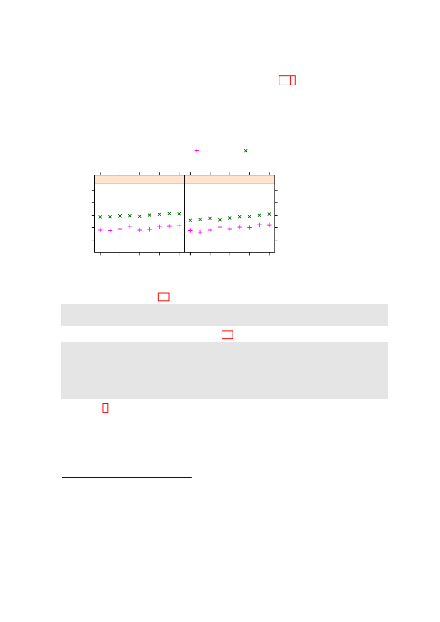
Figure 3.3: Blood cell to plasma ratio (
hc
) versus red cell count (
rcc
), by
sex
(different panels)
and
sport
(distinguished within each panel). The argument
type=c("p", "r")
displays both points
(
"p"
) and regression lines (
"r"
).
sex B _ B a l l F i e l d Gym N e t b a l l Row S w i m T _ 400 m T _ S p r n t T e n n i s W _ P o l o
f
13
7
4
23
22
9
11
4
7
0
m
12
12
0
0
15
13
18
11
4
17
The data were collected with the aim of examining possible differences in blood characteristics, be-
tween athletes in endurance-related events and those in power-related events.
Figure 3.3 plots blood cell to plasma ratio (%) against red cell count, for two sports only. The
two sports appear within the one panel, distinguished by different symbols and/or colours. Females
and males appear in separate panels. Figure 3.3 shows a suitable plot, adding also regression lines.
Again, note the creation of an initial basic plot, which is then updated. Code is:
b a s i c 1 < -
x y p l o t ( hc ~ rcc | sex , g r o u p s = s p o r t [ d r o p = T R U E ] ,
d a t a = s u b s e t ( ais , s p o r t % in % c ( " B _ B a l l " , " S w i m " )) ,
x l a b = " " , y l a b = " B l o o d c e l l to p l a s m a r a t i o (%) " )
b a s i c 2 < - u p d a t e ( basic1 , par . s e t t i n g s = s i m p l e T h e m e ( pch = c (1 ,3) ,
s c a l e s = l i s t ( tck =0.5) , lty =1:2 , lwd = 1 . 5 ) )
u p d a t e ( basic2 , t y p e = c ( " p " , " r " ) , a u t o . key = l i s t ( c o l u m n s =2 , l i n e s = T R U E ) ,
x l a b = e x p r e s s i o n ( " Red c e l l c o u n t (10 " ^ { 1 2 } * " . " * L ^{ -1} * " ) " ))
Again, there are details that require explanation:
•
type=c("p","r")
gives both points and fitted regression lines.
• In
groups=sport[drop=TRUE]
, the
drop=TRUE
is optional. If not included there will be one
legend item for each of the 10 sports. Subsetting a factor leaves the levels attribute unchanged,
even if some of the levels are no longer present in the data.
• As in base graphics, graphical annotation (tick labels, axis labels, labels on points, etc.) can be
given using the function
expression()
. In this context,“expression” is broadly defined; thus
expressions can have terms that are character strings. See
help(plotmath)
.
3.3.4
Keys – auto.key, key & legend
The argument
auto.key=TRUE
gives a basic key that identifies colors, plotting symbols and names for
the groups. For greater flexibility,
auto.key
can be a list. Settings that are often useful are:
•
points
,
lines
: in each case set to
TRUE
or
FALSE
.

3.4. PANEL FUNCTIONS AND INTERACTION WITH PLOTS
19
•
columns
: number of columns of keys.
•
x
and
y
, which are coordinates with respect to the whole display area. Use these with
corner
,
which is one of
c(0,0)
(bottom left corner of legend),
c(1,0)
,
c(1,1)
and
c(0,1)
.
•
space
: one of
"top"
,
"bottom"
,
"left"
,
"right"
.
Use of
auto.key
sets up the call
key=simpleKey()
. If not otherwise specified, colors, plotting
symbols, and line type use the current trellis settings for the device. Unless
text
is supplied as a
parameter,
levels(groups)
provides the legends.
When updating, use
legend=NULL
to remove an existing key, prior to adding a different key.
3.4
Panel Functions and Interaction with Plots
Further flexibility is added, in the creation of plots, by the use of a user’s own panel functions. A
number of panel functions are provided that can be incorporated. A further possibility is interaction
with the panels, or other graphics features, of a graph that has just been printed.
3.4.1
Panel functions
Each lattice command that creates a graph has its own panel function. Thus
xyplot()
has the panel
function
panel.xyplot()
. The following are equivalent:
x y p l o t ( ACT ~ year , d a t a = a u s t p o p )
x y p l o t ( ACT ~ year , d a t a = austpop , p a n e l = p a n e l . x y p l o t )
The user’s own function can be substituted for
panel.xyplot()
. Panel functions that may be
used, either in combination with functions such as
panel.xyplot()
or separately, include:
•
panel.points
,
panel.lines()
and a number of other such functions that are documented on
the same help page as
panel.points
);
•
panel.abline()
,
panel.curve()
,
panel.rug()
,
panel.average()
and a number of other func-
tions that are documented on the same help page as
panel.abline()
.
The following gives a version of Figure 3.3 in which the lines for the two sports are parallel:
x y p l o t ( hg ~ rcc | sex , g r o u p s = s p o r t [ d r o p = T R U E ] , d a t a = aisBS ,
a u t o . key = l i s t ( l i n e s = TRUE , c o l u m n s =2) , a s p e c t =1 ,
s t r i p = s t r i p . c u s t o m ( f a c t o r . l e v e l s = c ( " F e m a l e " , " M a l e " )) ,
# In p l a c e of l e v e l n a m e s c (" f " , " m ") , use c (" F e m a l e " , " M a l e ")
p a n e l = f u n c t i o n ( x , y , groups , s u b s c r i p t s , . . . ) {
p a n e l . s u p e r p o s e ( x , y , g r o u p s = groups ,
s u b s c r i p t s = s u b s c r i p t s , . . . )
b < - c o e f ( lm ( y ~ g r o u p s [ s u b s c r i p t s ] + x ))
l c o l < - t r e l l i s . par . get () $ s u p e r p o s e . l i n e $ col
lty < - t r e l l i s . par . get () $ s u p e r p o s e . l i n e $ lty
p a n e l . a b l i n e ( b [1] , b [3] , col = l c o l [1] , lty = lty [ 1 ] )
p a n e l . a b l i n e ( b [ 1 ] + b [2] , b [3] , col = l c o l [2] ,
lty = lty [ 2 ] )
})
When there are groups within panels,
panel.xyplot()
calls
panel.superpose()
. The customized
panel function has the structure:
p a n e l = f u n c t i o n ( x , y , groups , s u b s c r i p t s , . . . ) {
p a n e l . s u p e r p o s e ( x , y , g r o u p s = groups ,
s u b s c r i p t s = s u b s c r i p t s , . . . )

20
CHAPTER 3. LATTICE GRAPHICS
. . . .
p a n e l . a b l i n e ( b [1] , b [3] , col = l c o l [1] , lty = lty [ 1 ] )
p a n e l . a b l i n e ( b [ 1 ] + b [2] , b [3] , col = l c o l [2] ,
lty = lty [ 2 ] )
})
As the function
panel.superpose()
lacks an option to fit and display multiple parallel lines, the
user must supply the needed code. The following calculates the regression slope estimates:
b < - c o e f ( lm ( y ~ g r o u p s [ s u b s c r i p t s ] + x ))
# NB : g r o u p s ( but not x and y ) m u s t be s u b s c r i p t e d
The lines are then drawn one at a time, taking care that the line settings agree with those that will
appear in the key.
A further enhancement (omitted from the above code) adds axis labels, using an expression for
the x-axis label.
x l a b = e x p r e s s i o n ( " Red c e l l c o u n t (10 " ^ { 1 2 } * " . " * L ^{ -1} * " ) " )
y l a b = " B l o o d c e l l to p l a s m a r a t i o (%) "
3.4.2
Interaction with Lattice Plots
Focusing and unfocusing:
• Following the plot, call
trellis.focus()
.
• In a multi-panel display, click on a panel to select it.
• Use functions such as
panel.points()
,
panel.text()
,
panel.abline()
,
panel.identify()
.
• Call
trellis.focus()
, as needed, to switch panels.
• When finished, call
trellis.unfocus()
.
For non-interactive use of
trellis.focus()
, turn off highlighting, i.e., the call becomes
trellis.focus(highlight=FALSE)
.
Use the call
trellis.panelArgs()
to identify the arguments that are available to panel functions
following a call to
trellis.focus()
.
3.4. PANEL FUNCTIONS AND INTERACTION WITH PLOTS
21
Viewports:
A lattice plot is made up of a number of “viewports”. In the call to
trellis.focus()
, the default
is
name="panel"
.
Other choices of
name
include
"panel"
,
"strip"
,
name="legend"
and
"toplevel"
.
For
name="legend"
;
side
should be indicated.
Here is an example of the interactive labeling of points:
x y p l o t ( log ( T i m e ) ~ log ( D i s t a n c e ) , g r o u p s = r o a d O R t r a c k ,
d a t a = w o r l d R e c o r d s )
t r e l l i s . f o c u s ()
# # Now c l i c k ( m a y b e t w i c e ) on a p a n e l
p a n e l . i d e n t i f y ( l a b e l s = w o r l d R e c o r d s $ P l a c e )
# # C l i c k n e a r to p o i n t s t h a t s h o u l d be l a b e l e d
# # R i g h t c l i c k to t e r m i n a t e
t r e l l i s . u n f o c u s ()
Lattice is built on top of the
grid
package. This implements
viewports
, which are arbitrary
rectangular regions within which plotting takes place. In the course of plotting, the focus moves from
one viewport to the next, as needed to build up the plot.
The function
trellis.focus()
can, once the printing is complete, be used to restore focus to a
viewpoint within one of the current panels, or to the whole panel. Common choices for the parameter
name
are
"panel"
and
"strip"
, with
column
and
row
(by default, counting from the bottom up)
identifying the column and row in the layout. For
name="legend"
;
side
must be indicated. The
argument
name="toplevel"
gives access to the rectangular region within which the panels are placed.
For interactive use, the function
trellis.focus()
can be called without parameters. In a single
panel display, this highlights the panel. In a multi-panel display, clicking on a panel will select it. The
function
trellis.unfocus()
removes the highlighting and makes
"toplevel"
the current viewport.
Once the focus is on a panel, the user has access to the functions that were noted in the previous
subsection, and to many others besides.
The functions
trellis.focus()
and
trellis.unfocus()
can be used in a non-interactive mode.
The following prints the stripplot and a boxplot objects created in Subsection 3.5.1 one under the
other on the same graphics page. Following the printing of each plot, the focus is placed on the top
level viewport, and the function
grid.text()
(from the grid package) used to add a label:
l i b r a r y ( D A A G )
l i b r a r y ( g r i d )
# # P o s i t i o n i n g w i l l be ( x m i n =0 , y m i n =0.46 , x m a x =1 , y m a x =1)
p r i n t ( u p d a t e ( c u c k o o s t r i p , x l a b = " " ) , p o s i t i o n = c (0 , .46 , 1 ,1))
t r e l l i s . f o c u s ( " t o p l e v e l " , h i g h l i g h t = F A L S E )
g r i d . t e x t ( " A " , x =0.05 , y =0.935 , gp = g p a r ( cex = 1 . 1 5 ) )
t r e l l i s . u n f o c u s ()
p r i n t ( c u c k o o b o x , p o s i t i o n = c (0 , 0 , 1 , 0.54) , n e w p a g e = F A L S E )
t r e l l i s . f o c u s ( " t o p l e v e l " , h i g h l i g h t = F A L S E )
g r i d . t e x t ( " B " , x =0.05 , y =0.935 , gp = g p a r ( cex = 1 . 1 5 ) )
t r e l l i s . u n f o c u s ()
Observe that the rectangular regions on which the objects are printed have been chosen so that they
overlap somewhat, reducing the space between.
22
CHAPTER 3. LATTICE GRAPHICS
3.5
Displays of Distributions
3.5.1
Stripplots, dotplots and boxplots
Because the syntax for
stripplot()
and
boxplot()
are very similar, we demonstrate suitable code
side by side. (The function
dotplot()
is very similar to
stripplot()
, with differences that are
mainly cosmetic.) The following code creates a stripplot object and a boxplot object, for the
cuckoos
data (from DAAG):
c u c k o o s t r i p < - s t r i p p l o t ( s p e c i e s ~ length , a s p e c t =0.5 ,
x l a b = " C u c k o o egg l e n g t h ( mm ) " , d a t a = c u c k o o s )
c u c k o o b o x < - b w p l o t ( s p e c i e s ~ length , a s p e c t =0.5 ,
d a t a = cuckoos , x l a b = " C u c k o o egg l e n g t h ( mm ) " )
The
aspect
argument determines the ratio of distance in the y-direction to distance in the x-direction.
The following demonstrates the use of
dotplot()
:
d o t p l o t ( v a r i e t y ~ y i e l d | site , d a t a = barley , g r o u p s = year ,
x l a b = " B a r l e y Y i e l d ( b u s h e l s / a c r e ) " , y l a b = NULL ,
l a y o u t = c (1 , 6) , a s p e c t = 0.5 ,
a u t o . key = l i s t ( l a b e l s = l e v e l s ( b a r l e y $ y e a r ) , s p a c e = " r i g h t " ))
Try stretching the plot vertically so that the labels do not overlap.
The argument
type="h")
gives a line from the origin to the point. Both a line and a point may
be given. This can be used to quite striking effect, as in the following:
d e a t h r a t e < - c (40.7 , 3 6 , 2 7 , 3 0 . 5 , 2 7 . 6 , 8 3 . 5 )
h o s p < - c ( " C l i n i q u e s of V i e n n a ( 1 8 3 4 - 6 3 ) \ n ( > 2 0 0 0 c a s e s pa ) " ,
" E n f a n s T r o u v e s at P e t e r s b u r g \ n (1845 -59 , 1 0 0 0 - 2 0 0 0 c a s e s pa ) " ,
" P e s t h ( 5 0 0 - 1 0 0 0 c a s e s pa ) " ,
" E d i n b u r g h ( 2 0 0 - 5 0 0 c a s e s pa ) " ,
" F r a n k f o r t ( 1 0 0 - 2 0 0 c a s e s pa ) " , " L u n d ( < 100 c a s e s pa ) " )
h o s p < - f a c t o r ( hosp , l e v e l s = h o s p [ o r d e r ( d e a t h r a t e )])
d o t p l o t ( h o s p ~ d e a t h r a t e , x l i m = c (0 ,110) , cex =1.5 ,
s c a l e = l i s t ( cex =1.25) , t y p e = c ( " h " , " p " ) ,
x l a b = l i s t ( " D e a t h r a t e per 1 0 0 0 " , cex =1.5) ,
sub = " F r o m N i g h t i n g a l e ( 1 8 7 1 ) - d a t a f r o m Dr Le F o r t " )
3.5.2
Lattice Style Density Plots
earconch
Density
0.00
0.05
0.10
0.15
0.20
0.25
40
45
50
55
● ●●
●●●
● ●
●
●
● ●
● ●●
●
●
●
●
●
●
●
●
●
f
40
45
50
55
●
●
●
●
●
●
●
●
●
●
●
●
●
●
●
●
●
●
●
●
●
●
m
Vic
other
Figure 3.4: Lattice style density plot
comparing possum earconch measure-
ments, separately for males and fe-
males, between Victorian and other
populations. Observe that the scatter
of data values is shown along the hori-
zontal axis.
3
## For slightly improved labeling, precede with:
levels(cuckoos$species) <- sub(".", " ", levels(cuckoos$species), fixed=T)
4
Data are from Nightingale, F. (1871): Notes on Lying-in Institutions.

3.6. LATTICE GRAPHICS FUNCTIONS – FURTHER POINTS
23
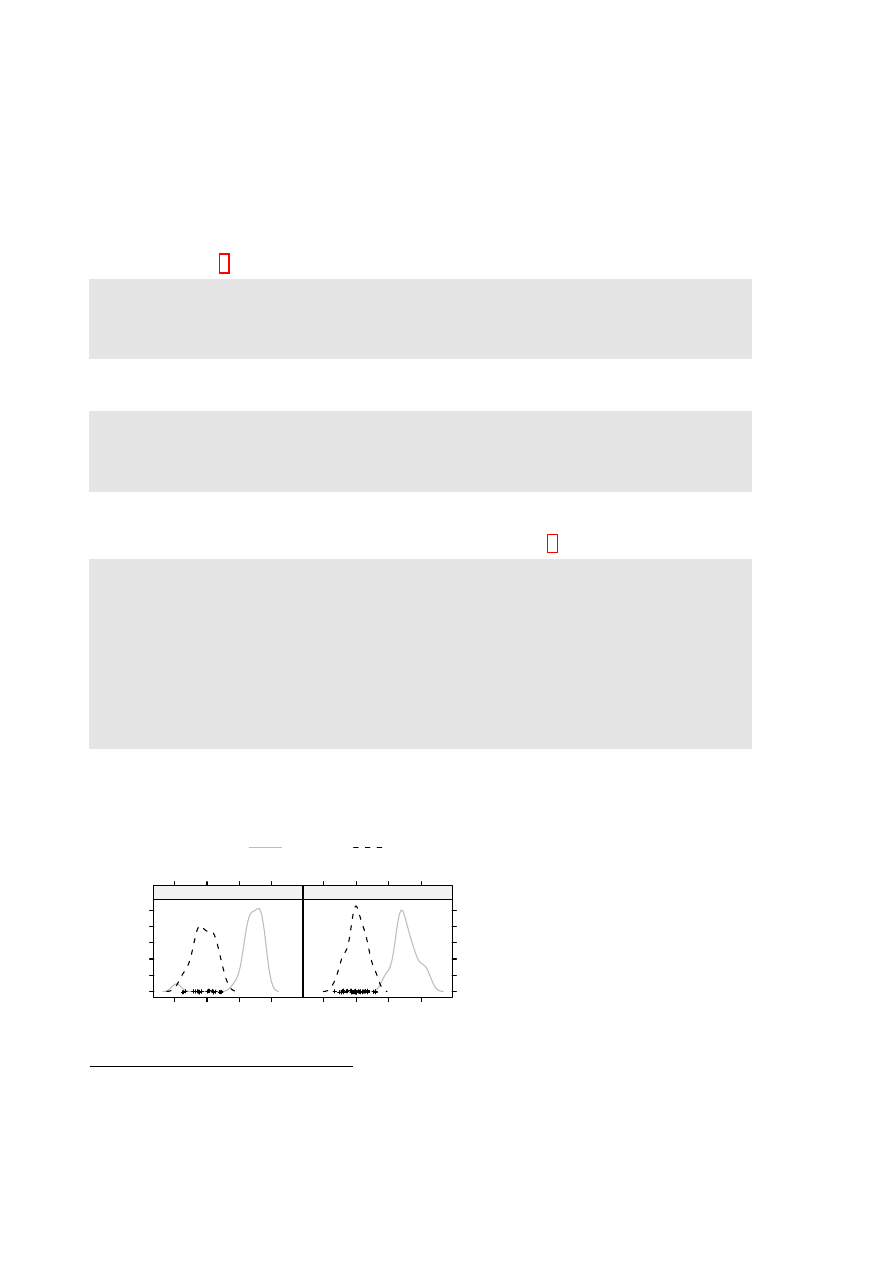
Here is a density plot (Figure 3.4), for data from the
possum
data set (DAAG), that compares
sex
es
and
Vic
/
other
populations.
d e n s i t y p l o t ( ~ e a r c o n c h | sex , g r o u p s = Pop , d a t a = possum ,
par . s e t t i n g s = s i m p l e T h e m e ( col = c ( " g r a y " , " b l a c k " ) ,
a u t o . key = l i s t ( c o l u m n s = 2 ) )
Where
densityplot()
(and
histogram()
) have a formula as argument, a name is not allowed on the
left of the
∼
symbol. For
histogram()
, the
groups
argument is not available.
3.6
Lattice graphics functions – Further Points
3.6.1
Help on lattice functions
For an overview, type
help(Lattice)
. For help on the graphical parameters used by lattice functions,
see
help(trellis.par.set)
and
help(simpleTheme)
. For other settings, see
help(lattice.options)
.
Several of the help pages for lattice functions are shared between more than one function. For
example,
xyplot()
,
dotplot()
,
barchart()
,
stripplot()
and
bwplot()
share the same help page.
As a consequence. typing
example(bwplot)
has the same effect as typing
example(xyplot)
.
3.6.2
Selected Lattice Functions
Functions that have already been demonstrated are
xyplot()
,
stripplot()
,
dotplot()
,
densityplot()
and
bwplot()
. Other ”high level” functions include:
barchart(character ~ numeric,..)
histogram( ~ numeric,..)
# NB: does not accept groups parameter
densityplot( ~ numeric,..)
# Density plot; does allow groups
bwplot(factor ~ numeric,..)
# Box and whisker plot
qqmath(factor ~ numeric,..)
# normal probability plots
## Bivariate
qq(factor ~ numeric, ...)
# comparing two empirical distributions
# (Two factor levels identify the 2 distns)
## Multivariate
cloud(numeric ~ numeric * numeric, ...)
# 3D surface
wireframe(numeric ~ numeric * numeric, ...)
# 3D scatterplot
levelplot(numeric ~ numeric * numeric, ...)
# cf image() in base graphics
contourplot(numeric ~ numeric * numeric, ...)
# contour plot
## Hypervariate
splom( ~ dataframe,..)
# Scatterplot matrix
parallel( ~ dataframe,..)
# Parallel coordinate plots
## Miscellaneous
rfs()
# Residual and fitted value plot (also see ’oneway’)
tmd()
# Tukey Mean-Difference plot
In each instance, users can add conditioning variables.

24
CHAPTER 3. LATTICE GRAPHICS
Chapter 4
The ggplot2 Package
This package, by Hadley Wickham, implements the graphics language that is described in Wilkinson’s
Grammar of Graphics. A draft of Hadley Wickham’s book that describes the package is available
from http://had.co.nz/ggplot2/. In contrast to base graphics, the syntax is consistent. It is much
less stylized than lattice, and accordingly easier to adapt.
The examples that are given here will use the wrapper function qplot() (quickplot) that is de-
signed for creating simple ggplot graphics objects. It has remarkably wide-ranging abilities.
4.1
Examples
Australian rain data
Figure 4.1 plots annual rainfall for South-East Australia.
400
500
600
700
800
900
1900
1920
1940
1960
1980
2000
●
●
●
●
●
●
●
●●
●
●●
●●
●
●
●●
●
●
●●
●
●
●
●
●
●
●
●
●
●
●
●
●
●
●
●
●
●
●
●
●
●
●
●
●
●
●
●
●
●
●
●●
●
●
●
●
●
●
●●
●
●
●
●
●
●●
●●
●
●
●
●
●
●
●
●●
●
●
●
●
●●
●
●●
●
●
●
●
●
●●
●
●●
●
●
●
●
●
●
●
●
Annual rainfall, SE Aust
Year
A:
400
500
600
700
800
900
1900
1920
1940
1960
1980
2000
●
●
●
●
●
●
●
●●
●
●●
●●
●
●
●●
●
●
●●
●
●
●
●
●
●
●
●
●
●
●
●
●
●
●
●
●
●
●
●
●
●
●
●
●
●
●
●
●
●
●
●●
●
●
●
●
●
●
●●
●
●
●
●
●
●●
●●
●
●
●
●
●
●
●
●●
●
●
●
●
●●
●
●●
●
●
●
●
●
●●
●
●●
●
●
●
●
●
●
●
●
Annual rainfall, SE Aust
Year
B:
400
500
600
700
800
900
1900
1920
1940
1960
1980
2000
●
●
●
●
●
●
●
●●
●
●●
●●
●
●
●●
●
●
●●
●
●
●
●
●
●
●
●
●
●
●
●
●
●
●
●
●
●
●
●
●
●
●
●
●
●
●
●
●
●
●
●●
●
●
●
●
●
●
●●
●
●
●
●
●
●●
●●
●
●
●
●
●
●
●
●●
●
●
●
●
●●
●
●●
●
●
●
●
●
●●
●
●●
●
●
●
●
●
●
●
●
Annual rainfall, SE Aust
Year
C:
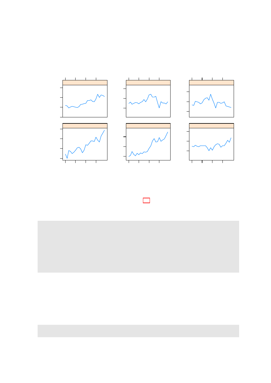
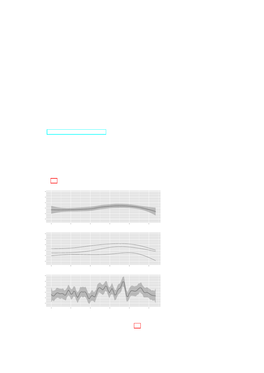
Figure 4.1: Annual rainfall,
from 1901 to 2007, for South-
East
Australia.
Curves
are fitted thus:
A: default
loess smoother, with default
smoothing parameter.
B:
20%, 50% and 80% quan-
tiles, based on 5 d.f. normal
splines. C: robust 36 d.f. nor-
mal spline fit.
Panel C is
designed to show trends that
are on the scale of an 11-year
sunspot cycle.
The bands in (A) and (C) are
designed to be pointwise one
standard error bands.
Be-
cause of likely sequential cor-
relation, at least for the 5
d.f. curve, they should be re-
garded as rough indications
only. To suppress the bands,
specify
se=FALSE
.
Here is the code. Note however that, in Figure 4.1, the points for 2006 and 2007 have been added.
25
26
CHAPTER 4. THE GGPLOT2 PACKAGE
l i b r a r y ( D A A G )
l i b r a r y ( g g p l o t 2 )
# # A : D e f a u l t l o e s s s m o o t h
q p l o t ( Year , seRain , d a t a = bomsoi , g e o m = c ( " p o i n t " , " s m o o t h " ))
# # B : 20% , 50% & 80% q u a n t i l e s
# #
5 d . f . n o r m a l s p l i n e s
q p l o t ( Year , seRain , d a t a = bomsoi , g e o m = c ( " p o i n t " , " q u a n t i l e " ) ,
f o r m u l a = y ~ ns ( x ,5) , q u a n t i l e s = c ( 0 . 2 , 0 . 5 , 0 . 8 ) )
# # C : R o b u s t fit u s i n g rlm ()
# #
15 d . f . n o r m a l s p l i n e s
q p l o t ( Year , seRain , d a t a = bomsoi , g e o m = c ( " p o i n t " , " s m o o t h " ) ,
f o r m u l a = y ~ ns ( x ,15) , m e t h o d = " rlm " )
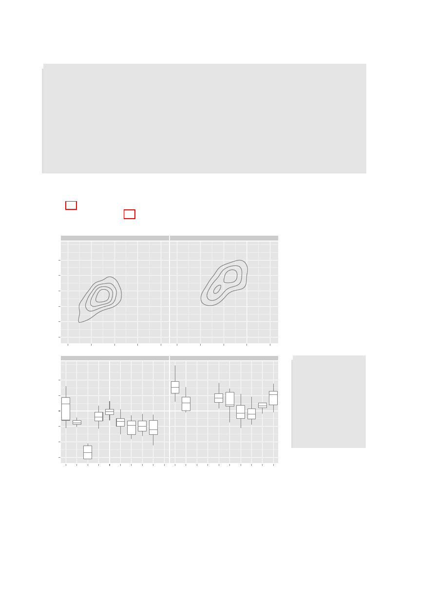
Physical measurements of Australian athletes
Figure 4.2A plots height against weight, for the
ais
data. Two-dimensional density contour estimates
have been added. Figure 4.2B shows boxplots (
geom="boxplot"
), by
sport
(given as the x-variable)
and
sex
(separate panels):
150
160
170
180
190
200
40
60
80
100
120
40
60
80
100
120
f
m
●
●
●
●
●
●
●
●
●
●
●
●
●
●
●
●
●
●
●
●
●
●
●
●
●
● ●
●
●
●
●
● ●
●
●
●
●
●
●
●
●
●
●
●
●
●
●
● ●
●
●
●
●
●
●
●
●
●
●
●
●
●
●
●
●
●
●
●
●
●
●
●
●
●
●
●
●
●
●
●
●
●
●
●
●
●
●
●
●
●
●
●
●
●
●
●●
●
●
●
●
●
●
●
●
●
●
●
●
●
●
●
●
●
●
●
●
●
●
●
●
●
●
●
●
●
●
●
●
●
●
●
●
●
●
●
●
●
●
●
●
●
●
●
●
●
●
●
●
●
●
●
●
●
●
●
●
●
●
●
●
●
●
●
●
●
●
●
●
●
●
●
●
●
●
●
●
●
●
●
●
●
●
●
●
● ●
●
●
●
●
●
●
●
●
●
●
●
●
●
●
●
ht
wt
A:
150
160
170
180
190
200
B_Ball Field Gym Netball Row SwimT_400m
T_Sprnt
Tennis
W_Polo
B_Ball Field Gym Netball Row SwimT_400m
T_Sprnt
Tennis
W_Polo
f
m
ht
sport
B:
Figure 4.2: A: Height
versus
weight,
for
Australian
athletes
in the
ais
data set.
Two-dimensional
density contours have
been added. B: Box-
plots
of
heights
of
athletes,
by
sport
and
(in
separate
panels) by
sex
.
# # A
q p l o t ( wt , ht ,
d a t a = ais ,
g e o m = c ( " p o i n t " ,
" d e n s i t y 2 d " ) ,
f a c e t s = sex ~ .)
# # B
q p l o t ( sport , ht ,
d a t a = ais ,
g e o m = " b o x p l o t " ,
f a c e t s = sex ~ .)
To get different colours for different levels of
sport
, specify
colour=sport
, For different plotting
symbols, specify
shape=sport
. For different sizes of symbol, specify
size=sport
.
Possible choices of
geom
, additional to those already demonstrated, are
"path"
(join points),
"line"
(join points),
"histogram"
, and
"density"
.

Chapter 5
References and Bibliography
5.1
Books and Papers on R
Crawley, M.J. 2005. Statistics – An Introduction with R. Wiley.
Crawley, M.J. 2007. The R Book. Wiley.
Dalgaard, P. 2002. Introductory Statistics with R. Springer-Verlag, New York.
[An excellent R-based introductory statistics text]
Fox, J. 2002. An R and S-PLUS Companion to Applied Regression. Sage Books.
(web page http://socserv.socsci.mcmaster.ca/jfox/Books/Companion/index.html)
[This is particularly aimed at classical types of regression calculations.]
Kuhnert, P. and Venables, W. 2005. An Introduction to R: Software for Statistical Modelling
& Computing. CSIRO Australia. Available from
http://cran.r-project.org/doc/contrib/Kuhnert+Venables-R_Course_Notes.zip
Ihaka, R. & Gentleman, R. 1996. R: A language for data analysis and graphics. Journal of
Computational and Graphical Statistics 5: 299-314.
Maindonald, J. H. & Braun, J. B. 2007. Data Analysis & Graphics Using R. An Example-Based
Approach. Cambridge University Press, Cambridge, UK, 2007.
(web page http://www.maths.anu.edu.au/~johnm/r-book.html
[This is aimed at researchers who have had some previous exposure to statistics, and at applied
statisticians.]
Venables, W.N. and Ripley, B.D. 2000. S Programming. Springer-Verlag, New York.
[This treats both R and S-PLUS.]
Venables, W.N. and Ripley, B.D., 4
th
edn 2002. Modern Applied Statistics with S. Springer.
[This demands a relatively high level of sophistication. This treats both R and S-PLUS.]
5.2
Web-Based Information
See Documentation on the web page http://www.r-project.org
Note the R Wiki (http://wiki.r-project.org/rwiki/doku.php) and the help information listed
under Other (http://www.r-project.org/other-docs.html).
For examples of R graphs, see http://addictedtor.free.fr/graphiques/.
27

28
CHAPTER 5. REFERENCES AND BIBLIOGRAPHY
R News:
Successive issues of R News contain much useful information. These can be copied down
from one of the CRAN sites.
Contributed Documentation:
There is an extensive collection of user-written documents on R
that can be accessed by going to this same mirror site, and clicking (under Documentation) on
Contributed. See also the links that John Fox gives on the web page for his book that is noted
under the reference for his book.
Books:
See http://www.R-project.org/doc/bib/R.bib for a list that is updated regularly.
5.3
Graphics
Cleveland, W. S. 1985. The Elements of Graphing Data. Wadsworth, Monterey, California.
Chen, C., Hrdle, W. and Unwin A. 2008. Handbook of Data Visualization. Springer, in press.
Maindonald J H 1992. Statistical design, analysis and presentation issues. New Zealand Journal
of Agricultural Research 35: 121-141.
Murrell, P. 2005. R Graphics. Chapman & Hall/CRC.
http://www.stat.auckland.ac.nz/~paul/RGraphics/rgraphics.html.
[This is a detailed exposition of the R graphics systems, with examples of their use.]
Tufte, E. R. 1983. The Visual Display of Quantitative Information. Graphics Press, Cheshire,
Connecticut, U.S.A.
Tufte, E. R. 1990. Envisioning Information. Graphics Press, Cheshire, Connecticut, U.S.A.
Tufte, E. R. 1997. Visual Explanations. Graphics Press, Cheshire, Connecticut, U.S.A.
Wainer, H. 1997. Visual Revelations. Springer-Verlag, New York
Large and Possibly Sparse Data
Go to the website http://user2007.org/program/. Scroll down to ”Large data and Programming
Competition Winners”.
Unwin, A., Theus, M. and Hofmann, H. 2006. Graphics of Large Datasets. Springer, NY 2006
Literature on trellis (lattice) graphics
Cleveland, W. S. 1993. Visualizing Data. Hobart Press, Summit, New Jersey.
Sarkar, D. 2008. Lattice. Multivariate Data Visialization with R. Springer.
[This is the definitive reference on Lattice graphics.]
The grammar of graphics in R (
ggplot2
)
Wilkinson, L. 2005. The Grammar of Graphics. Springer, 2005.

Index of Functions
acf, 10
as, 10
as.Date, 17
attach, 7
axis, 7, 9
barchart, 23
boxplot, 7, 22
bwplot, 22, 23
c, 7, 8, 13, 15, 16, 18, 19, 21–23, 26
cloud, 23
coef, 19, 20
Commander, 6
contourplot, 23
data.frame, 10
demo, 7, 11
density, 9
densityplot, 23
detach, 7
dot, 9
dotplot, 22, 23
example, 23
exp, 17
expression, 9, 18, 20
factor, 22
format, 17
function, 19
gpar, 21
gray, 8
grid.text, 21
help, 9, 17, 18, 23
hist, 7
histogram, 23
identify, 7, 9, 10
image, 23
install, 5
install.packages, 5
invisible, 12
italic, 9
lag.plot, 10
levelplot, 23
levels, 19, 22
library, 6, 7, 11, 12, 21, 26
lines, 7, 9
list, 13–19, 22, 23
lm, 19, 20
log, 17, 21
mfrow, 10
mtext, 7–9
names, 15
ns, 26
order, 22
pacf, 10
panel.abline, 19, 20
panel.average, 19
panel.curve, 19
panel.identify, 20, 21
panel.lines, 19
panel.points, 20
panel.rug, 19
panel.superpose, 19, 20
panel.text, 20
panel.xyplot, 19
par, 7, 9
parallel, 23
paste, 8, 17
plot, 3, 7–10, 12
points, 7–9
pretty, 17
print, 11–13, 21
qplot, 25, 26
qq, 23
qqmath, 23
qqnorm, 9
rep, 7, 8, 16
rev, 8
rfs, 23
rlm, 26
round, 17
29

30
INDEX OF FUNCTIONS
rug, 7
runif, 10
scatter3d, 6
scatterplot, 6
seq, 8, 9, 16, 17
show.settings, 16
simpleKey, 19
simpleTheme, 13–15, 18, 23
splom, 23
strip.custom, 19
stripplot, 22, 23
sub, 22
subset, 18
table, 17
text, 7–9
time, 10
tmd, 23
trellis.device, 15, 16
trellis.focus, 20, 21
trellis.panelArgs, 20
trellis.par.get, 15, 19
trellis.par.set, 15, 16
trellis.unfocus, 20, 21
unlist, 17
update, 13, 16–18, 21
wireframe, 23
with, 7, 17
xyplot, 12–16, 18, 19, 21, 23
Document Outline
- Preliminaries
- Base Graphics
- Lattice Graphics
- The ggplot2 Package
- References and Bibliography
Wyszukiwarka
Podobne podstrony:
Breast and other cancers in 1445 blood relatives of 75 Nordic patients with ataxia telangiectasia
The Wartime Economy; Foreign Workers, Half Jews, and Other Prisoners in a German Town, 1939 1945
Analysis of residual styrene monomer and other VOC in expand
Philippa Foot Moral Dilemmas and other topics in moral philosophy 2003
The Presentation of Self and Other in Nazi Propaganda
Smile and other lessons from 25 years in business
The Bohemian Grove and Other Retreats A Study in Ruling Class
Edgar Allan Poe The Murders In the Rue Morgue and Other Stories
Cadmium and Other Metal Levels in Autopsy Samplesfrom a Cadmium Polluted Area and Non polluted Contr
Coueses in Underwater Archaeology at Universities and other Institutions UNESCO 07 2010
Domhoff G William, Bohemian Grove and Other Retreats A Study In Ruling Class Cohesiveness (1974)
Clive Staples Lewis The Grand Miracle; And Other Selected Essays On Theology And Ethics From God In
Functional Origins of Religious Concepts Ontological and Strategic Selection in Evolved Minds
2008 4 JUL Emerging and Reemerging Viruses in Dogs and Cats
Angielski tematy Performance appraisal and its role in business 1
The Hound of?ath and Other Stories
Kissoudi P Sport, Politics and International Relations in Twentieth Century
Greenshit go home Greenpeace, Greenland and green colonialism in the Arctic
więcej podobnych podstron